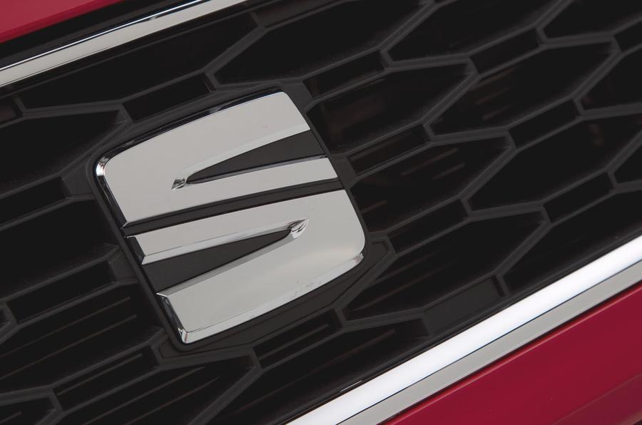
The latest incarnation of the Seat logo has been premiered as the Spanish car maker announced its all-new Seat Leon hatchback.
The Seat Leon will be the first car to wear the badge when it goes on sale next year.
Seat’s designers have simplified the logo, which loses the central floating bar. Seat says it conveys the "precision and elegance of the brand’s design language".
The logo will be introduced across Seat’s visual material and locations after the Paris motor show in September.


Join the debate
Add your comment
The Badge looks as
The Badge looks as interesting as the cars that the VAG group produces, bland uninteresting and boring so for me it matches the cars well.
New "streamlined logo"
I presume this will dramatically lower the Co2 and improve fuel consumption. Apart from the streamlining, that old "floating bar" must have weighed a ton.
Uncle Mellow wrote: I
Streamlined meaning simpler. Jeepers.
Wow!, now I'm seriously
Wow!, now I'm seriously tempted to buy a SEAT!
I've always been put off by the previous "S" design as it just didn't look sporty enough! Now though, with this new "S" I think they have finally solved all of their image problems!
Well done SEAT!
NEXT WEEK:
AUDI TO REDUCE THE NUMBER OF RINGS IN ITS BADGE FROM FOUR TO THREE IN A NEW WEIGHT SAVING PROGRAMME!