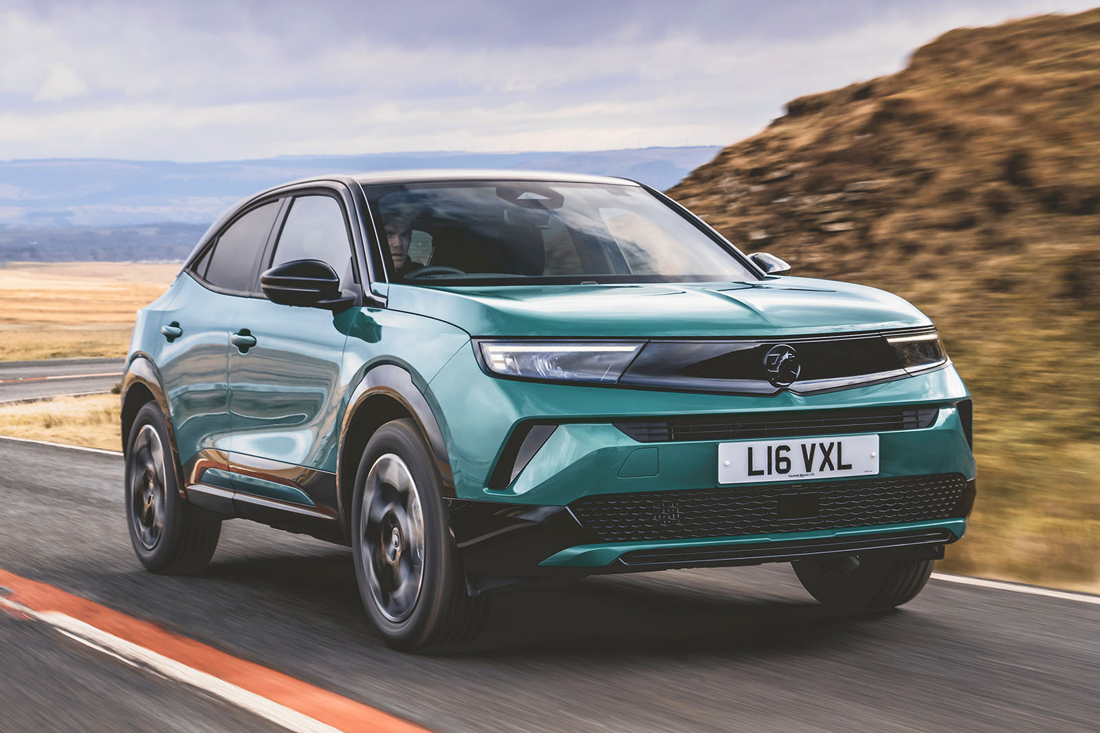
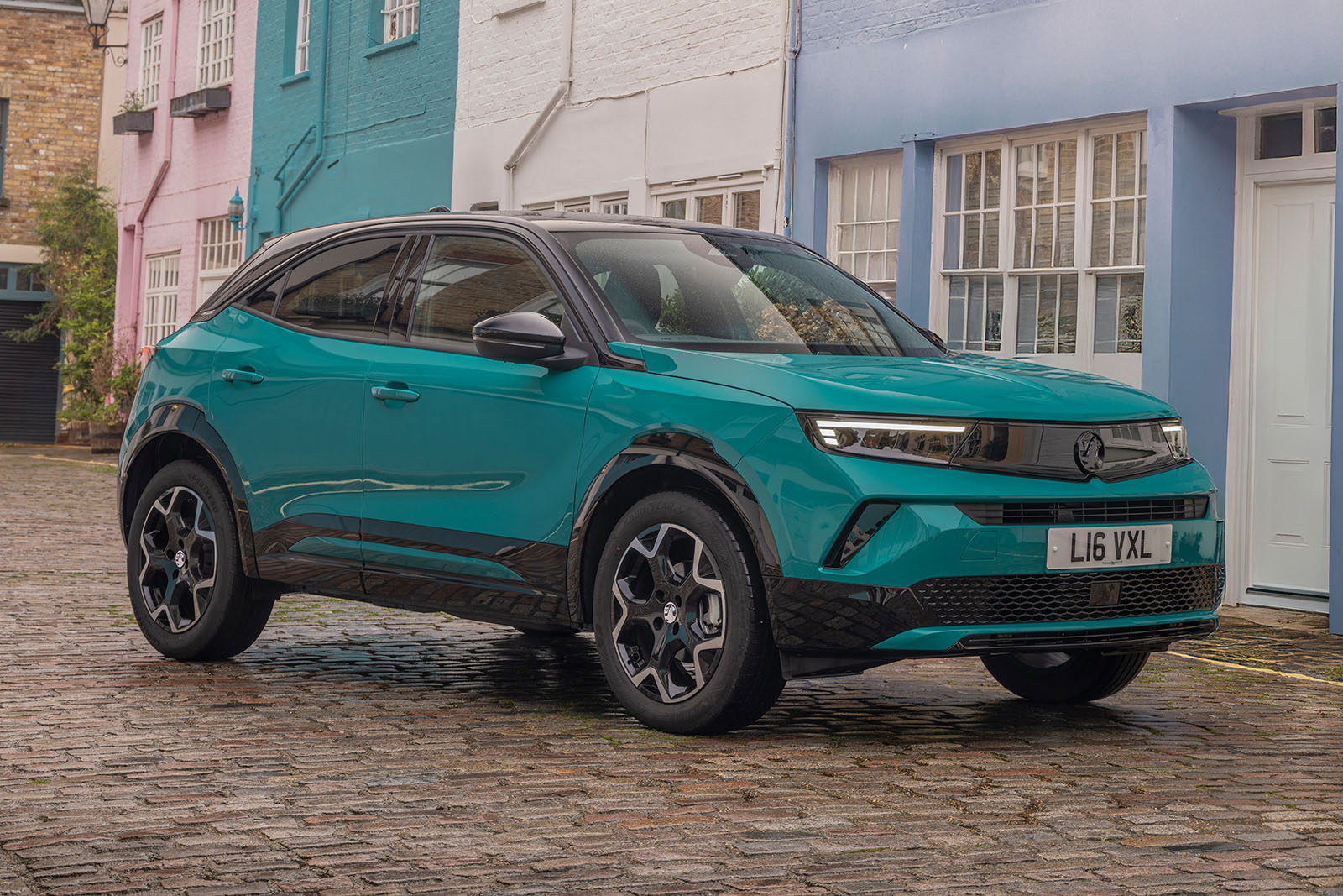
From £21,5557

Frumpy crossover turns into something of a style icon. Does it have substance, too?

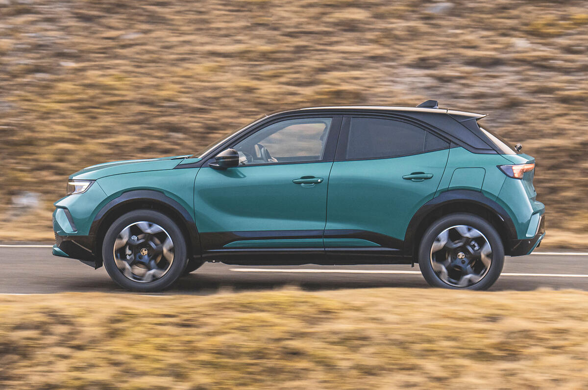
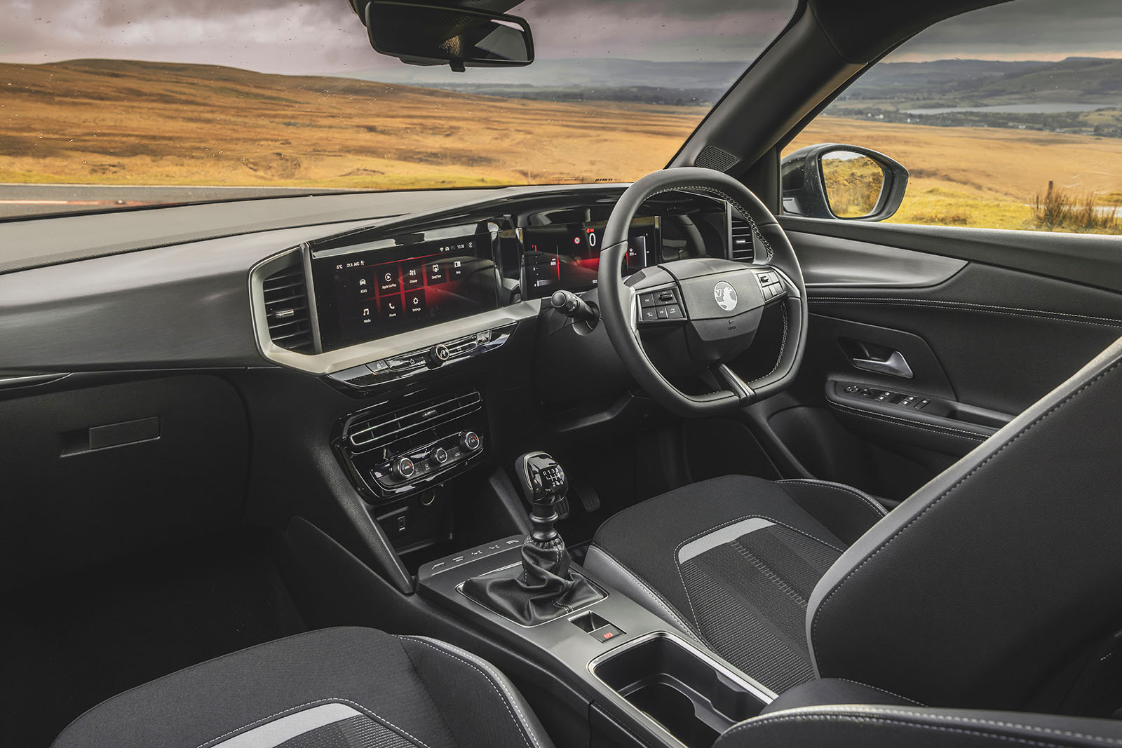
As with the Mokka’s exterior styling, the cockpit is adventurous by its maker’s habitual conservative standard.

While some of the ways in which it catches your eye ultimately do the car’s overall chances of impressing more harm than good, it ends up looking and feeling almost as much of a departure from within as it does from without. 

Vauxhall’s Pure Panel display layout is pretending to be a Mercedes-style sweep of interconnected digital display real estate, but it isn’t that convincing.

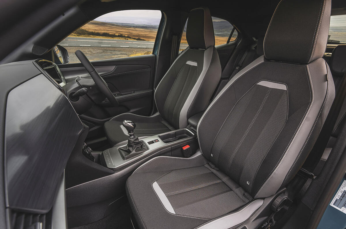
Having first lifted your feet over the car’s trip hazard of a sill (something we’ve noted about every car we’ve tested on this platform to date), you settle into a medium-high-set seat, and in front of an appealing, materially rich and varied dashboard.

An integrated-looking duo of digital infotainment and instrumentation screens sweeps across behind the steering wheel and into the upper centre stack. Vauxhall calls this its ‘Pure Panel’: an attempt to notionally claim as its own a design convention that’s becoming quite common among the latest models being launched.

Within it, you get a pair of 7.0in screens in entry-level cars, expanding to 10.0in for the infotainment system and 12.0in for the digital dials on top-of-the-line Mokkas.
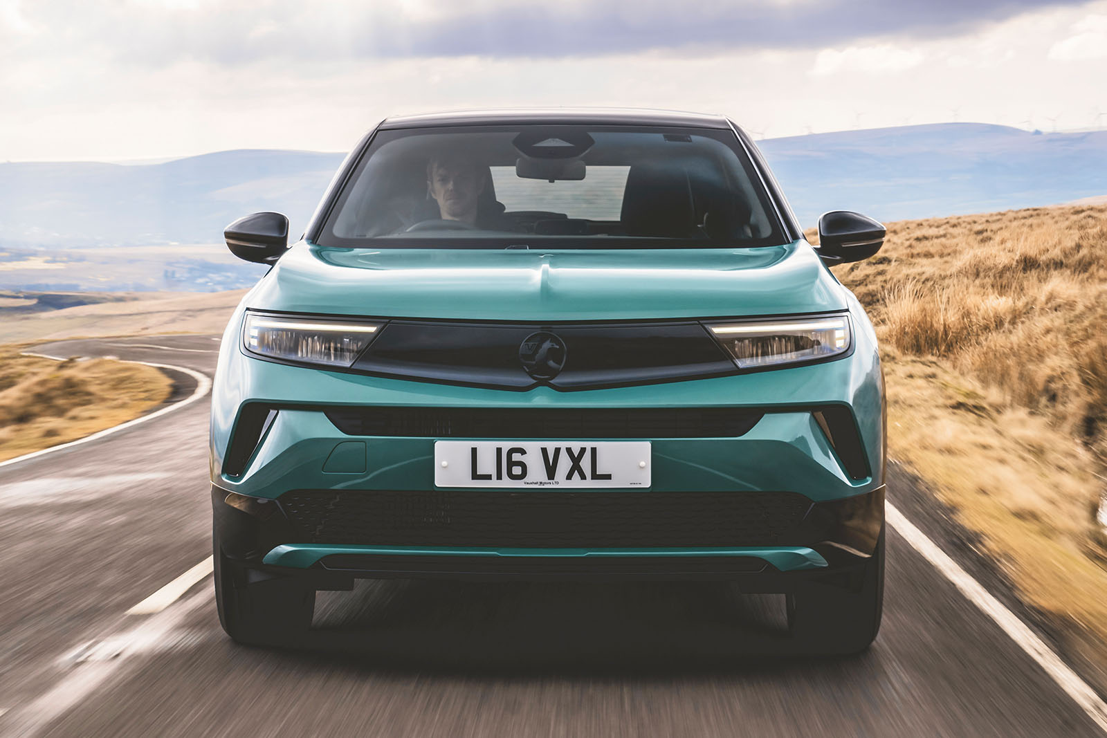
The thinking is that by surrounding both configurations in gloss black plastic, both better fit into the cabin architecture around them; and perhaps they do, although if you don’t like cars with lots of gloss black plastic, you’re unlikely to take to it.

Advertisement
Back to top

The instrument screen is quite sparsely designed and perhaps a touch oversimplified. It relays a rev counter at an oddly small scale and declines to include a classic, analogue-style speedometer in any of its display modes. 

The instrument screen is, at least, protected from the glare of the sun by a thoughtfully positioned shade.

It’s strange, then, that Vauxhall’s colour and trim department didn’t think about the potential of the other materials used on the dashboard to reflect light into your eyes. Glossy finishes and convex surfaces abound, and while they do add colour and life to the cockpit, they can certainly annoy you on a bright day.

The Mokka’s rear seats have undeniably shrunk a little for adult-appropriate passenger space. We measured less rear head room and quite a lot less typical rear leg room here than we did in the original Mokka in 2012, and less room overall than plenty of current rivals. 

A smaller adult will be comfortable enough, but that’s about the limit of it, and he or she might be disappointed by the available oddment storage and the lack of a fold-down armrest.

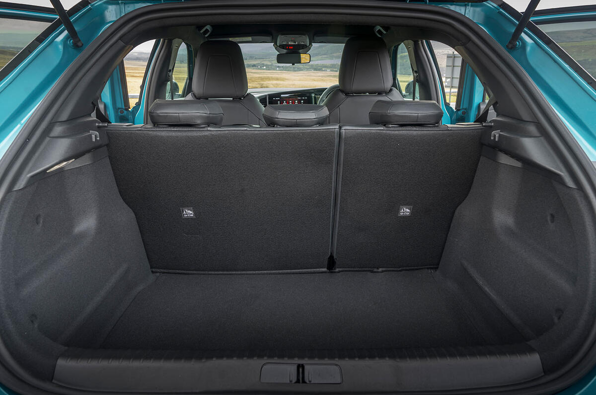
Vauxhall claims that boot space is only marginally less than it was: up to 350 litres now, down from 360 before. All round, though, there’s a good chance that existing Mokka owners will miss the greater practicality of their old car.

Vauxhall Mokka infotainment and sat-nav

The Mokka gets a 7.0in touchscreen infotainment system as standard, with smartphone mirroring, USB connectivity and six speakers. It’s not the most generously endowed system, but it's not bad.

Our mid-spec test car upped the screen size to 10.0in and added a couple of USB charging ports for second-row passengers.

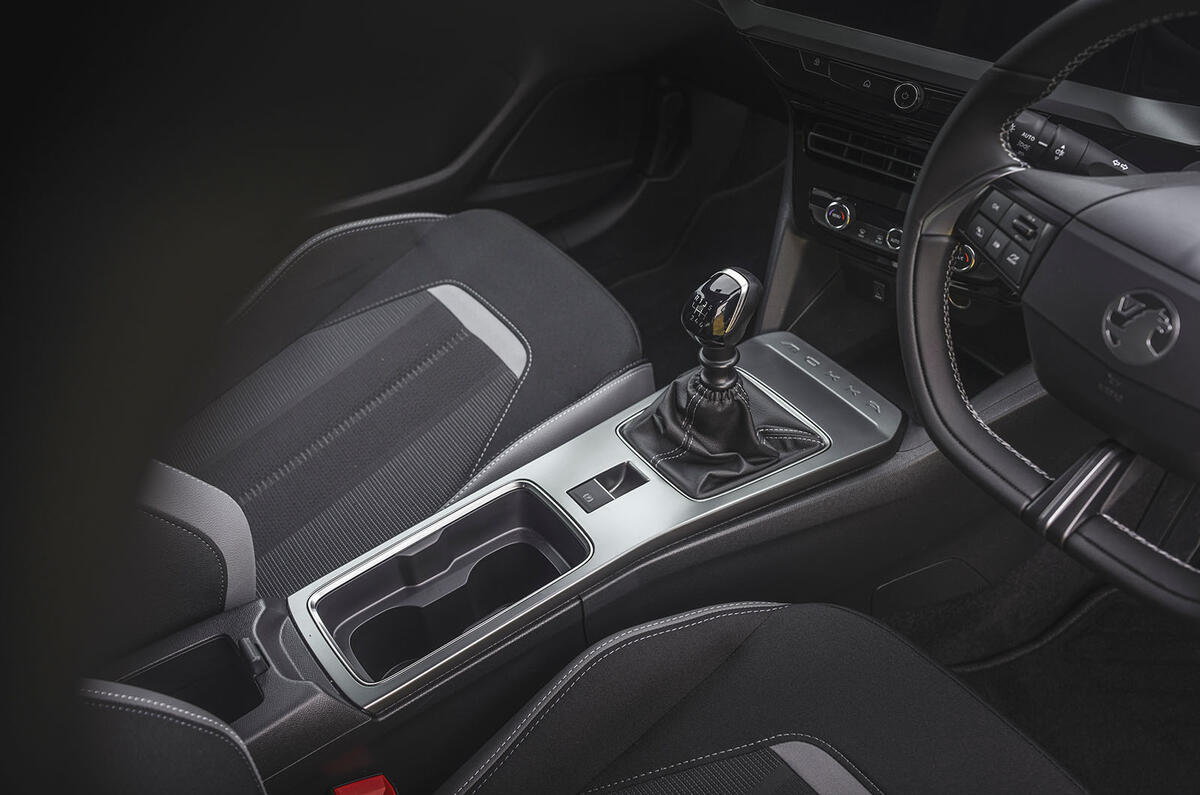
That it’s a reskinned system closely related to the one you might find in a Peugeot, Citroën or DS is made clear by the fact that as well as having physical heater controls, the Mokka has duplicated digital touchscreen ones, too (because some of its relations don’t have the physical knobs).

Back to top

Vauxhall’s decision to offer plenty of physical switchgear certainly makes the system more usable. Some testers would have preferred either a separate rotary input device or somewhere more natural to anchor your outstretched left arm when using the touchscreen. The factory navigation system, which recognises spoken destinations and is easy to follow, is probably worth having.