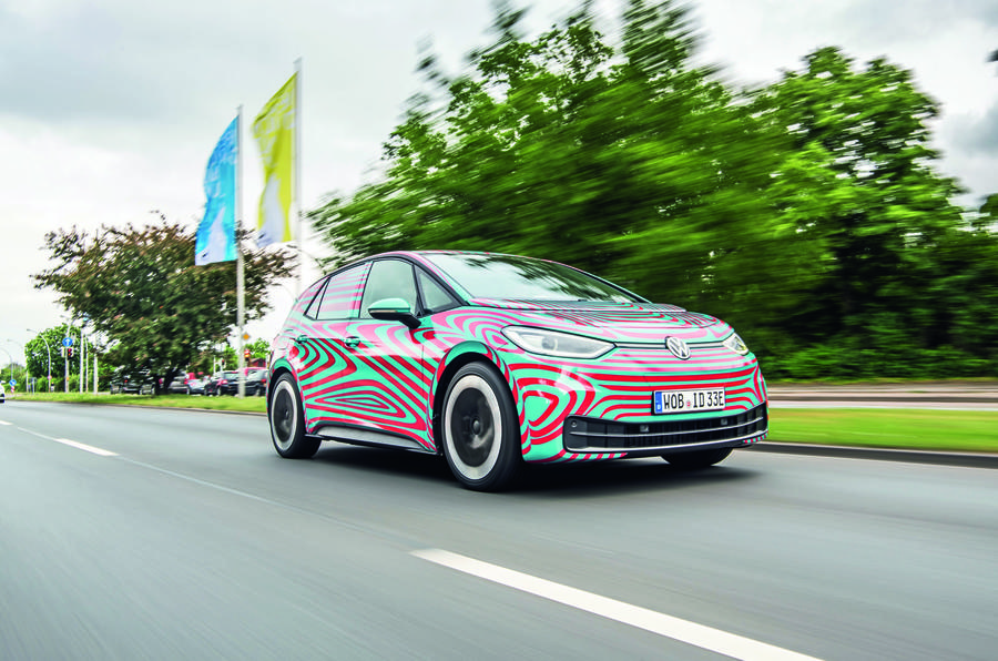
Volkswagen has unveiled a new brand identity alongside the pivotal ID 3 electric car at the Frankfurt motor show today (Monday), as it attempts to draw a line under the fallout from the Dieselgate scandal.
The revelations in October 2015 about how the firm had cheated diesel emissions tests sparked a clear-out of its leadership group, and sparked a heavy investment in electric technology. The first result of that will be the ID 3, the first car based on the VW Group’s electric-only MEB platform.
The new logo is a two-dimensional design in order to work better on digital platforms, with thinner lines. While it maintains the company's traditional 'VW' roundel design, the letter W no longer touches the bottom of the circular frame. The firm while also adopt a more flexibile use of colours, for example with the logo set to appear in red on future GTI models.
As well, the logo will be accompanied by the new use of a 'floating line', and Volkswagen is introducing a new official female voice, and a 'sound logo' for use in television adverts. The firm has also introduced a new font, along with other changes.
The redesign is the work of VW design chief Klaus Bischoff, and will be rolled out across the firm's factories and dealerships in stages in the coming years. The firm estimates around 70,000 logos will be switched at more than 10,000 dealerships and service facilities in 154 countries.
Termed ‘New Volkswagen’, the design revamp goes far beyond a new logo. Chief operating officer Ralf Brandstätter calls it a “pivotal moment”, as significant as a new-car launch.
Speaking at the unveiling, VW sales chief Jurgen Stackmann said: “The brand is undergoing a fundamental transformation towards a future with a neutral emission balance for everyone. Now is the right time to make the new attitude of our brand visible to the outside world.”
The roots of ‘New Volkswagen’ began following a board meeting after Herbert Diess took over the firm’s top role in the wake of the crisis. At that meeting, VW looked beyond Dieselgate, to the declining profitability of several models, the upcoming EU 95g/km emission targets and the firm’s struggle in key regions such as the US.


Join the debate
Add your comment
STYLE OVER SUBSTANCE
Except there is no style to this, a 5 year old could do better.
The more I see at it the
The more I see at it the worse it looks - theres an unblanaced look to it cos theres space between the w and the bottom of the circle, space between the w and the v, yet no space between the top of the v and the circle, bad design.
Is that it?
Anaemic, weak, lacking robustness and devoid of visual strength for this new logo.
You'd think the PR build up prior to its reveal would show off a dawn. Sadly it's a step backwards.
Hardly electrifying in looks...