Mixed feedback regarding the functionality of interior buttons prompted Volkswagen to remove them altogether and improve the configurability of its infotainment software, beginning with the ID 7.
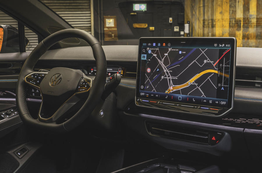
Discussing the ID 7’s new 15.0in touchscreen, which doesn't feature the physical Menu, Climate, Assist and Mode buttons present on the Volkswagen ID 3’s 10.0in unit, user experience expert Marie Puhle told Autocar: “Before we had these hardware buttons, and if you asked managers in a large company, also customers, ‘what are your personal, most wanted four buttons?’, you will always get different results. So we said, ‘let’s make them configurable [in the screen software]’. It’s much easier.”
As such, the ID 7 allows users to customise the infotainment home screen, allowing them to choose which shortcuts they have access to at all times. For example, a driver who often disables the lane-keeping assistance can choose to have the shortcut to the assistance settings menu displayed along the top bar of the infotainment screen, regardless of which sub-menu is open.
Climate control functions – such as seat heating and the automatic control setting – are always displayed along the bottom row, above the physical touch sliders for the temperature and radio volume. These sliders are now backlit while the car is on; previously they weren't, making them difficult to use in low-light conditions.
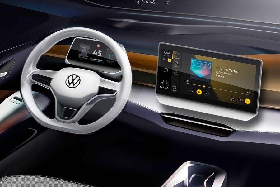
The approach of removing buttons in favour of configurable software shortcuts will be mirrored in a future update to the ID 3 facelift. This revision will bring an ID 7-style 12.9in infotainment system, previewed in official design sketches.

The accelerated timeline for the hatchback’s upgrade programme means this screen won't be production-ready in time for the model’s arrival later this year. UK buyers will therefore be left with the existing 10.0in screen, using physical shortcut buttons. The new 12.9in system is expected to arrive in mid-2024 at the earliest.


Join the debate
Add your comment
They dont learn.....nothing wrong with instinctive buttons, which can be replaced individually if they fail.
In RHD cars the controls on the 'i-pad' in the centre of the dashboard means the the predominately right handed users are having to prod around in featureless menu's with their left hand whilst being bounced around on the combination of low profile tyres vs roads more akin to tractor tracks.
It just doesnt work, it adds complexity, cost and reliance on more micro chips.