JLR has adapted its 90-year-old Jaguar brand for “the second century”, with four new design elements that are called “symbols of change” for the marque.
The British car maker last week began testing prototypes of its four-door GT model on public roads, the first of three models to launch in 2026, and plans to reveal a design prototype during December’s Miami Art Week which will set the tone for the brand’s complete electric rebirth.
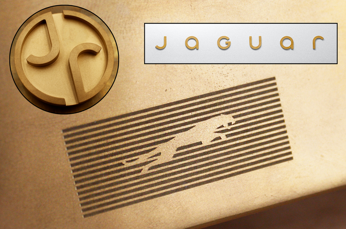
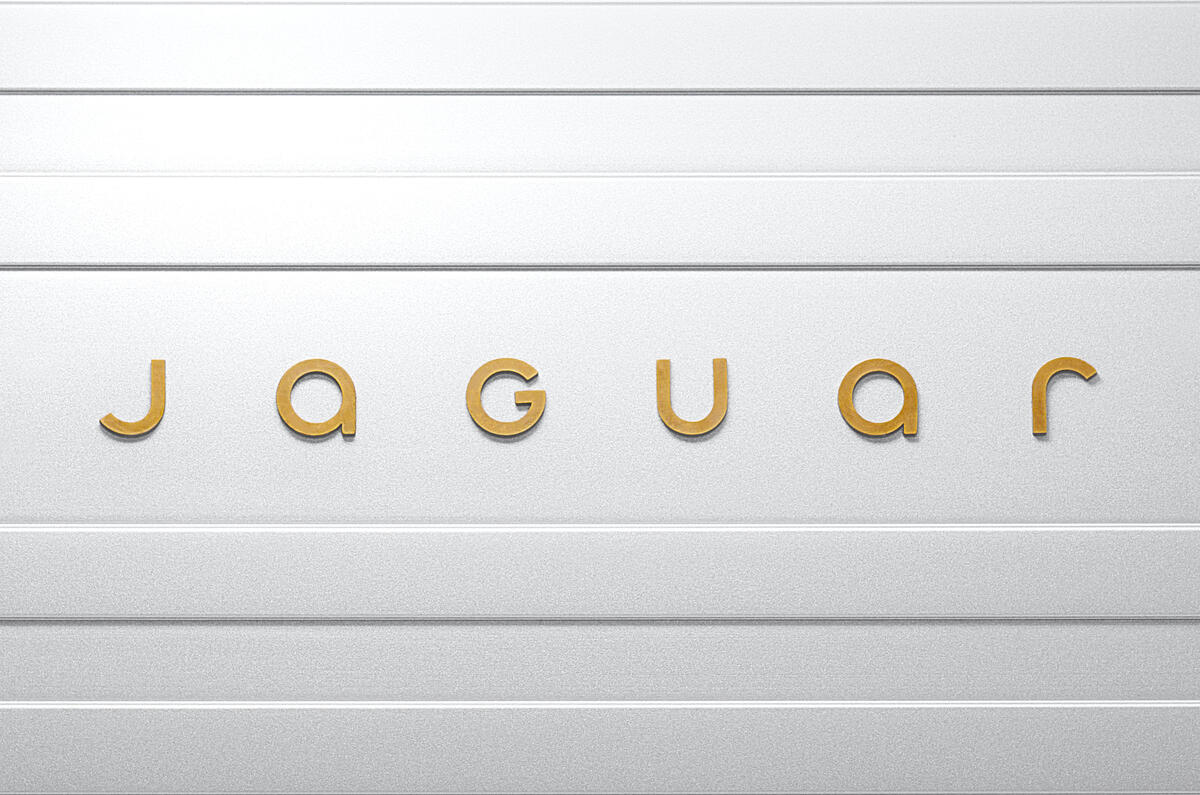
The first is a ‘Device Mark’, in effect a new font (called Exuberant) in which the word ‘Jaguar’ will be displayed.
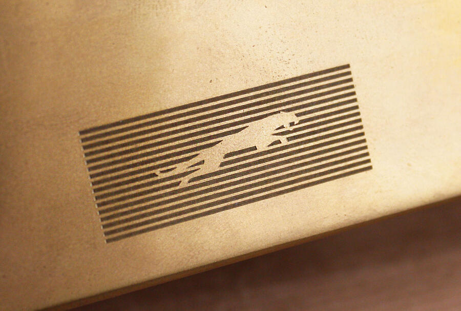
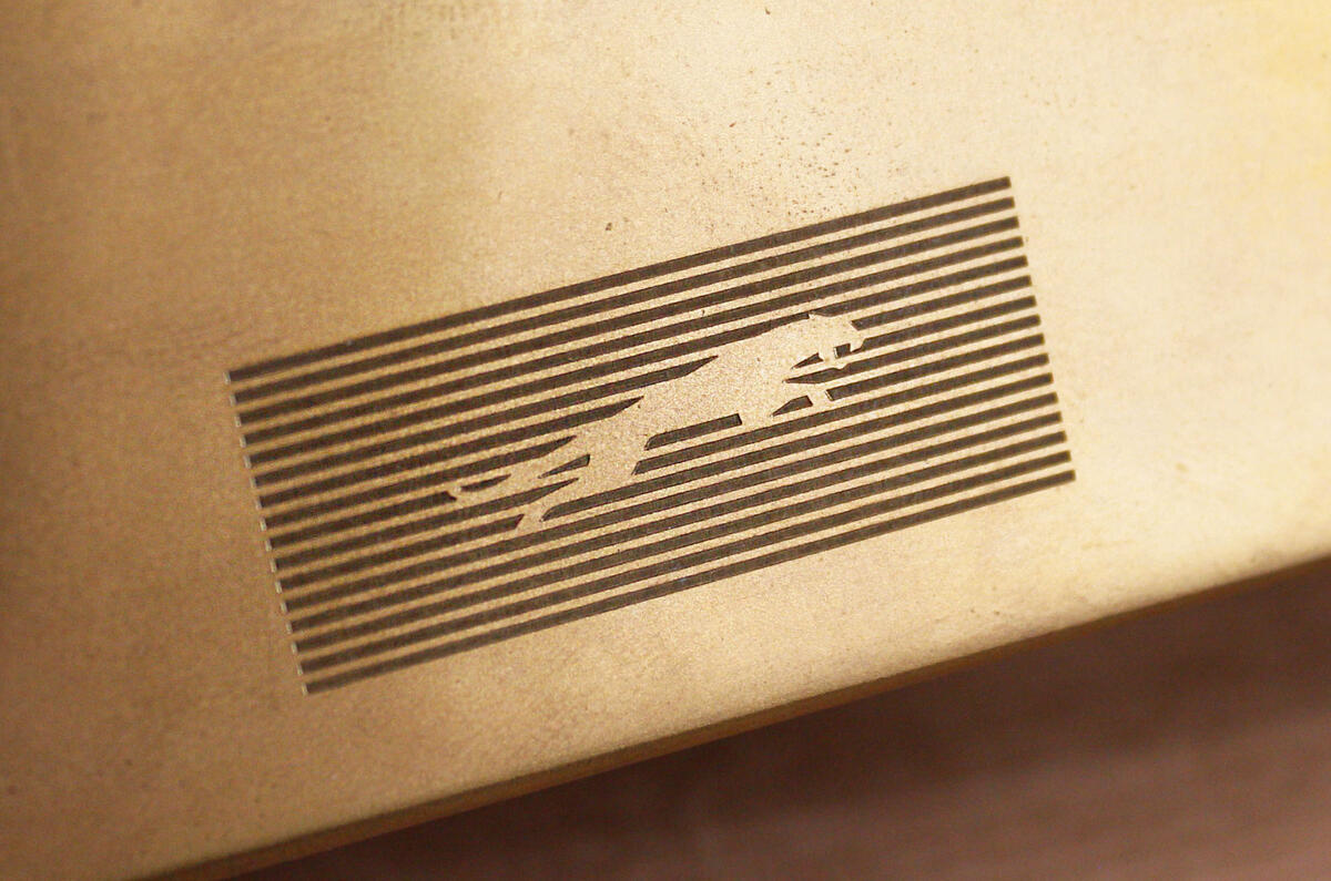
The second is a 16-bar grid of horizontal stripes called a ‘Strike Through’, which will become both a background and a “universally recognised symbol” of the new cars.
The third is a new colour palette used on the upcoming concept and intended to “present texture and movement”.
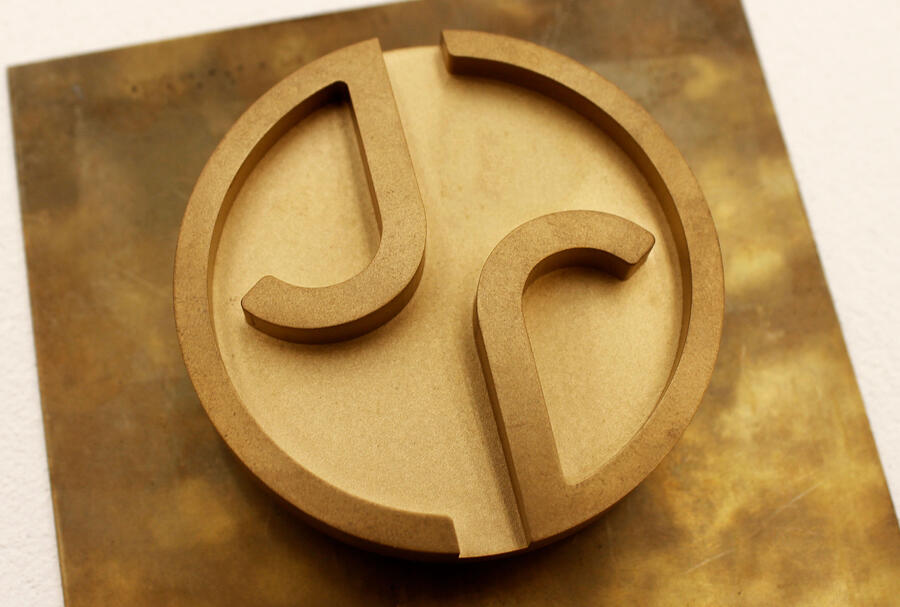
And the fourth is the ‘Maker’s Mark’, which has two elements. The first is a traditional Jaguar ‘Leaper’, now redesigned. The second is a medallion shaped “monogram” combining ‘j’ and ‘r’ in a circular surround.
“This is a reimagining that recaptures the essence of Jaguar, returning it to the values that once made it so loved, but making it relevant for a contemporary audience,” said design boss Gerry McGovern. “We are creating Jaguar for the future, restoring its status as a brand that enriches the lives of our clients and the Jaguar community.”
Speaking at an exclusive event earlier this month at the inner sanctum of JLR’s Gaydon design studio, chief commercial officer Lennard Hoornik said that if a company like Jaguar wanted to make radical changes, “first, you have to find the guts to do it”.
More generally, CEO Adrian Mardell described Jaguar’s changes as “a complete reset” and asserted that “this time, we’re going to do something spectacular.” Jaguar MD Rawdon reiterated the “fearless” remark, and said the aim was to take Jaguar “back to its natural habitat”, a move that would unashamedly take the cars to an average price point more than double the £55,000 held by the outgoing cars. He promised cars with “a visceral, emotional connection with the driver”.






Join the debate
Add your comment
Raw Dong Lover?
Really?
Death by a thousand image consultants, lol.
Bye-bye Jaguar, you had a good run.
The capital G with the rest looks wrong. Copy nothing has been forgotten. The logo font is very similar to Motorola, and the G is from Google. Are Jaguar trying to say they are now a tech company?
Yes, the G (iritatingly) sticks out like a sore thumb.
Well I hope they got a good deal from whichever consultancy helped them with this, £3.50 sounds about right.