Currently reading: New Porsche logo for firm’s 75th anniversary

Next-generation 2023 Porsche Panamera will be first to wear slightly simplified, three-dimensional badge

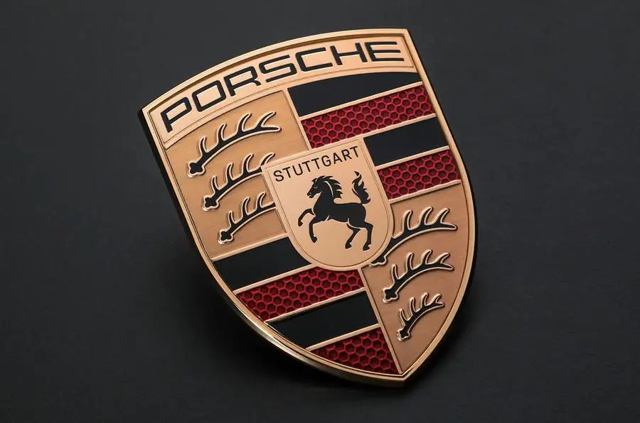
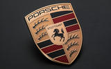
Porsche has announced a revised logo as it celebrates its 75th anniversary, with a revised design and subtle colour changes intended to “bridge the history and future of the brand”.

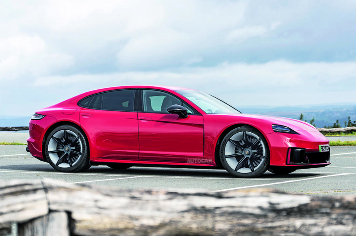
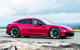
The new 2023 Porsche Panamera will be the first car to wear the German firm's new crest, with dealerships switching to the new identity around the same time. 

Porsche said the new logo was designed to be “instantly recognisable” while bridging the gap between the history and future of the brand.

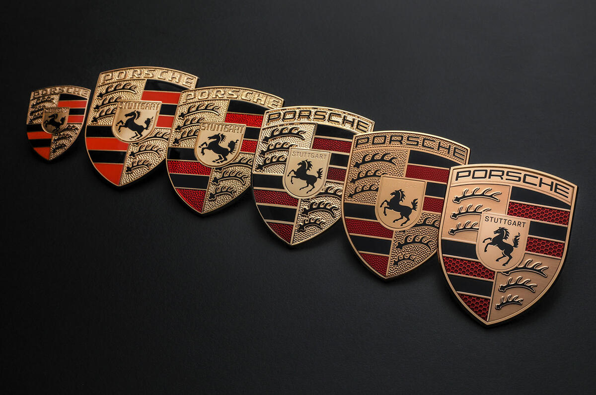
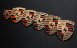
It apparently has a "more substantial silhouette" than today’s crest, which arrived in 2014 as an evolution of the emblem that Porsche has used since 1952. 

This was achieved over an "intensive" three-year design process that involved widening the top, narrowing the bottom, recessing some elements and raising some others for a more three-dimensional design. 
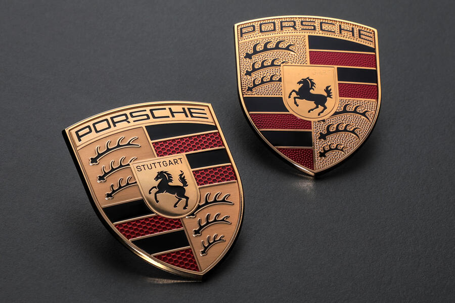
New porsche logo 1

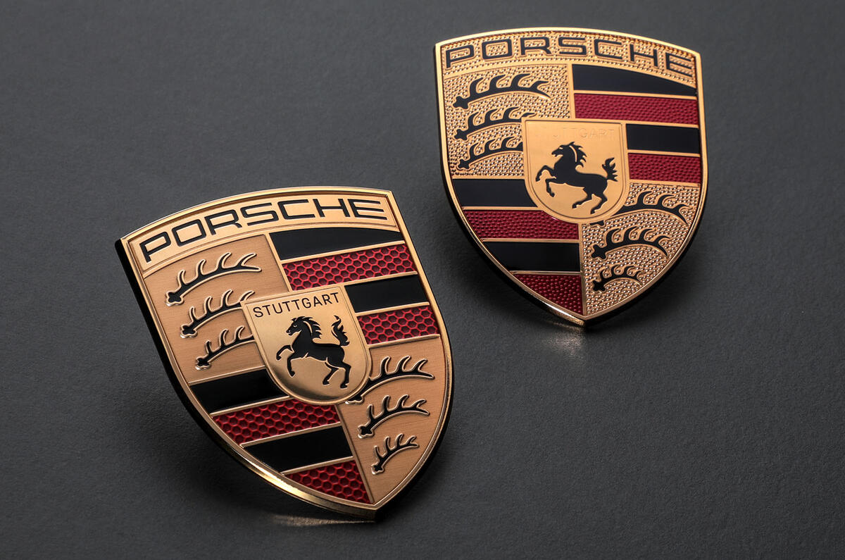
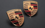
The colours employed have also been subtly changed over the old logo (pictured above right), with the gold being given a darker tinge. 

The lettering has also been updated with a simpler typeface and thinner font. Porsche says this makes it look "a lot more modern and yet still keeps a traditional touch". 

A similar approach has been made to the antlers (which are taken from the Stuttgart region's coat of arms). 

Also, the red bands now features a honeycomb structure to symbolise the lightweight construction of Porsche’s sports cars, containing subtle different shades of red to give the hexagonal shapes a 3D effect. The web of honeycomb itself is in a slightly lighter tone than the walls of the hexagons.  

The horse in the centre – which originated as Stuttgart's city mascot – has been made to look "more dynamic and more angry", with the designers trying to give it more of a "thoroughbred" appearance, while the 'Stuttgart' lettering above it has been reinstated in black.

Back to top

"When we presented the crest, there was always the desire to actually feel it and not only look at it. The effect it has, not just as a graphic but as a 3D piece, was a very strong focus," said Matthias Kulla, Porsche's director of design management for its sports car programmes. 

New porsche logo with old logos

Chief marketing officer Robert Ader said: “The Porsche crest is an unmistakable symbol and simultaneously a central element of our brand identity. For this reason, the new crest became the occasion for us to rework our corporate design.

"We will be using the crest in a more targeted way to underline emotional highlights. At the same time, the Porsche lettering will gain even greater significance.”

When asked about how much customer feedback influenced the design of the new crest, Porsche design boss Michael Mauer said: "Despite being a global brand, you should never be so arrogant not to listen to customers. On the other hand, you have to be very clear to come to a clear brand identity that is attractive and desirable but is also differentiating between other brands. It's always a combination, but at the end of the day, it's our decision and wasn't initiated by customer feedback." 

Customers with classic Porsches looking for the original version of the firm's crest can still order it.

Join our WhatsApp community and be the first to read about the latest news and reviews wowing the car world. Our community is the best, easiest and most direct place to tap into the minds of Autocar, and if you join you’ll also be treated to unique WhatsApp content. You can leave at any time after joining - check our full privacy policy here.

Jonathan Bryce

Jonathan Bryce
Title: Social Media Executive

Jonathan is Autocar's social media executive. He has held this position since December 2024, having previously studied at the University of Glasgow before moving to London to become an editorial apprentice and pursue a career in motoring journalism. 

His role at work involves running all of Autocar's social media channels, including X, Facebook, Instagram, TikTok, YouTube Shorts, LinkedIn and WhatsApp. 

Join the debate

Comments
4
Add a comment…
LP in Brighton 1 June 2023
How many million Deutschmarks were wasted on this? In all honesty nobody except car badge designers are going to notice the difference. Quite apart from which a Porsche simply does not need a badge, we all know what one looks like.
Rods 1 June 2023

It's interesting that Porsche are bucking the trend here, and have gone for an even more 3D logo. Most other manufacturers who have updated their logos recently have moved to flat, 2D "digital first" logos (VW, Nissan, MINI, BMW, Audi, etc. ). They can be a bit 'soulless' though. I won't be surprised when I see those slowly revert to 3D logos when the manufacturers do their respective brand refreshes in the coming years and proclaim that they want to "get back to our roots" lol.


Filippouy 1 June 2023

What is interesting is that this inconsequential update has taken three intensive years, one sizeable article by Autocar and a similarly sizeable comment.

Marketing guys tapping each other's shoulders indeed.

Boris9119 1 June 2023

Agreed, three years, intensive?? Wish they had spent those resources on building more GT4RS etc so that we could actually order one!