Currently reading: Analysis: Are touchscreens a good thing?

Safety concerns about in-car touchscreens are giving rise to new developments

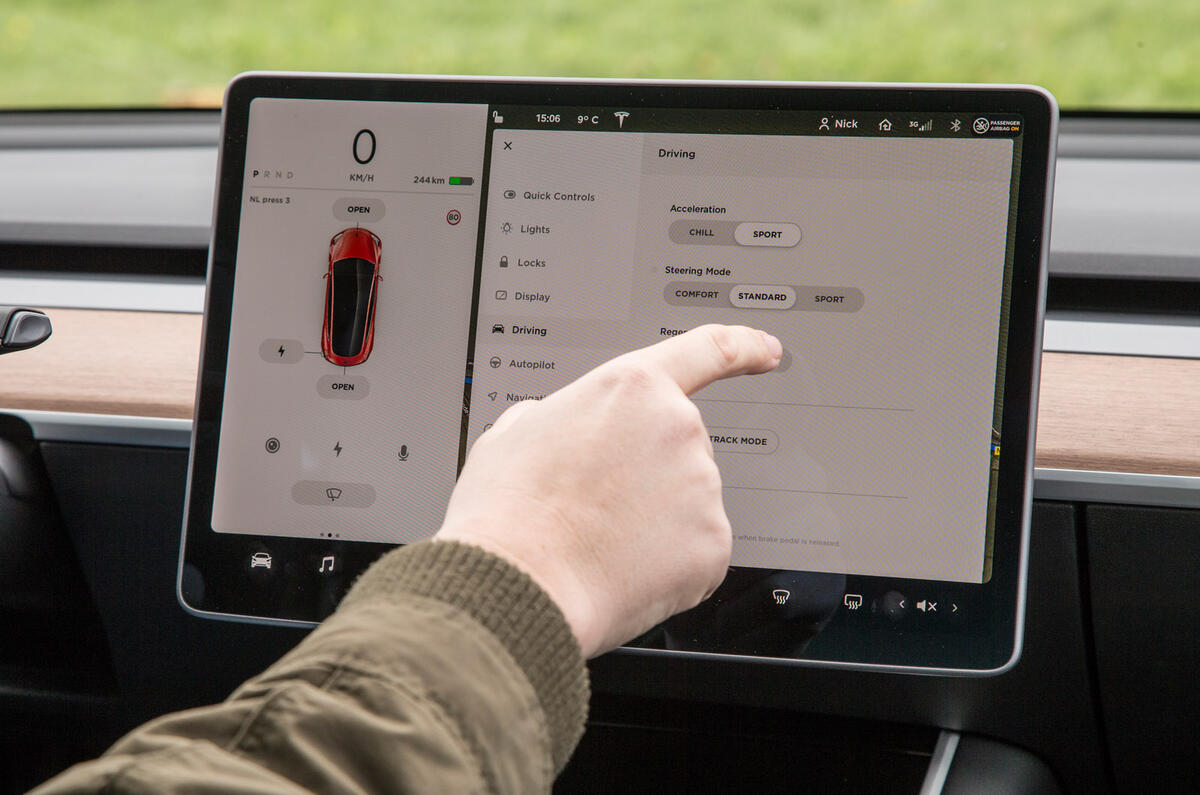
It’s hard to find a new car with a dashboard that isn’t dominated by a large infotainment touchscreen – increasingly at the expense of physical buttons and dials. Tesla may still be the most extreme proponent, but the trend is reflected across the whole industry.

The growing size of touchscreens is linked directly to their increasing use in all aspects of society. Melanie Limmer, the electronics boss for the new Audi A3, said the decision to remove some physical buttons from that car was because “more and more people are getting into touch functions with smartphones”.

Although many car infotainment screens retain physical controls as well, an increasing number don’t – and the rise of touchscreen-only interfaces has led to questions about how safe they are. There are concerns that large screens can cause a distraction and that, without the tactile response of a physical button to assure users they’ve selected the right option, drivers are more inclined to look away from the road to operate them.

Still, the growth in the size of touchscreens is a boost for safety, according to Matthew Avery, director of research at leading UK automotive safety body Thatcham Research.

3 Volvo touchscreen

“Large infotainment screens are not necessarily an issue, because they allow for bigger icons and less crowded displays,” he said. “Small screens with fiddly icons are a greater concern.”

Avery also said the latency of such systems is crucial: “Screens must be as responsive to touch as you would expect a smartphone to be. Clarity and user interface commonality across vehicles is also fundamental, allowing drivers to more instantly recognise the icon they intend to press.”

Avery cites the Apple CarPlay and Android Auto smartphone mirroring systems as key to that, because they work the same across every model of car. They also replace any need for drivers to use smartphones while driving.

The government is currently working to close loopholes that have enabled some drivers to escape penalties for using smartphones for functions other than making phone calls while driving. But some of the same concerns about such distractions could apply to touchscreens. Highways England boss Jim O’Sullivan has said: “We don’t like them from a safety perspective.”

Advertisement

Read our review

Car review

The new Honda Jazz is bigger than ever thanks to a new chassis and longer wheelbase, but does it come with a more engaging drive

Back to top

But touchscreens in cars and smartphones aren’t directly comparable, of course. When considering further limitations on mobile phone usage while driving, the Transport Select Committee ruled out banning hands-free calls. That was despite research suggesting the risks were largely down to the cognitive demands they place on a driver “engaging with someone who is not in their shared environment” rather than the actual operation of the smartphone.

2 Audi a3 interior

For those involved in touchscreen development, the systems aren’t just styled on smartphones: they’re a way of supplementing them.

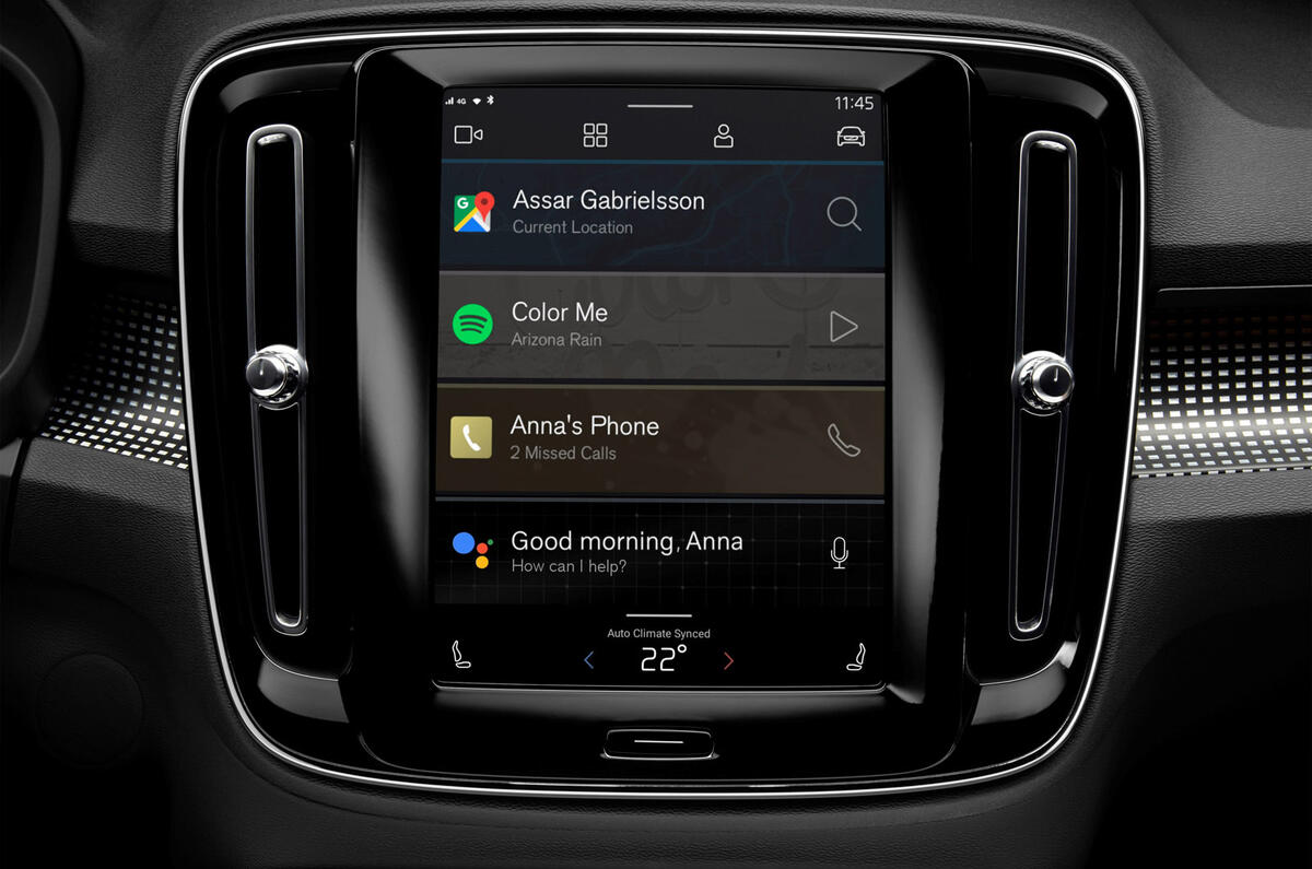
“Safety comes in many forms,” said Google’s Harris Ramis, who works on the new Android-based touchscreen operating system, a version of which will be used in all future Volvo and Polestar models. “Today, people pull out their phones and use them while driving anyway, so when we started thinking about safety, we did so from the perspective of ensuring they have access to the services they want that are built for in-car use, to ensure they leave their phones where they need to be.”

Ramis referred to that approach as “driver distraction optimised”. Effectively, this is recognising that people want to use the phone system or music services on their smartphones and finding ways to offer that as safely as possible via a car’s infotainment system. “We spent a lot of time working to ensure the system is built for use while driving, so it doesn’t distract,” said Ramis.

Back to top

To ensure that, the new Volvo Android system – which will be seen first on the forthcoming XC40 Recharge P8 EV – is a fixed template design, with the basic controls required to be in the same place across all apps, ensuring user familiarity. That applies even to the ‘third-party’ apps that will be offered on Android systems.

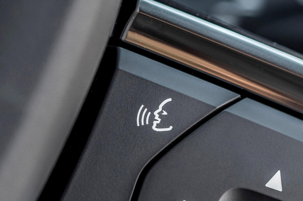
Another key function offered by the new Volvo system is voice control, the increasing use of which could remove the need to use a touchscreen or any physical controls. Voice control has been widely in use across car brands for years, with the Volkswagen Group, Mercedes-Benz and BMW all offering their own versions.

Ödgärd Andersson, Volvo’s digital boss, said: “Voice commands make total sense when you’re driving.” Thatcham’s Avery agreed: “It brings clear benefits in keeping the driver’s eyes on the road.”

But he also said: “Functions like this are often built in some years ahead of a model hitting the road and are therefore behind the development curve of [Apple] Siri or [Amazon] Alexa. Where the voice control fails to recognise what the driver is saying, the safety benefits are lost.”

Andersson said that having access to Google Assistant voice control is “a key thing we’re very excited about” with the partnership.

The Google system is being continually developed based on real-world feedback from its use in other smartphone and electronics functions and works with multiple languages and accents. Andersson claimed that “it’s well above anything that’s in any car right now”. She added: “It enables you to speak in a much more natural way, which is a safety feature from our perspective.”

1 Voice control

Back to top

The hope is that such improvements might win over people yet to be convinced by voice control. But it’s also about choice: giving drivers multiple ways to control a car so they can use whichever is the most comfortable to them – which will likely be the safest.

It’s clear from looking inside any concept car that, like them or not, touchscreens are increasingly going to dominate car controls. It reflects demand. The key is ensuring technology developments make them ever safer.

READ MORE

Honda bucks industry trend by removing touchscreen controls 

Under the skin: How haptics are making touchscreens safer 

Opinion: New Taycan interior shows off Porsche's heavy touch

James Attwood

James Attwood, digital editor
Title: Acting magazine editor

James is Autocar's acting magazine editor. Having served in that role since June 2023, he is in charge of the day-to-day running of the world's oldest car magazine, and regularly interviews some of the biggest names in the industry to secure news and features, such as his world exclusive look into production of Volkswagen currywurst. Really.

Before first joining Autocar in 2017, James spent more than a decade in motorsport journalist, working on Autosport, autosport.com, F1 Racing and Motorsport News, covering everything from club rallying to top-level international events. He also spent 18 months running Move Electric, Haymarket's e-mobility title, where he developed knowledge of the e-bike and e-scooter markets. 

Join the debate

Comments
13
Add a comment…
233kosta 14 September 2020

I mean sure, but...

Touchscreens are the best interface we have for things you should do when stationary, such as changing music sources (i.e. spotify playlist) or setting up your maps destination, etc.

What touchscreens are absolytely ABYSMAL at are things you might need to do while the car is moving. Changing the AC temperature for example, or turning down/switching off the radio, the new Teslas even have most of their WIPER CONTROLS on the f-cking touchscreen! This is ridiculous and needs to end. Buttons and knobs engage more than one of your senses and as such can be operated through touch alone. THIS IS A HUGE ADVANTAGE WHEN YOU NEED TO KEEP YOUR EYES ON THE ROAD!!! Did none of these people ever consider the safety aspects of that?

Oh, and the few buttons that are left? They're as good as useless on many cars! I drove a 2019 1-series for a day and its AC controls consisted of a row of switches that all look and feel the same! In contrast, my old Toyota might not have dual zone climate control, but I can feel and operate every single control without looking and without second guessing whether I'm pressing the right button. THAT is good design and it's what's missing from new cars.

Put it this way - there's a very good reason why most controls on ships and aircraft STILL have switches. Both of these industries have had the financial and technological backing to move to touchscreens since probably the '80s and they haven't. There's a very good reason for that!

Speedraser 17 April 2020

Stupid and dangerous

Autocar, you say about touchscreens, "drivers are more inclined to look away from the road to operate them." Inclined??? Can you really not come out and say it straight? A touchscreen requires the user to look at it -- and therefore NOT look at the road. It's fundamentally stupid -- and dangerous -- in a moving vehicle. Marketing trumps safety. Period.

gavsmit 17 April 2020

Distracting, confusing, unreliable, expensive, time consuming...

....and unnecessary. I want to drive a car, not be forced to use a computer as well as trying to drive at the same time - I'm forced to do that for everything else I do, from cooking my dinner to watching the TV.

Unwanted / intrusive / insecure / unreliable tech is driving me insane!