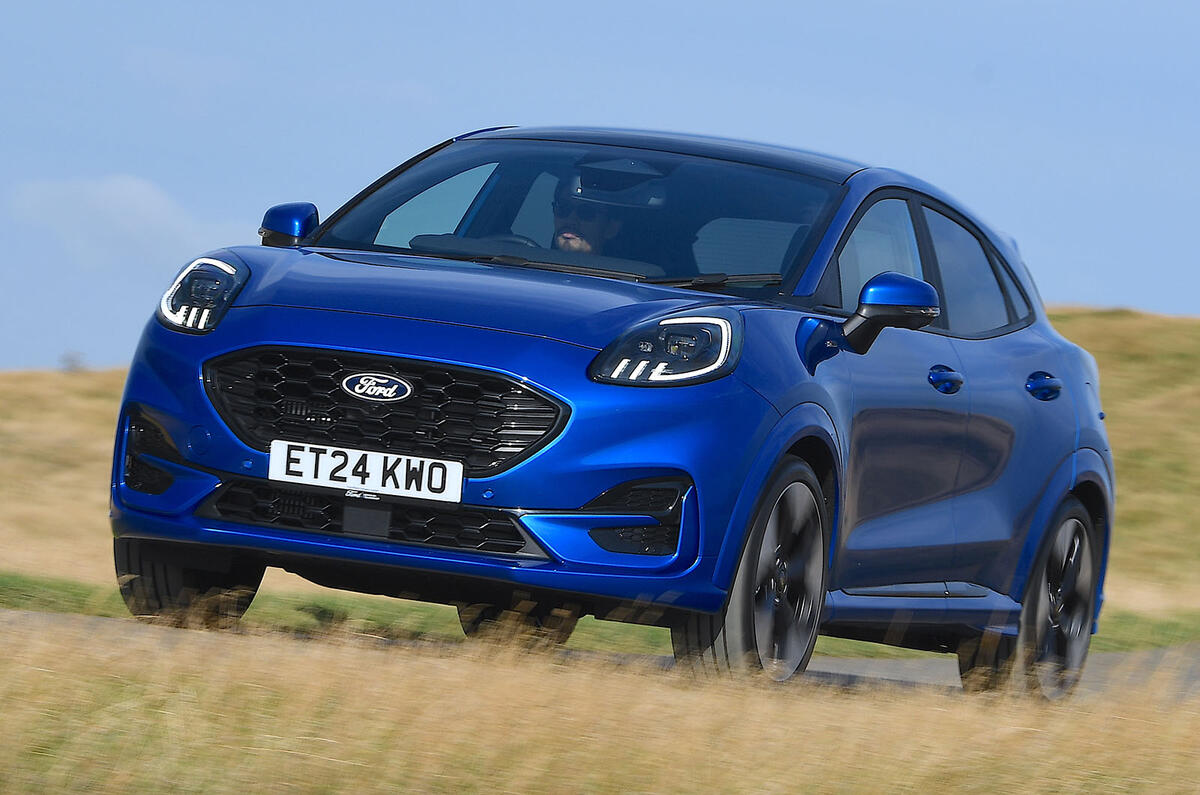
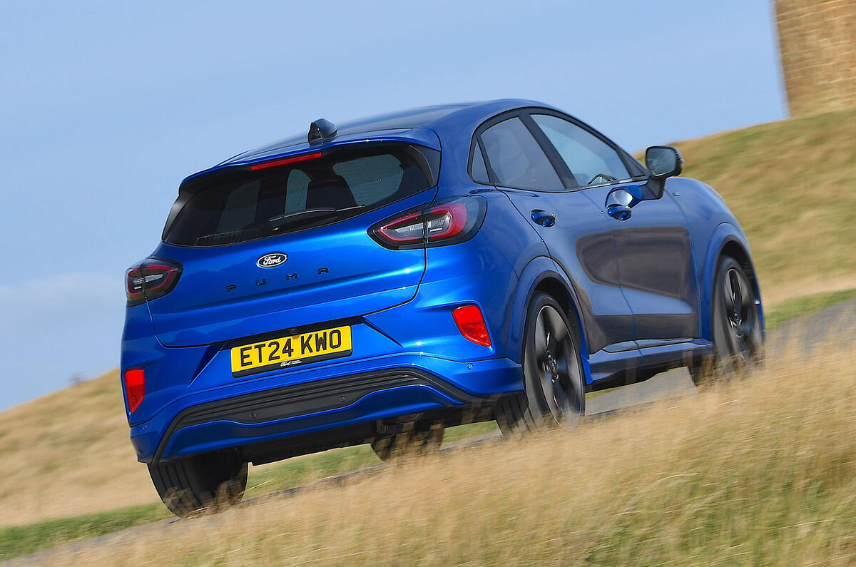
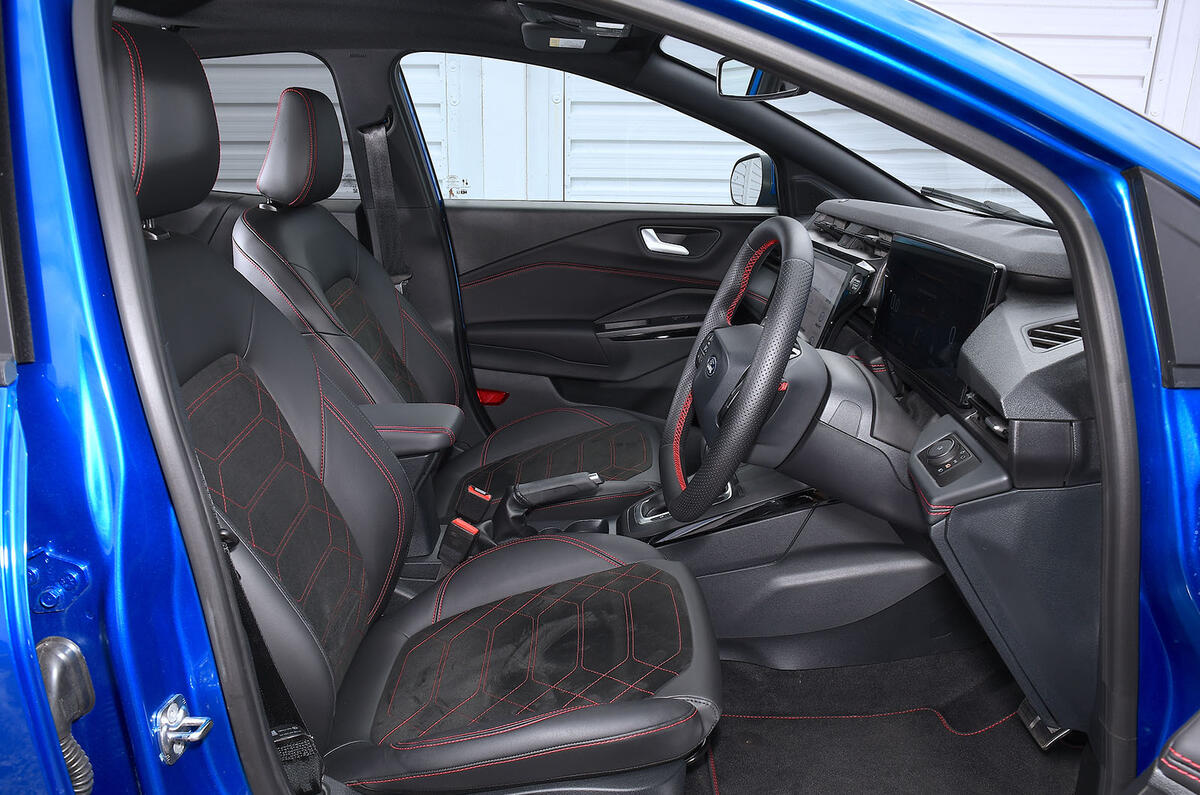
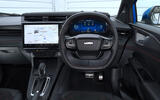
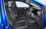
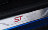
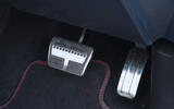
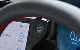
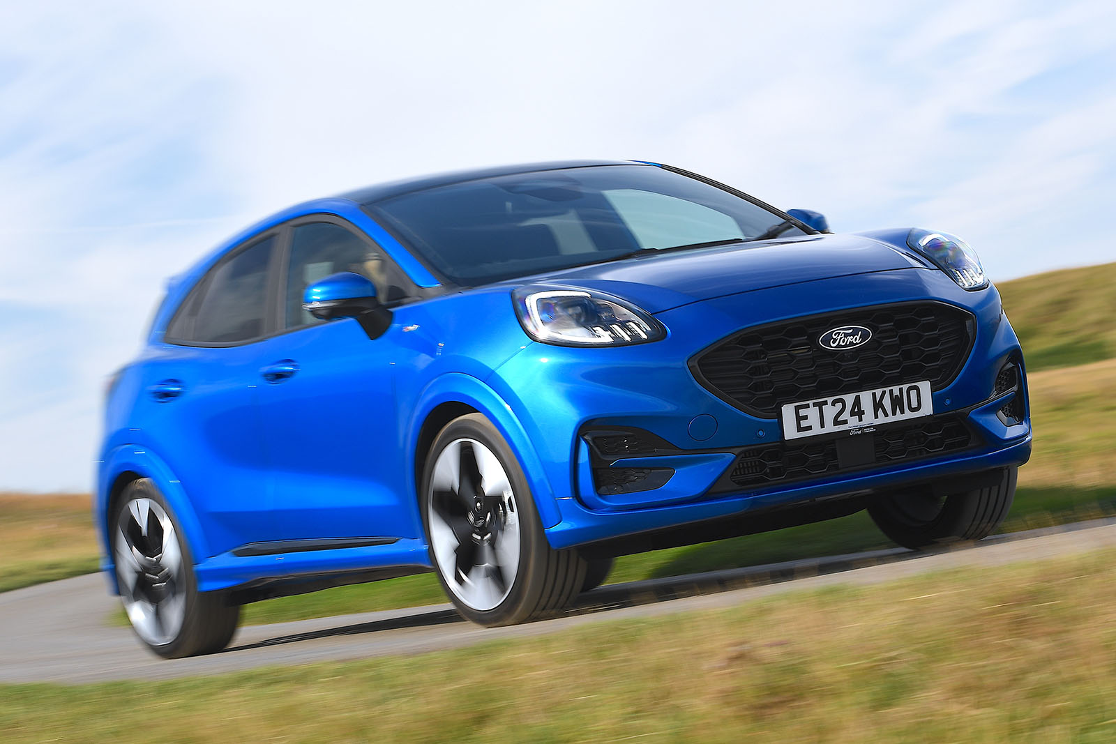
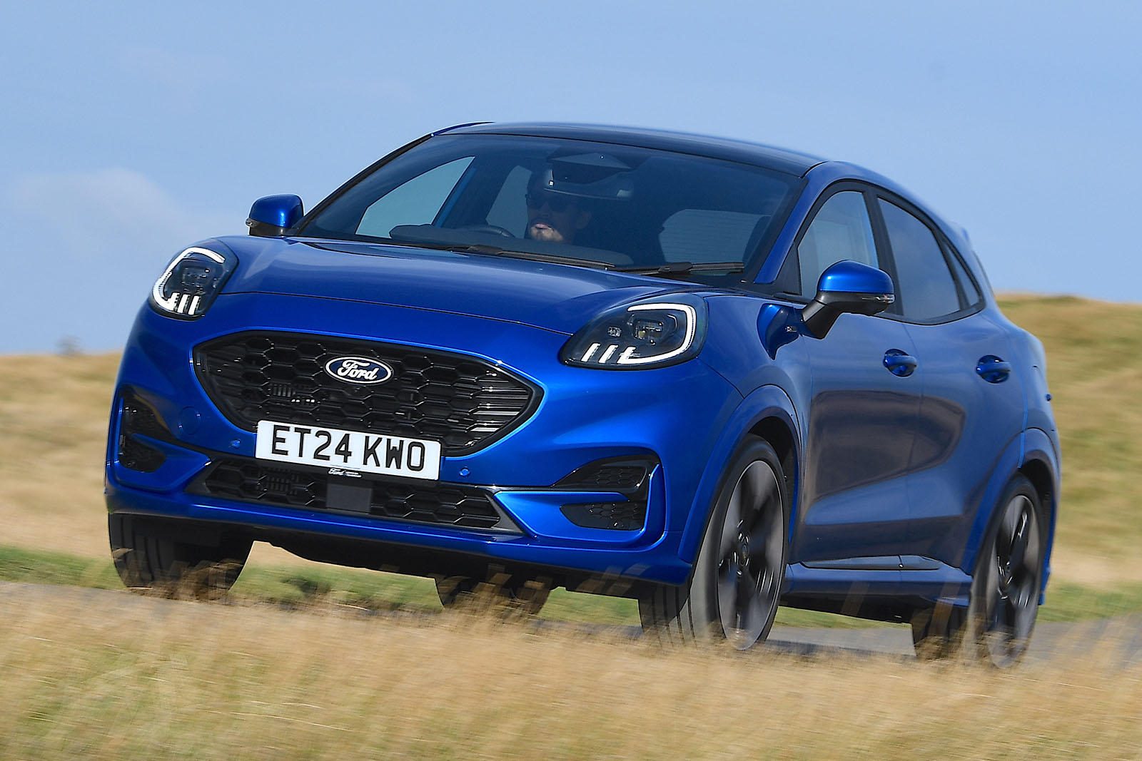
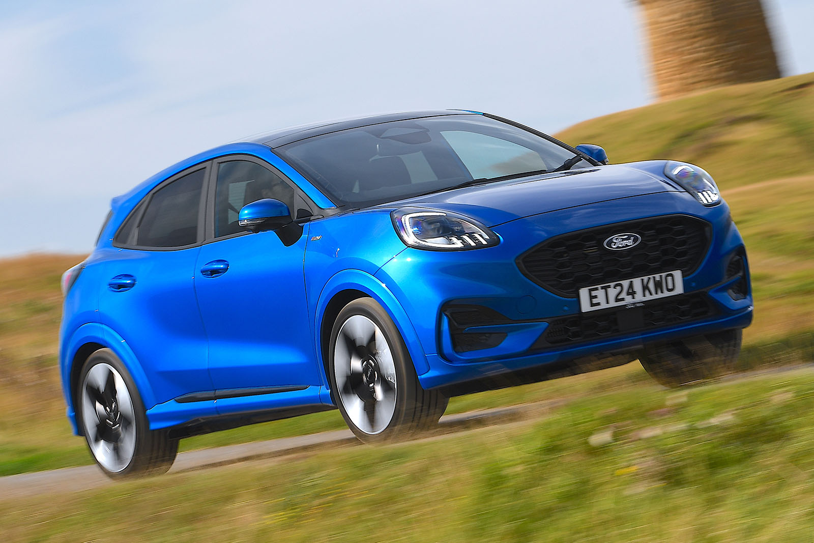
It is clear that most of the Puma's development budget has gone to its interior.
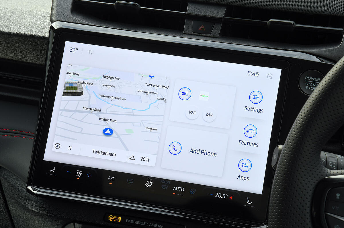
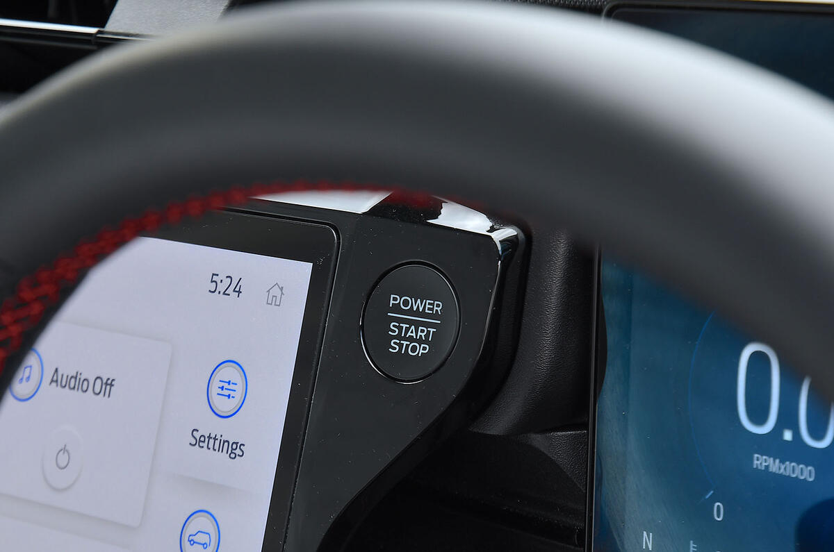
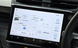
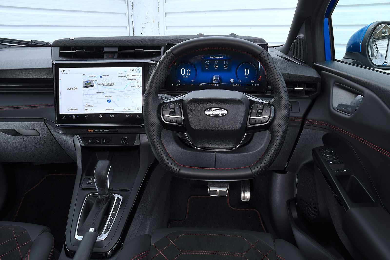
Ford has thoroughly rethought the design and upgraded the technology with a new 'floating' 12.0in infotainment touchscreen running Ford's latest software, SYNC4, together with a 12.8in instrument cluster and wireless charging, both of which are standard across the range. Ford says these systems have “twice the computing power” of the previous car’s, with over-the-air updates, built-in Amazon Alexa and 5G connectivity.
In keeping with the times, the buttons for the climate control and heated seats have now been integrated into the touchscreen, which has come as part of a move to reduce the number of physical switches for a “cleaner design”. The small size of the touchscreen icons mean it would be more convenient to have kept them as physical switches, but you eventually get used to their placement.
The Puma’s interior still doesn't have the most eye-catching design and material quality has taken a noticeable step down. The pre-facelift car had clearly been built down to a price, but now it seems Ford is simply seeing what it can get away with. The materials atop the dashboard, the door cards, the glovebox and surrounding the centre console feel nasty, and the infotainment screen’s bezel flexes at even the lightest touch.
Another gripe we had was that the right-hand stalk that previously controlled the windscreen wipers has been removed, leaving an ugly black cover where it used to be and the left-hand indicator stalk with too much to do. What's more, the new steering wheel does not include paddle shifters on automatic versions, which means you can no longer change gear yourself; strange for a sporting crossover.
The saving grace is that the major touch points such as the steering wheel, gear lever, vent adjusters, and combined indicator/windscreen wiper stalk feel of a decent quality.
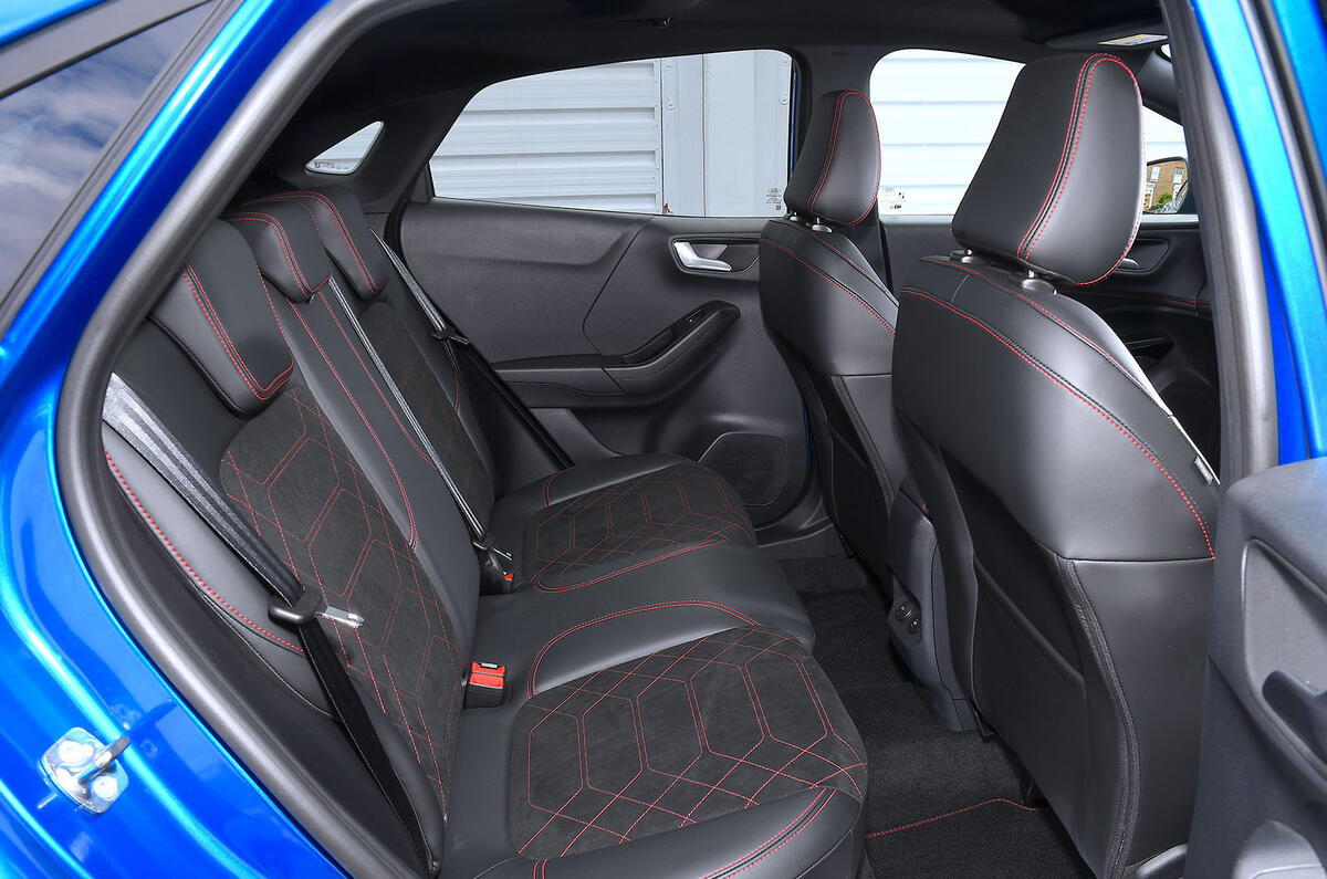
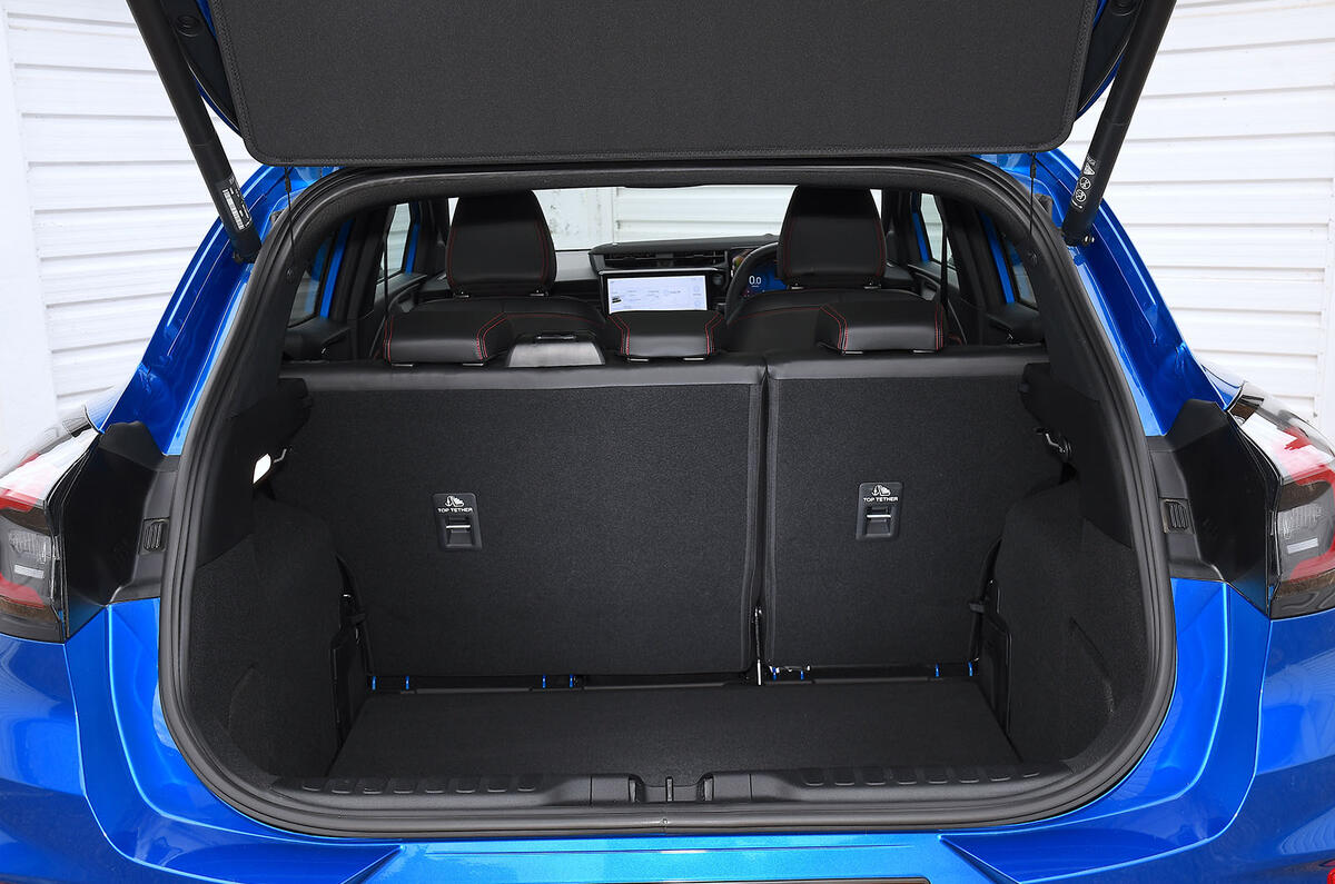
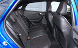
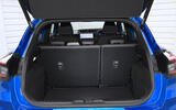
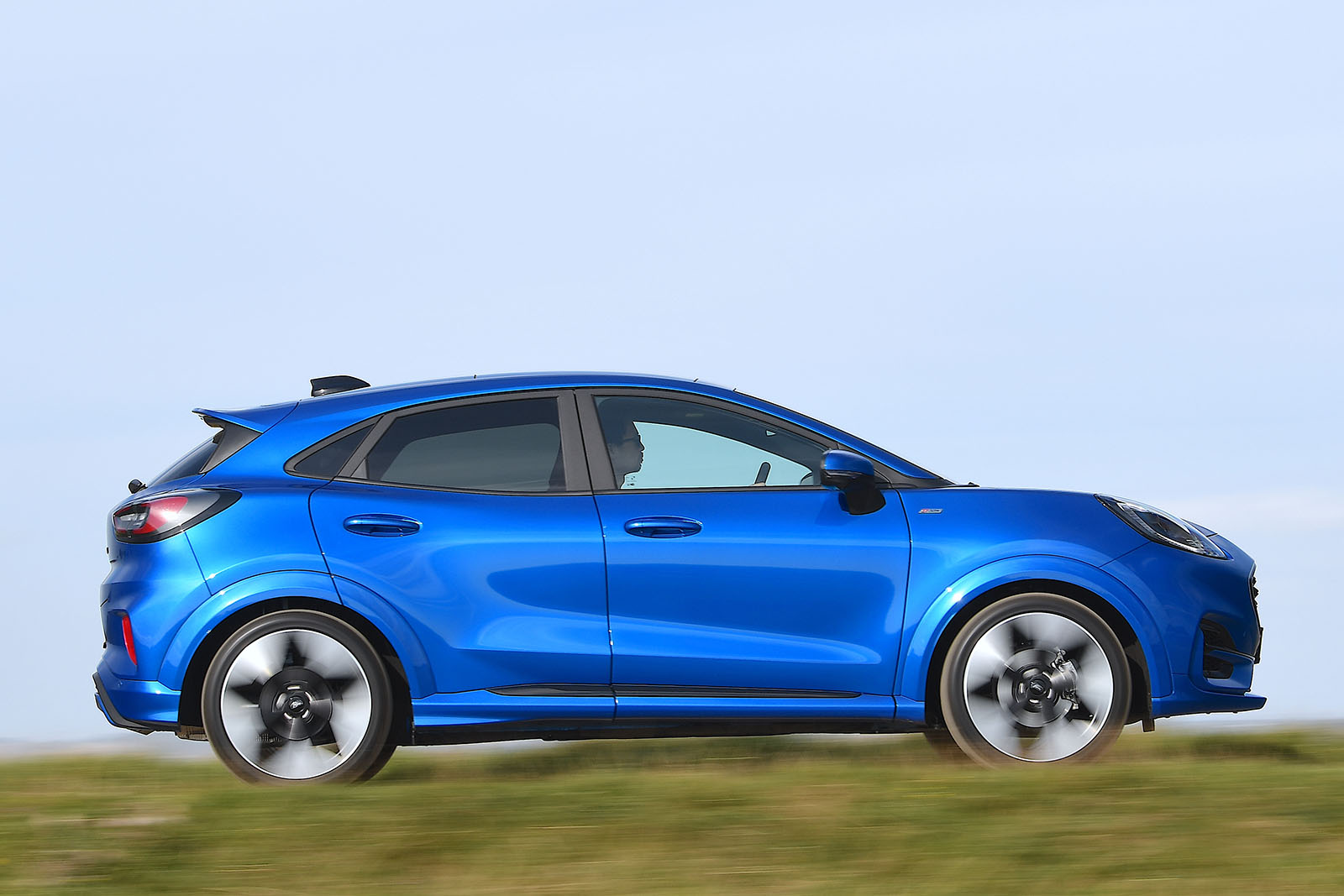
Elsewhere, you get a 456-litre boot that is competitive with the T-Cross (455 litres) and Lexus LBX (402 litres), and space in the rear row is acceptable for those under six foot, but the car’s sloping roofline means those over it will struggle for headroom.
Up front, however, there is much more practicality and adjustment on offer. There’s a wide range of adjustability in the steering column and seat base, which affords you the opportunity to sit in a marginally lower, slightly more immersive driving position than you’ll find in many of its rivals. Given the Puma’s heightened focus on energetic driver appeal, this flexibility is welcome.
Ford Puma multimedia
All Ford Pumas sold in the UK have Ford’s Sync4 infotainment system as standard. This comprises an 12.0in touchscreen that’s used to operate effectively all of the suite’s main features, which include sat-nav, DAB radio, Apple CarPlay and Android Auto.
Its responsiveness is excellent and it offers clear graphical sophistication, even in comparison to its Volkswagen Group rivals. The HVAC buttons have been moved to run along the bottom edge of the screen, although physical buttons around the display’s border would still be preferable.
FordConnect comes as standard across the range, too, adding a WiFi hotspot with connectivity for up to 10 devices. Meanwhile, the FordPass mobile app includes handy features such as a vehicle locator and vehicle status checker, so you can verify the fuel level and oil status remotely, and unlock the doors as well.


