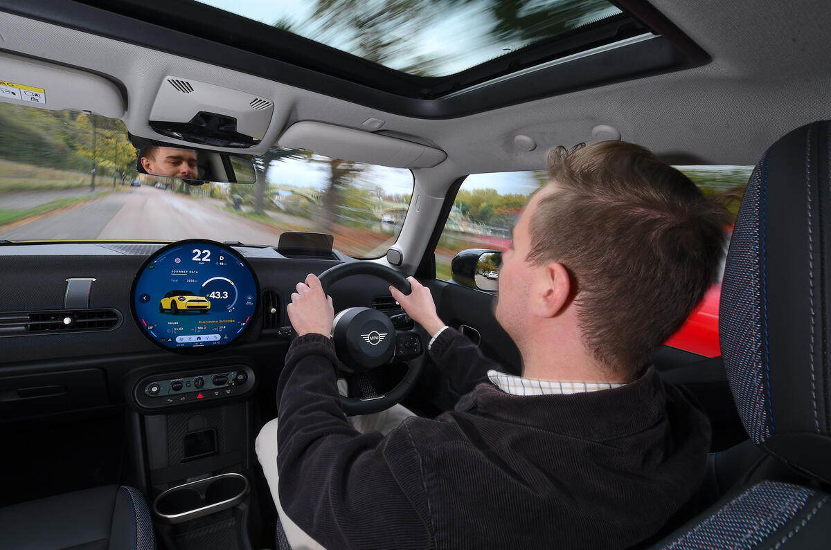
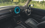
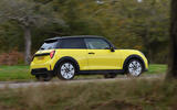
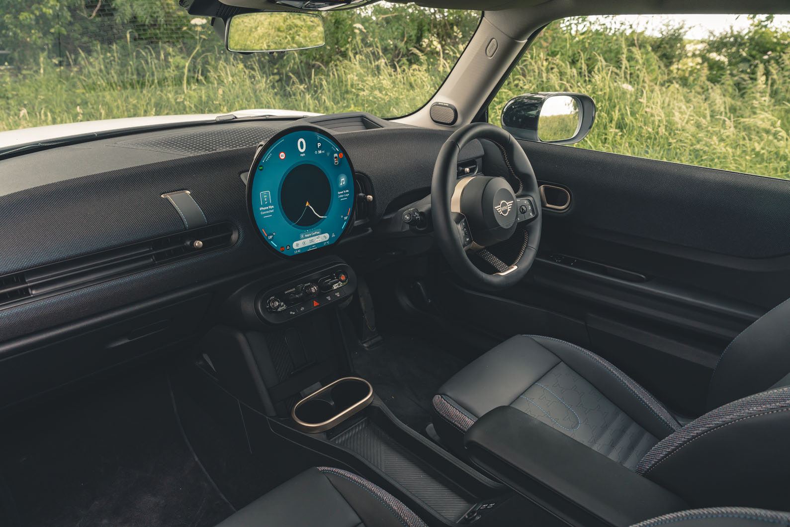
If the exterior design of the Cooper takes out some of the busy ornamentation of previous generations, the interior takes it to the extreme, but thankfully the application of minimalism has been done with more of a sense of design, style and warmth than in Teslas.
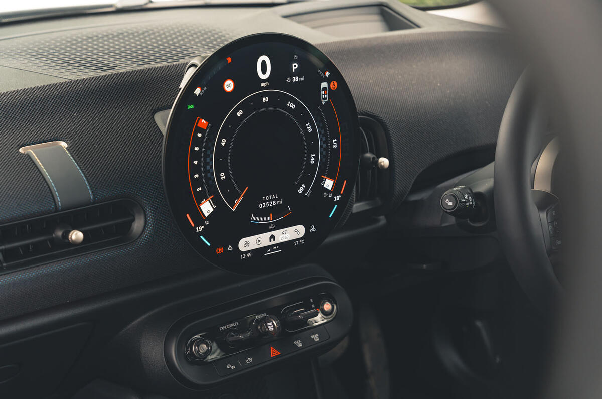
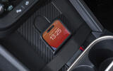
Like in the Mini Countryman SUV, the controls and instrumentation have been reduced to a large, round touchscreen and a small panel of buttons and switches underneath. Despite how modern it is, the modern Mini’s interior has never referenced the original Issigonis Mini quite so strongly.
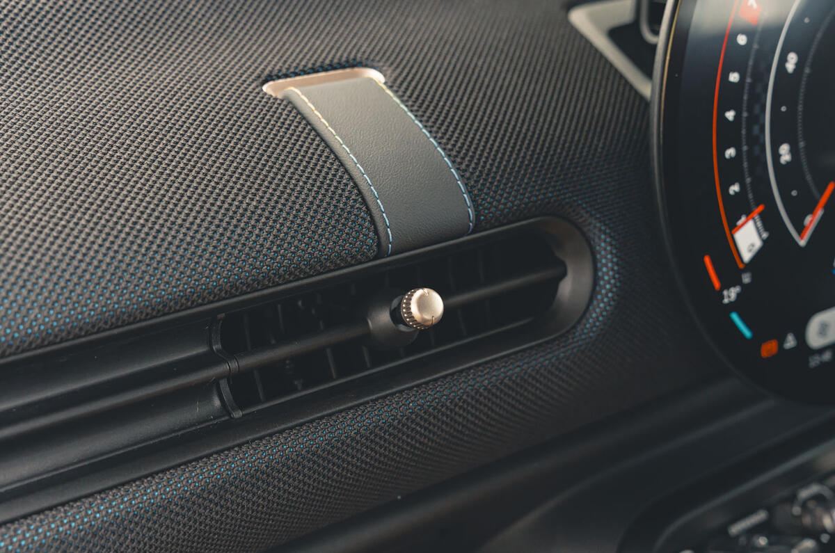
Mini has used a knitted fabric on the dashboard and the doors that provides a bit of plushness and tactility. It’s much more interesting than the screen-on-a-plank approach that Tesla espouses. There are plenty of other fun details, like the strap that forms the steering wheel’s lower spoke or the denim-and-houndstooth upholstery.
Of course, this screen-dominant layout has quite a profound effect on usability. Apart from a handful of shortcut buttons, the screen has absorbed nearly every function, including that of the gauge cluster.
Particularly the lack of a gauge cluster in front of the driver has proven divisive. Some testers found this problematic, others weren’t too bothered and even liked the clear view out. It’s worth remembering that Mini has form with this: the first and second generations of the BMW-era Mini had the speedometer in the centre, like the original Mini of 1959.
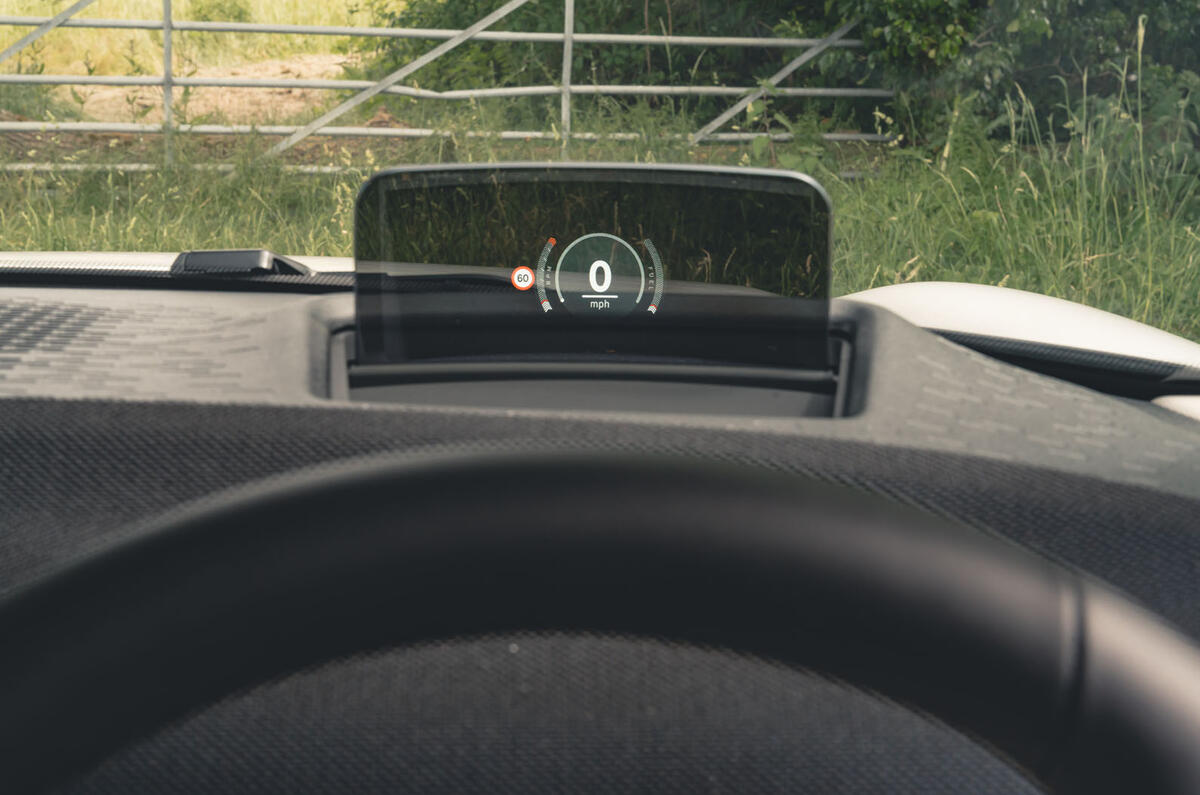
The Level 1 option package includes a head-up display, although it's of the cheaper type, where the information is projected onto a little screen.

In any case, things do get quite busy on the centre screen, and it’s absurd that you need to be in Go-Kart mode (Mini’s term for sport mode) to have a tachometer at all, and if you want one with numbers on it, you need to open the speedometer app on the infotainment. ‘Speedometer app’ is not a collection of words that should be required in a car review, but here we are.
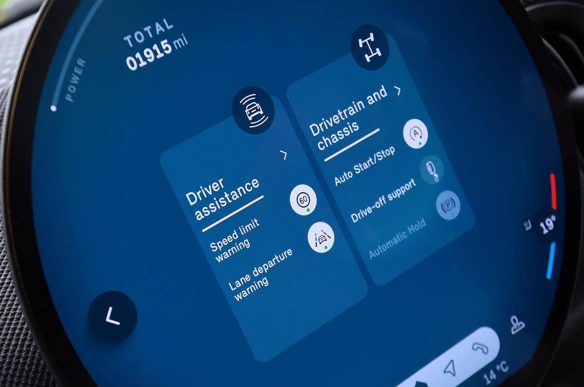
The general infotainment interface is typical of current-gen BMWs in that it’s incredibly convoluted, with overloaded and overly deep menu structures that tend to put functions in places you wouldn’t expect to find them. Familiarity helps, but you still find yourself doing far more tapping and swiping than even with the touchscreen-intensive systems from Mercedes-Benz and Renault.
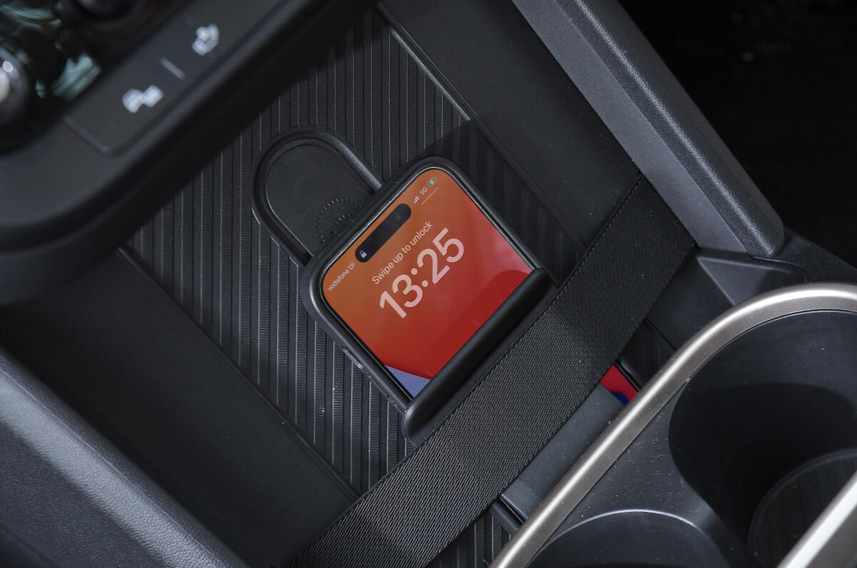
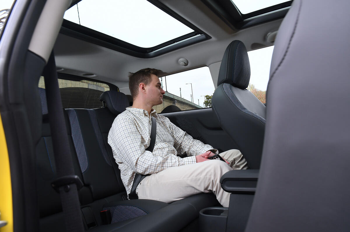
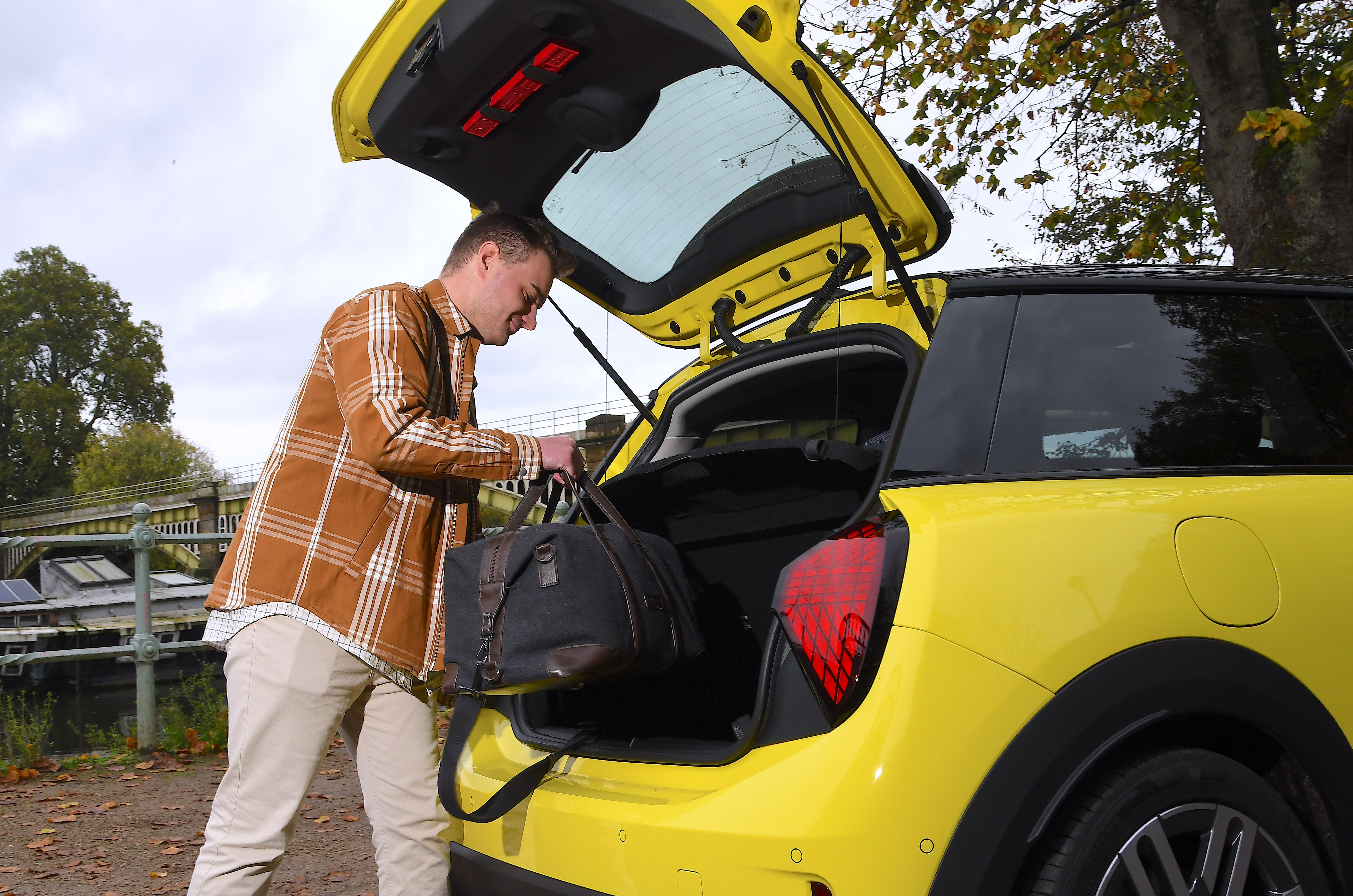
Oddment storage space is reasonable, but if you’re looking for a car with a lot of rear passenger space or boot space, a 21st-century three-door Mini has never been and will never be the car for you. For two people and their luggage or an occasional rear passenger, though, it’s more than adequate. The boot is surprisingly deep and comes with a variable-height floor.
As before, you sit very low for a B-segment hatchback, and there is a lot of adjustment in the steering column. Because this is a three-door car, getting in the front is very easy too, and the B-pillar is very far back.
We will end our look at the hatch on a niggle, though, because the seats have lost their adjustable cushion tilt and length and their adjustable lumbar support, which makes them slightly less comfortable than in the old Mini.
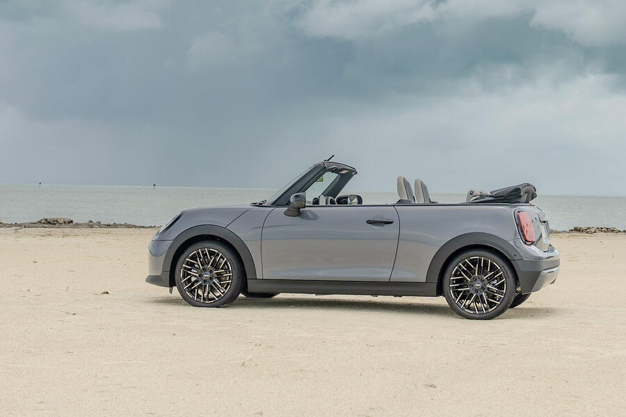
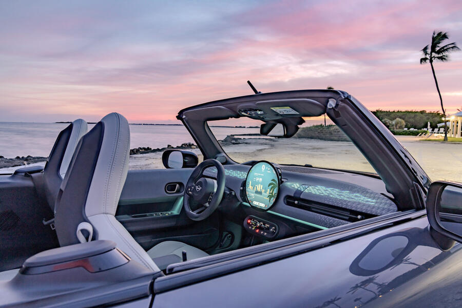
The shape of the Convertible's folding roof means that rear passengers actually get a touch more room than in the standard hatch when it’s in place, although clambering in and out certainly isn’t graceful and you wouldn’t want to be back there for an extended period. With the roof up the boot is a reasonable size, although you won't get that much in once it'slowered.
When the roof is down, visibility is predictably improved, and thanks to the rear wind deflector, it’s reasonably well sheltered.


