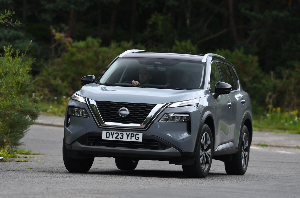
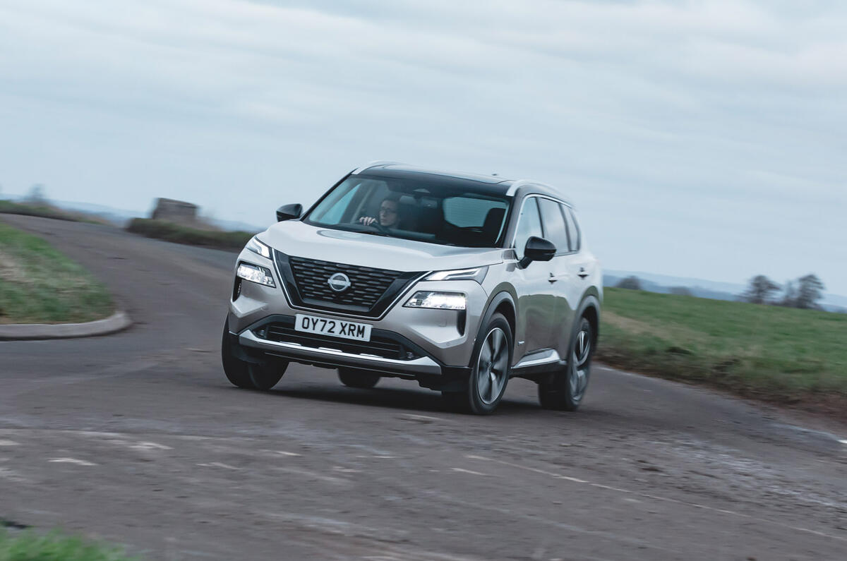
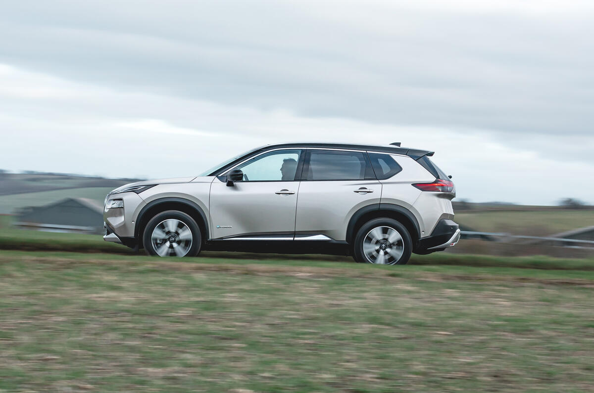
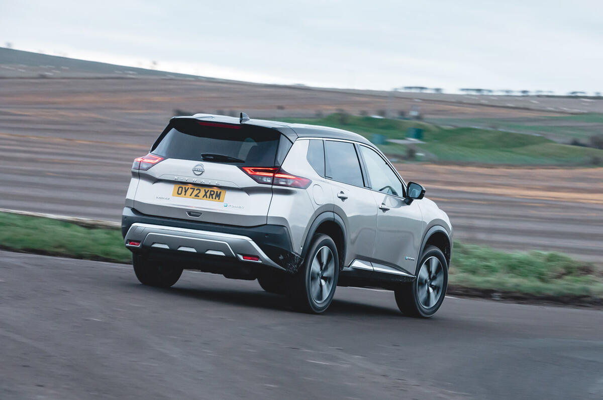
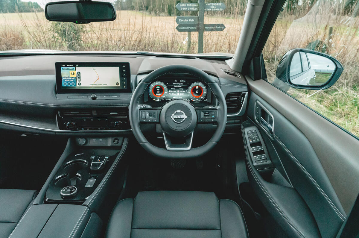
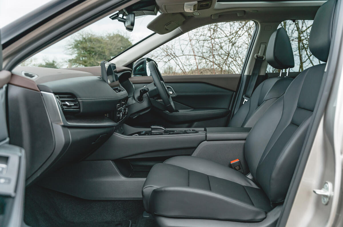
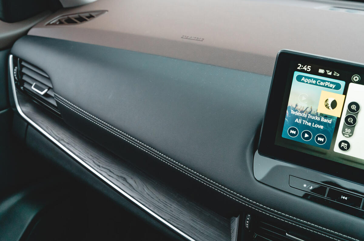
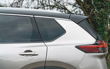
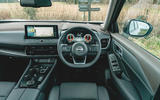
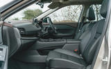
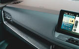
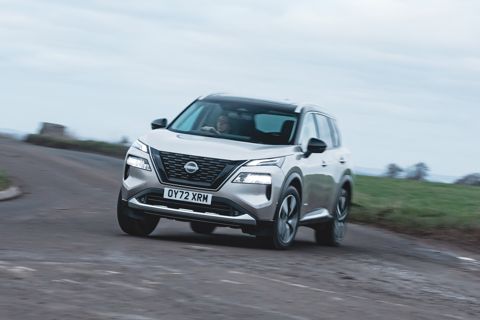
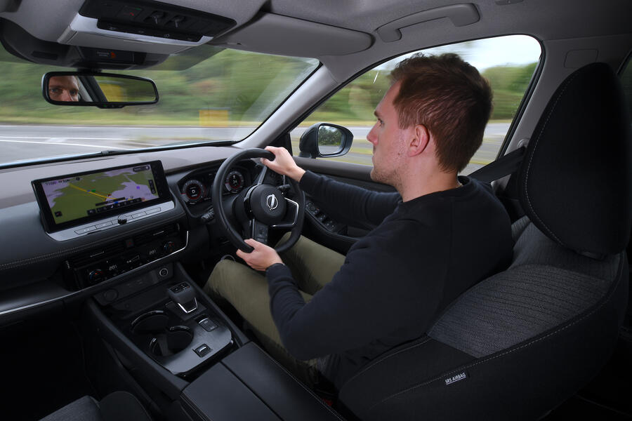
Up front, it’s mostly Nissan Qashqai. Save for some different colours and a new pattern for the piece of trim on the passenger side, the dashboard is the same as in Nissan’s smaller SUV. You might hope to get a bit more for the price premium over the Qashqai, but frankly there is very little to genuinely complain about.
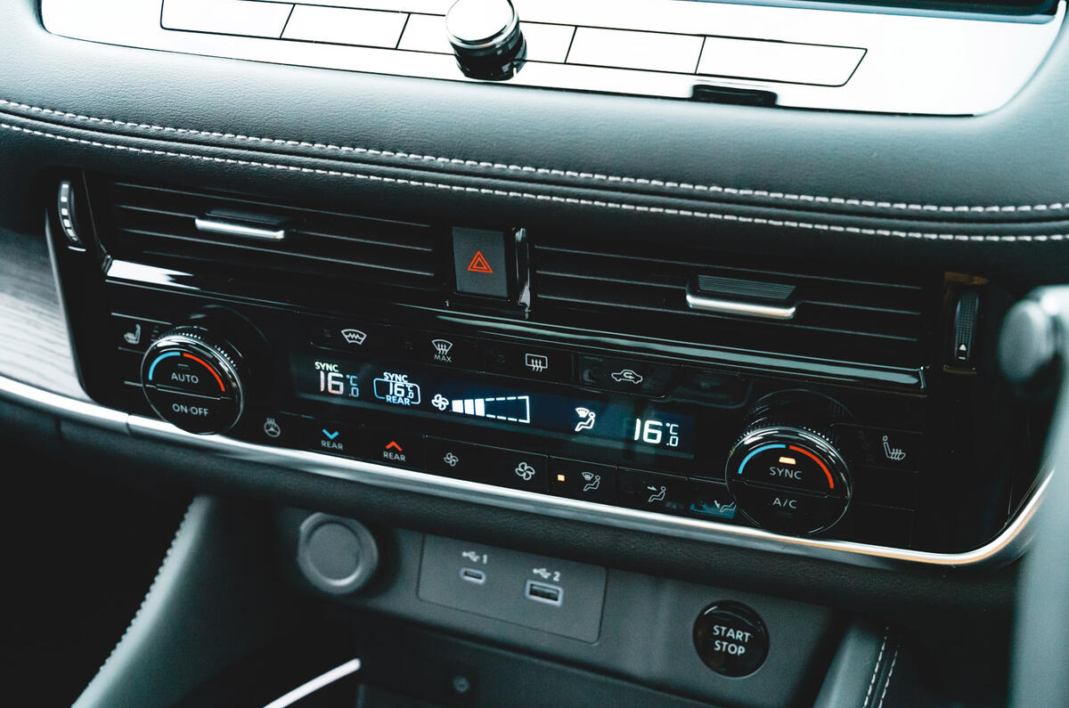
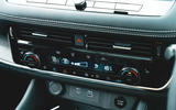
Other cars have a more avant-garde style, but the X-Trail hardly looks dated. There are soft-touch materials as far as the eye can see, and the practical usability is far more carefully considered than in most modern cars. The climate control panel uses all chunky, physical buttons and there’s very little fingerprint-attracting glossy black plastic.
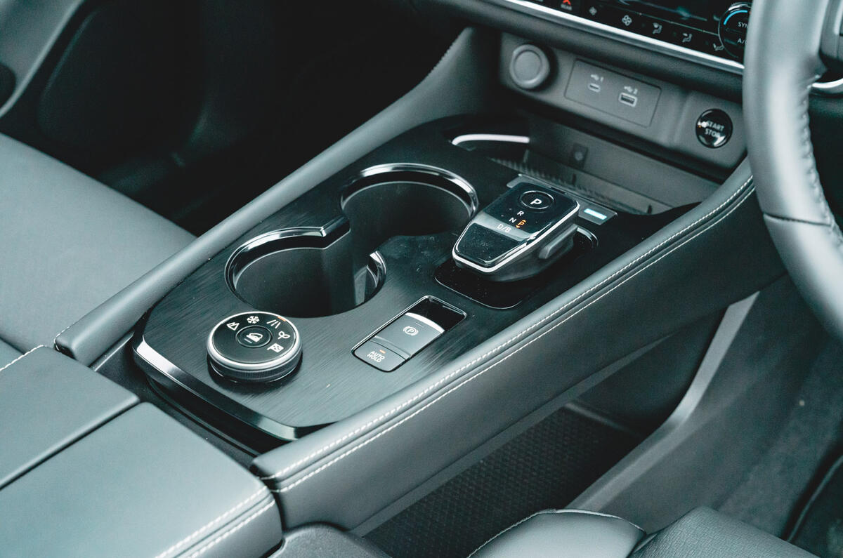
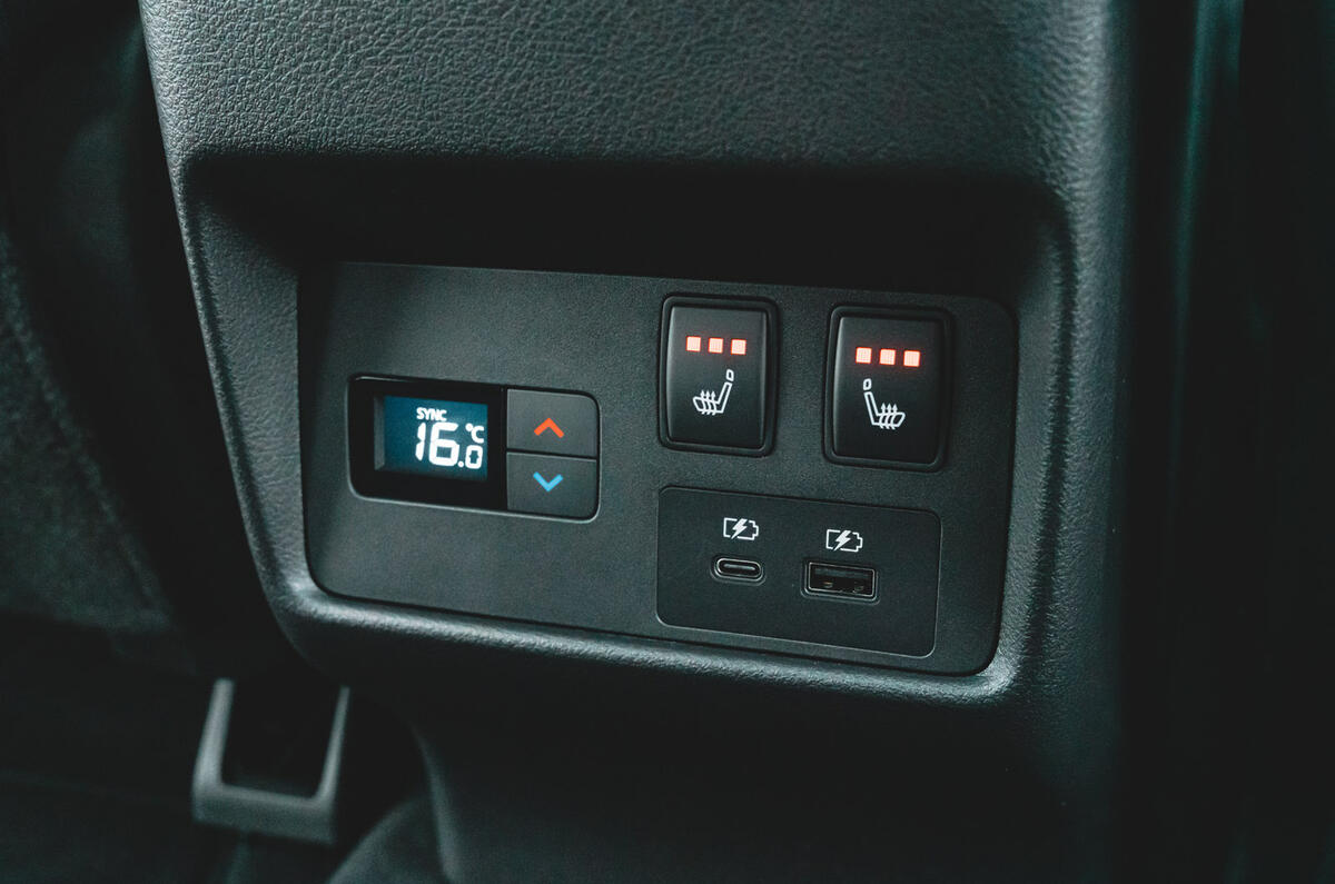
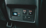
The centre console is the biggest change from the Qashqai. It is a floating design with space beneath. On top, there are generous cupholders, a wireless phone charger, a 12V socket, a USB-A port and a USB-C port. The rear seats also get a USB-A and USB-C port.
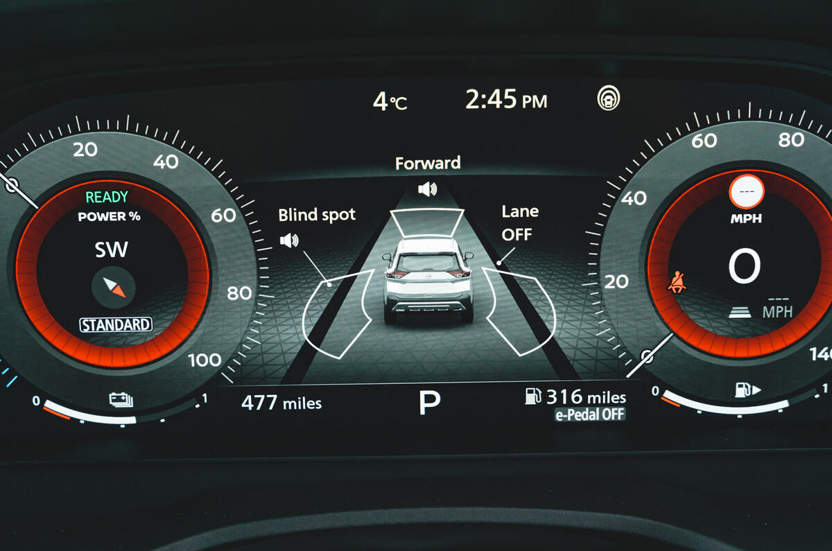
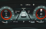
It’s worth studying the brochure, though, because the lower trims get de-contented quite heavily. For instance, Visia trim has fewer USB ports and doesn’t even have an infotainment screen. The digital gauge cluster also only comes on N-Connecta and up. Instead, lower grades use analogue gauges with a smaller, 7.0in screen. The 12.3in digital cluster in our test car isn’t hugely configurable but it makes good use of space and is very clear.
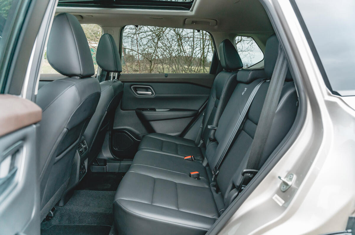
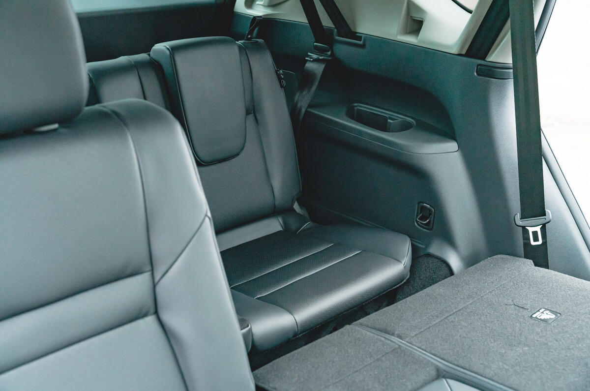
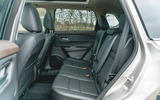
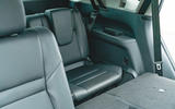
The X-Trail is a brilliant place to be if you’re in the front. However, as an SUV with an optional third row (adding the extra two seats equates to a £1000 price increase on average), it’s a car you buy for the space it offers, and in that respect it might somewhat disappoint, depending on what you compare it with.
As a rival for the Toyota RAV4 or Kia Sportage, rear-seat space is very generous indeed, with 100mm more leg room than the Toyota. Compared with other seven-seat SUVs, though, the X-Trail doesn’t do so well. Granted, with the second row slid all the way back, there is more leg room than in a Kia Sorento, but it’s still less than you get in a Skoda Kodiaq and leaves no leg room for the third row. If you want to make the rearmost seats in the X-Trail usable, even for small children, you have to slide the second row forwards quite a lot.
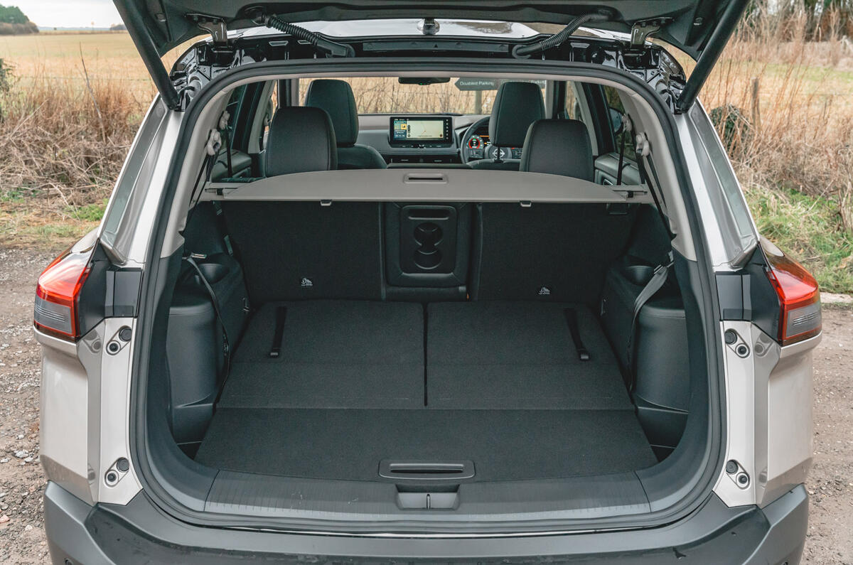
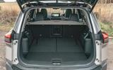
Making matters worse is the hybrid battery under the passenger compartment. As in an EV, that pushes up the floor and makes the seating position less relaxed. The boot isn’t the most generous either. With the third row folded away, there are 485 litres of space. That grows to 575 litres in the five-seat hybrid and 585 litres in the five-seat mild hybrid. For comparison, the RAV4 has 580 litres, the Sportage hybrid 587 litres and a seven-seat Kodiaq 765 litres.
Multimedia system

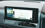
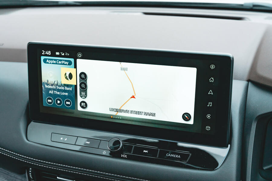
When we road tested the Qashqai, we said the infotainment was inoffensive but dated, and that is still the case on cheaper versions of the X-Trail, as the system is carried over. N-Connecta versions and up of both the 2023 Qashqai and X-Trail get an all-new, 12.3in system and it makes the world of difference.
The graphics are sharp and the screen boots up and responds quickly. There’s a permanent bar of shortcuts on the right side of the screen as well as a physical volume knob and buttons for the tuning and for switching between day and night mode.
The software is logical and you can customise the home screen. The navigation is decent and there’s wireless Apple CarPlay and wired Android Auto. Our test car had the upgraded Bose stereo, which sounded quite good, but we did notice some crackle from the speakers now and then.
One strange quirk is that the vehicle settings have to be adjusted through the gauge cluster, using the steering wheel buttons, rather than the touchscreen.


