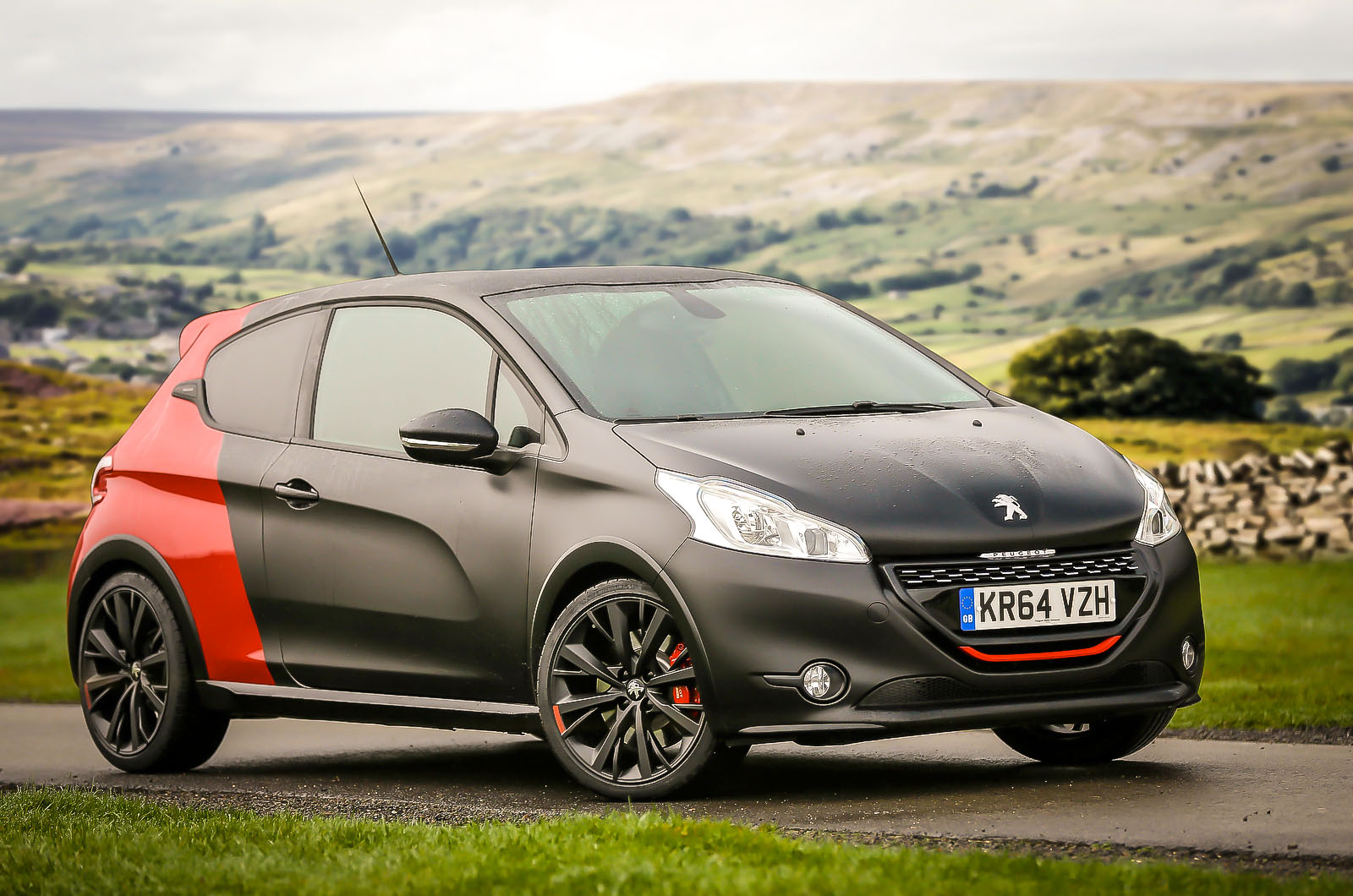
When Peugeot drew attention last year to the 30th birthday of its seminal 205 GTi hot hatchback, performance car fans all over Europe suddenly felt that little bit older.
You needn’t have been a teenager in the early 1980s to know the sporting legend that this front-wheel-drive phenomenon created – or to have added your own ownership story to it. The 205’s superbly engaging handling, combined with typical hot hatch usability and value, have made it arguably the most affectionately remembered French performance car yet made.
The company’s latest inheritor of that legacy, the 208 GTi, was a more serious attempt than we’ve seen in a long time to return the Peugeot brand to the kind of reverence in which it began to be held two or three decades ago.
But although it was a simpler and more willing entertainer than many a hot supermini, it had the misfortune of arriving at the same time as the very good Renault Clio RS 200 Turbo and outstanding Ford Fiesta ST.
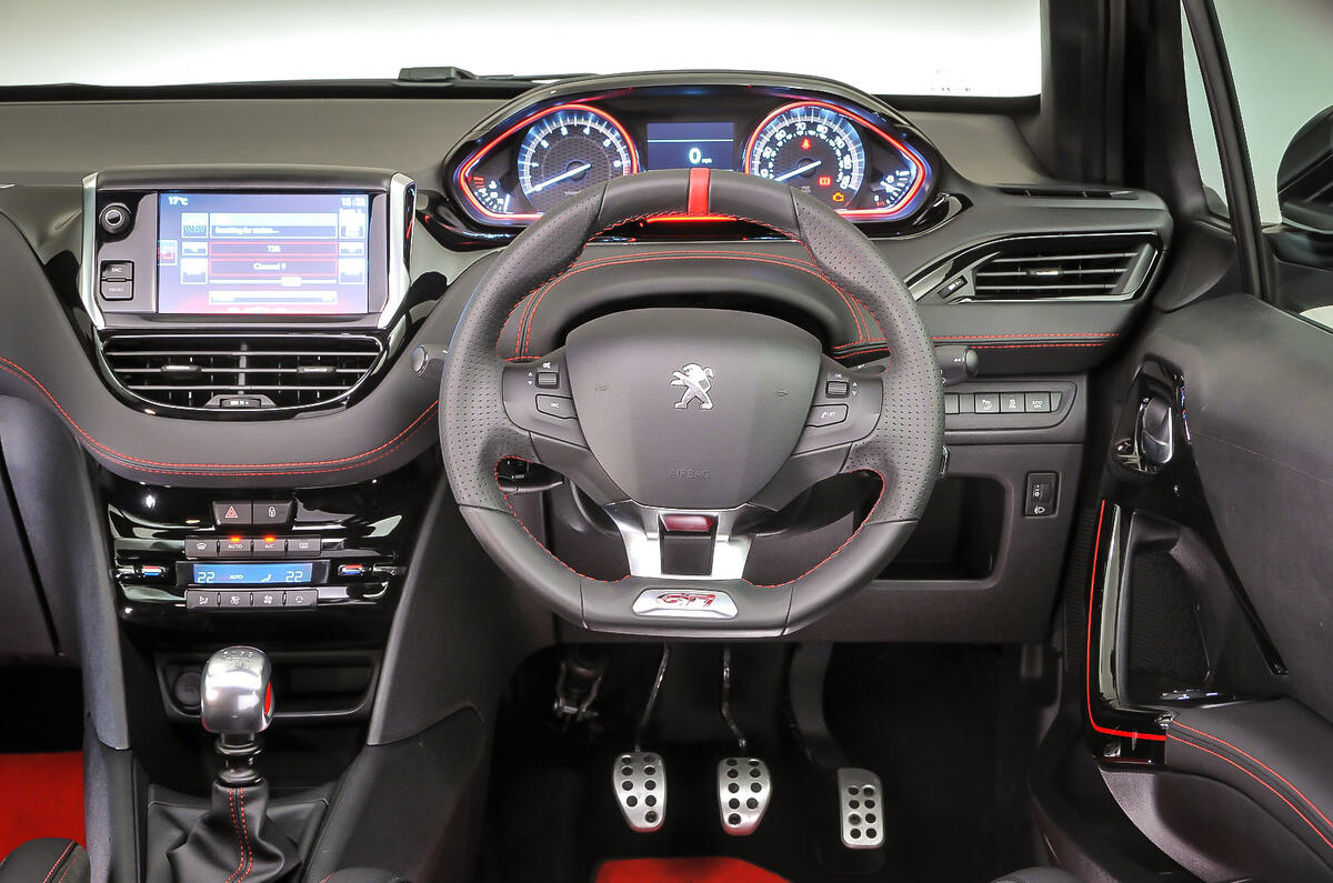
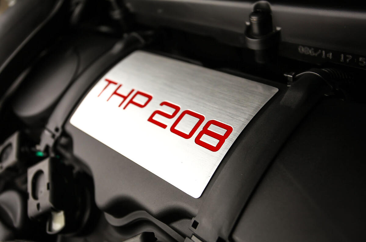
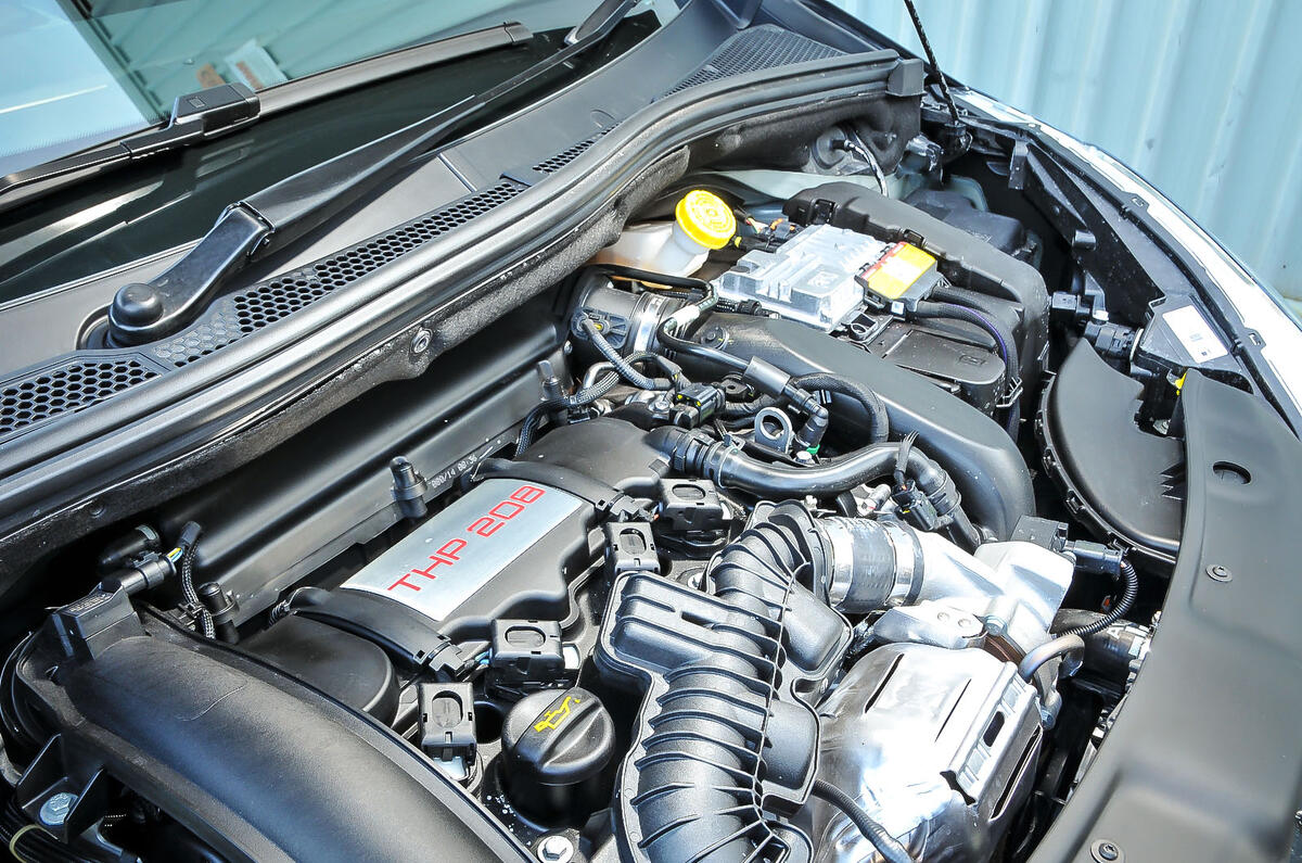
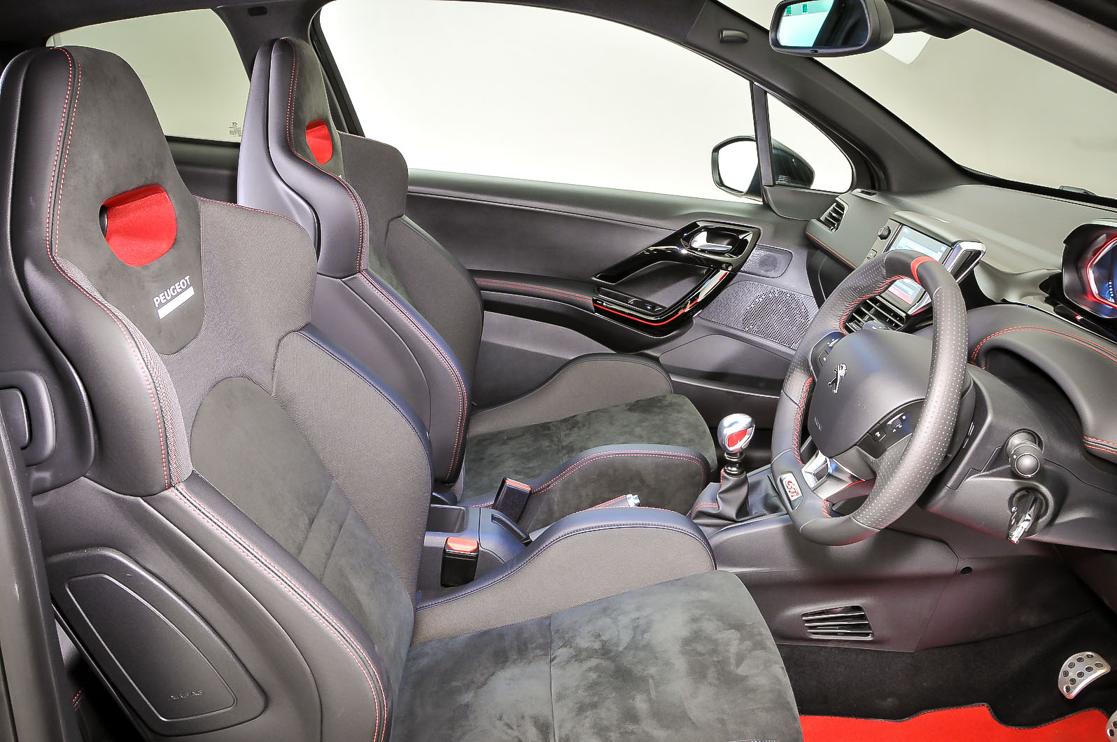
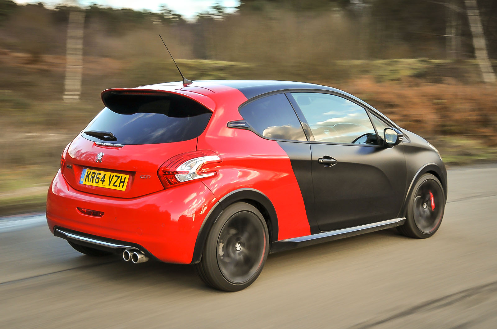
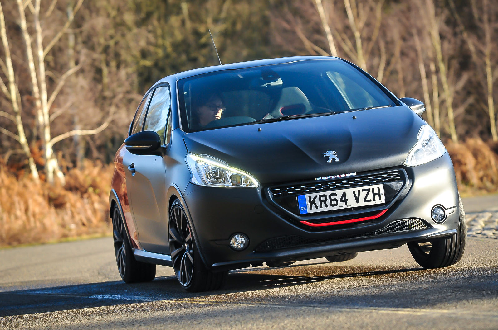
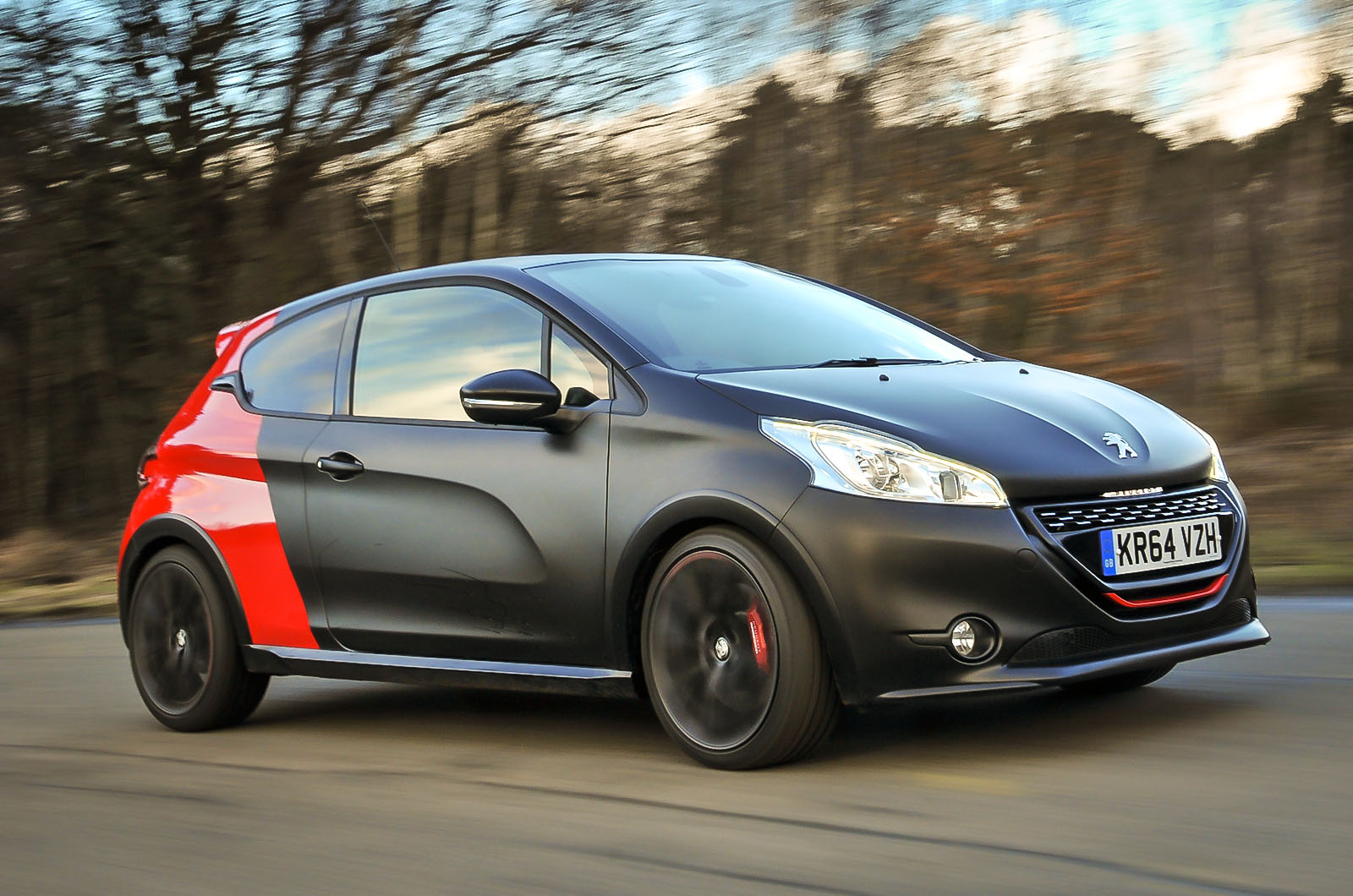
Peugeot’s response – almost two years later and delivered with some celebratory largesse – would seem to be ‘upstage this’: the limited-edition 208 GTi 30th. Departing from the usual paint-job-and-alloy-wheels recipe of special-edition hot hatchery, its engine, transmission, suspension, brakes and steering have all been uprated or retuned, and its outward appearance and interior have been updated.


