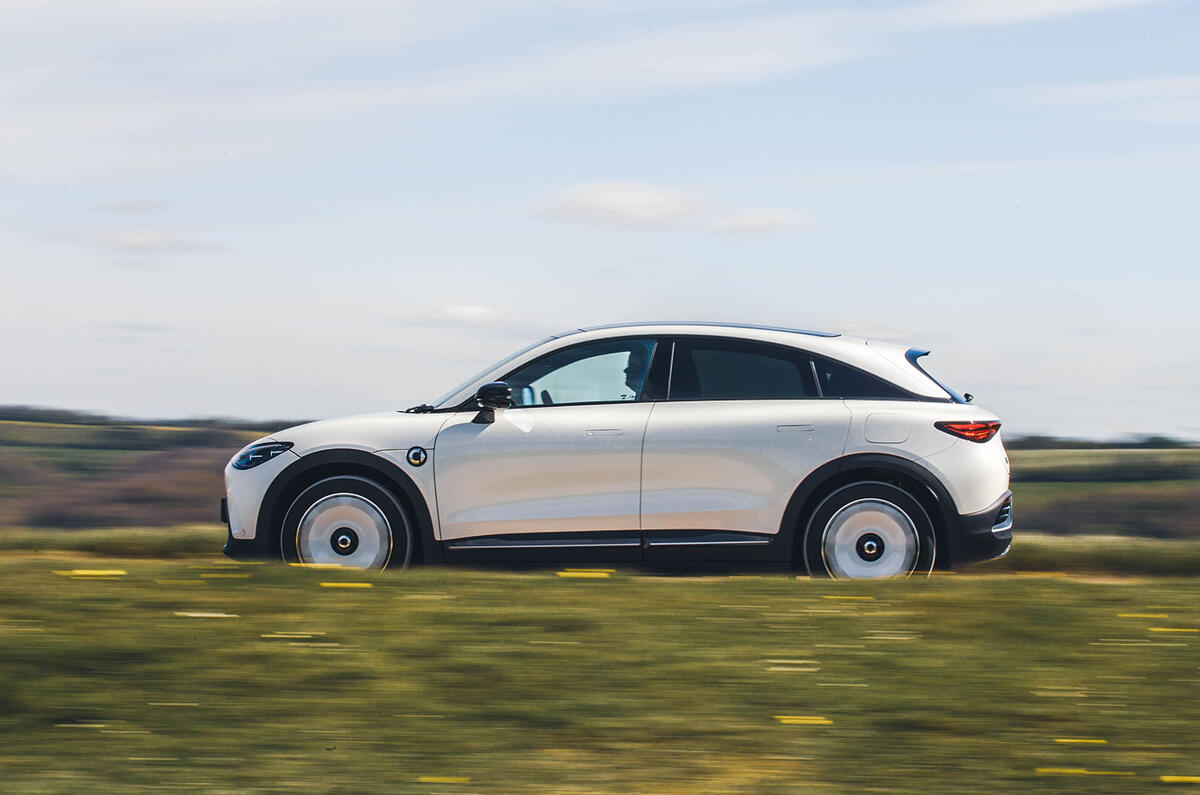
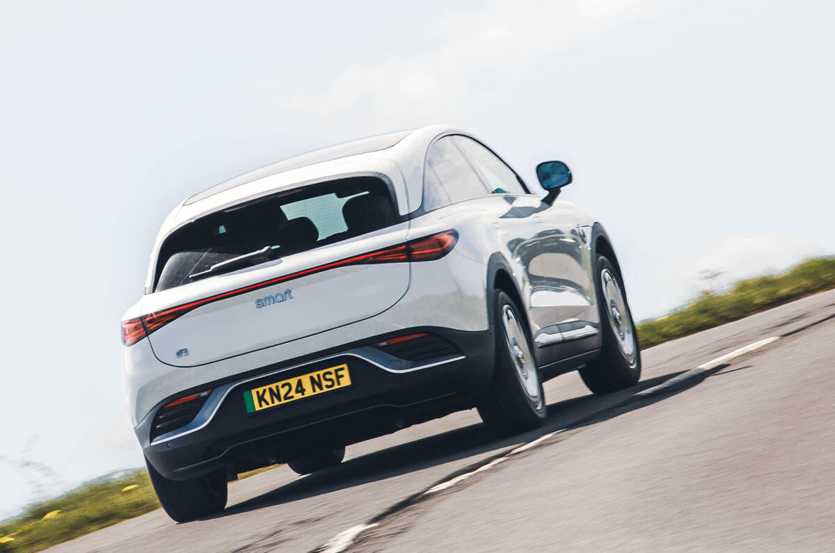
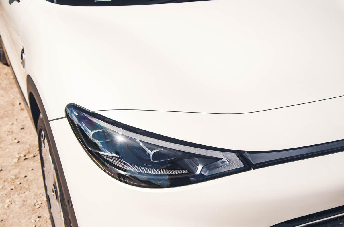
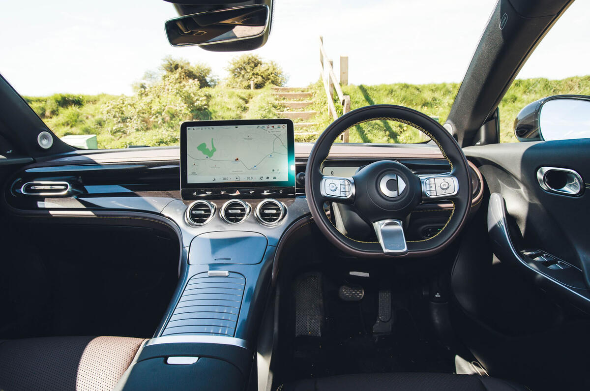
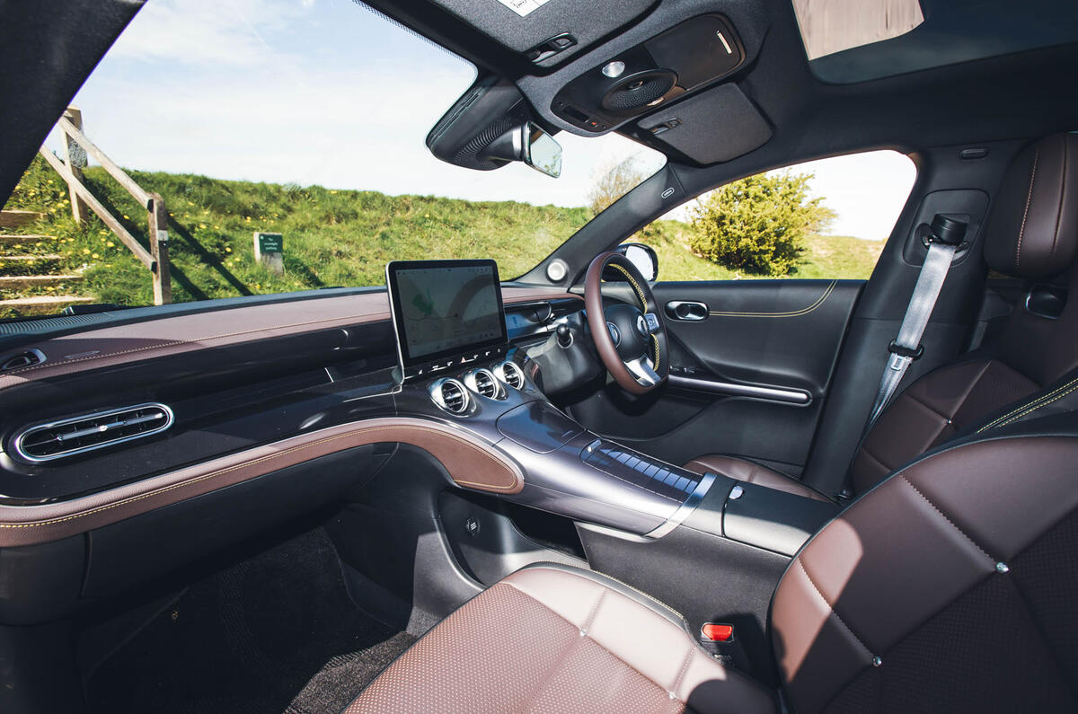
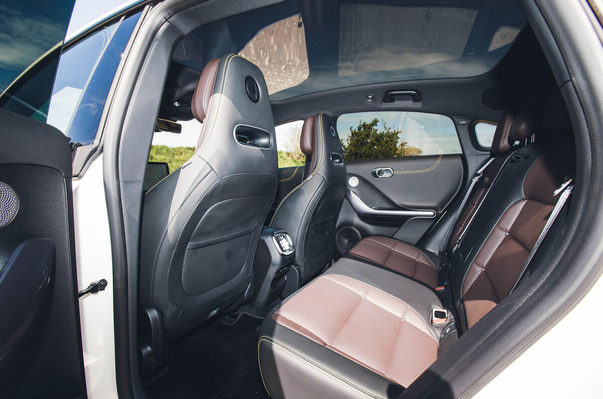
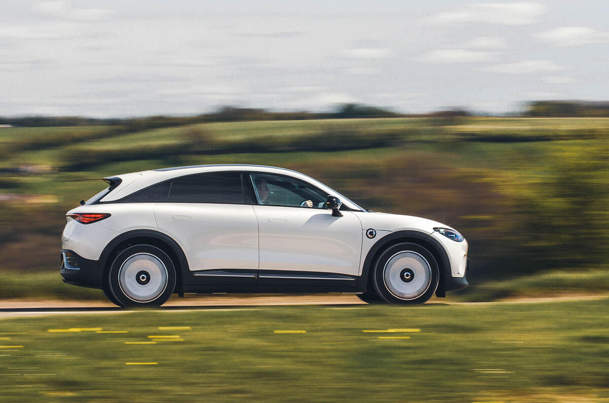
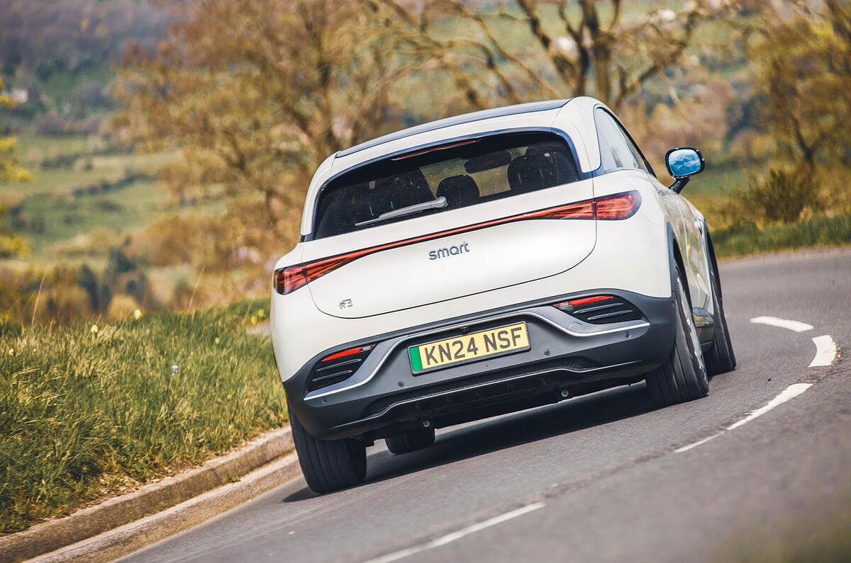
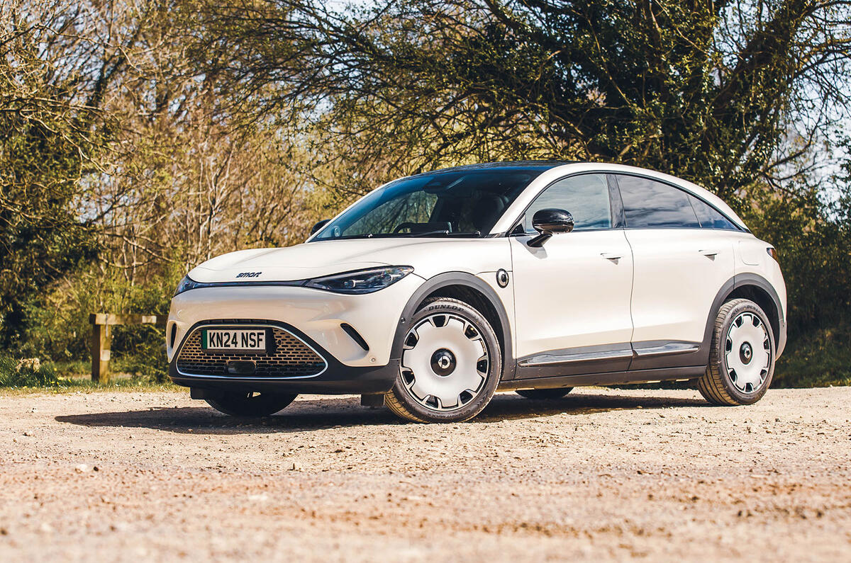
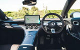
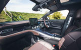
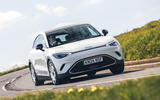
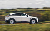
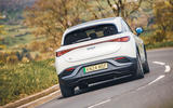
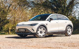
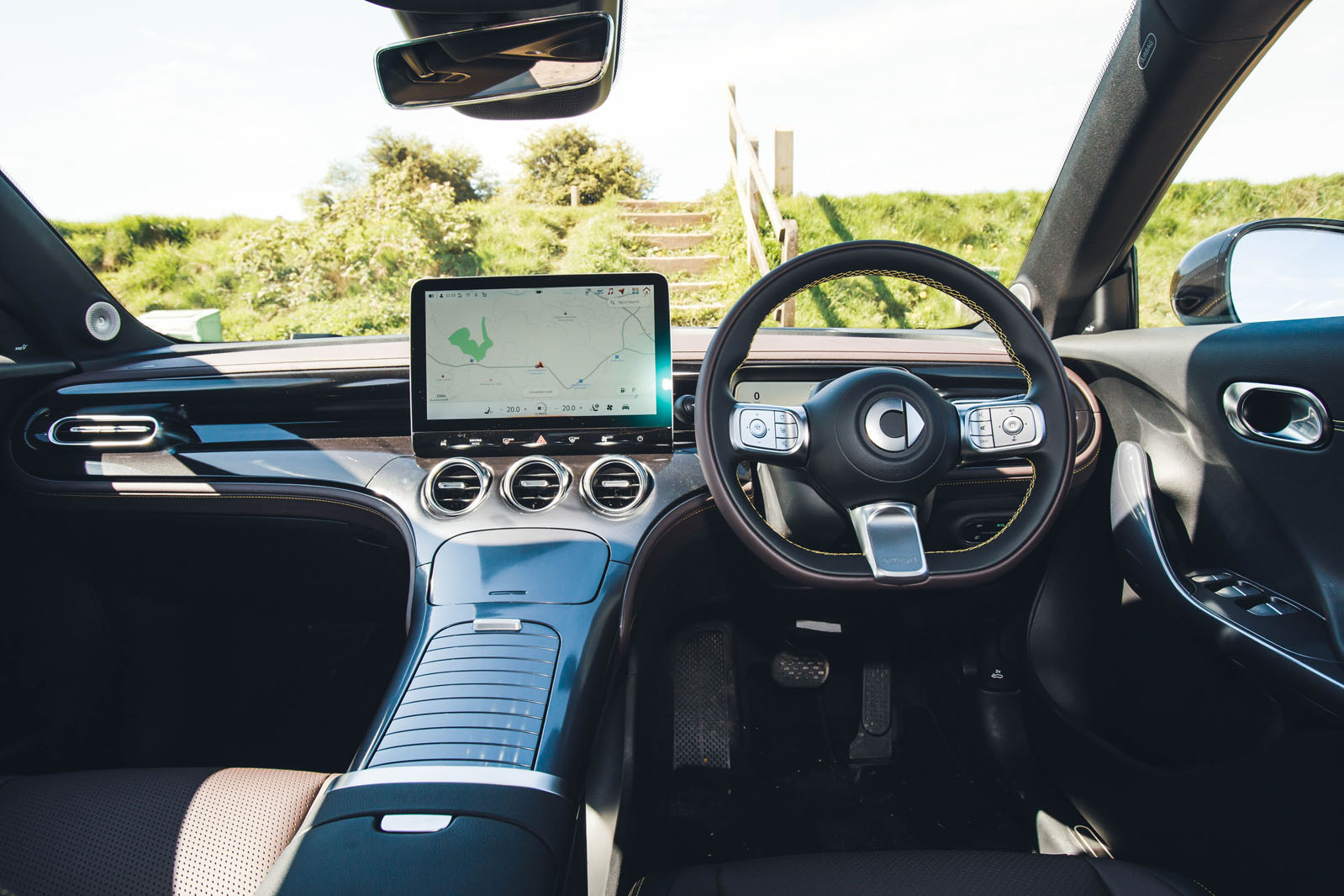
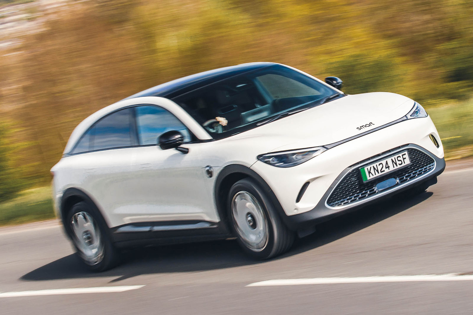
Smart may no longer make exclusively small cars but, according to its current designers, it does want to offer the best-packaged passenger car in every market niche in which it competes. The interior of the #1 certainly bore out that strategy and the #3 does too, albeit to a predictably less striking extent.
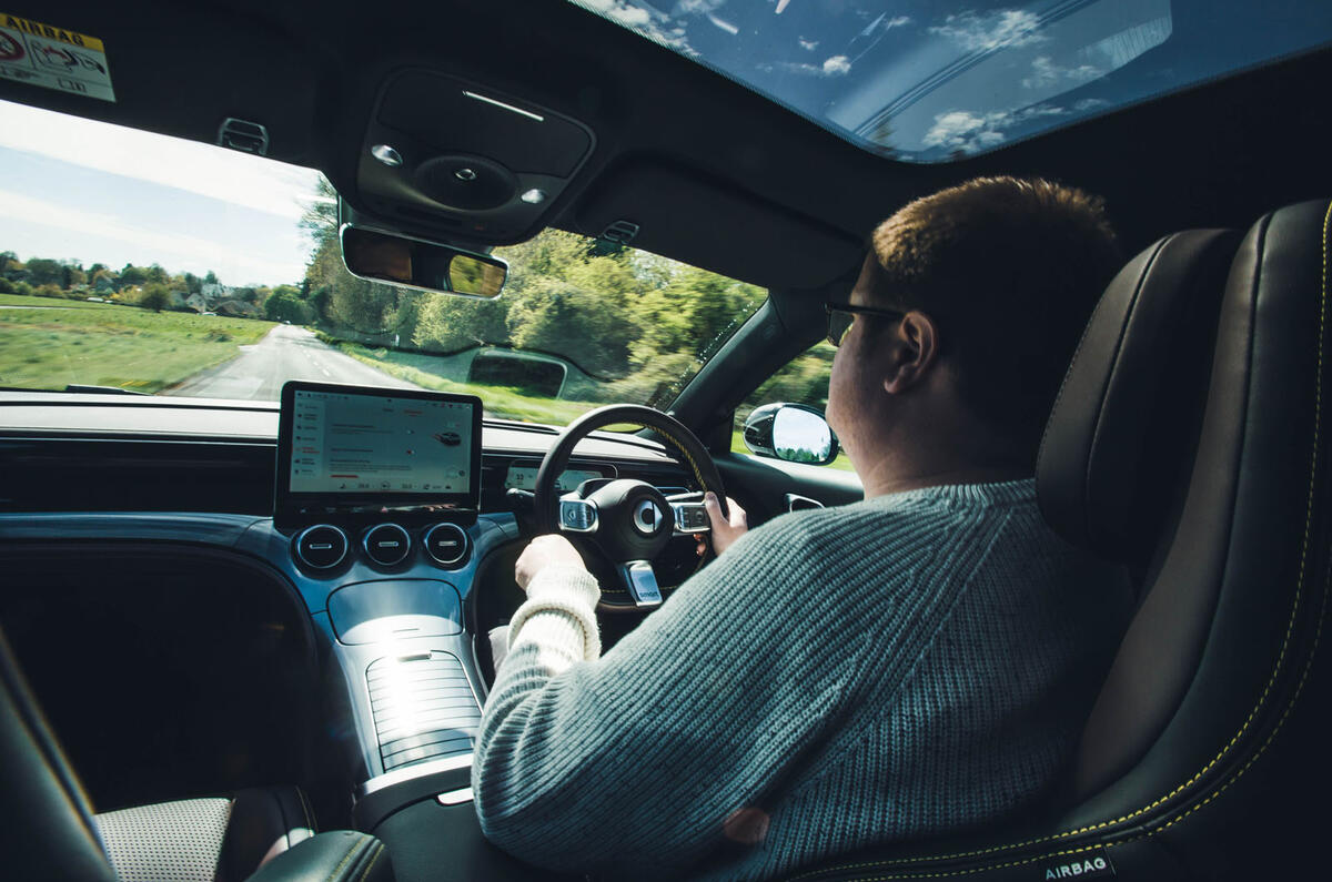
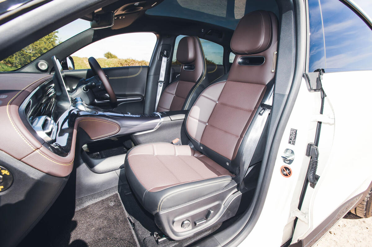
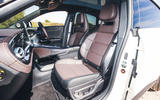
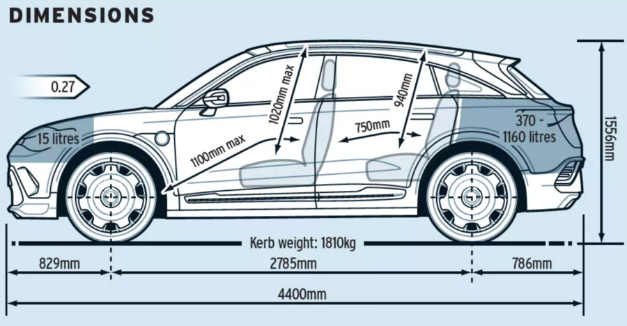
Bigger doesn’t necessarily also mean better packaged, of course, but while the #3 does give away a little bit of head room compared with the taller #1, its cabin is still quite spacious. There’s plenty of room for taller, larger adults in the front row, although the car’s sporty-looking front seats weren’t considered ideally comfortable by a few of our testers. Their ‘integral’-style headrests are fixed, and tended to jut out and poke some drivers in the nape of the neck rather than supporting the head itself, while their seat cushions lacked useful inclination adjustment and thigh support.
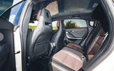
In the back row, there’s good space for adults (something you can’t say of plenty of EVs at this price point), and an accommodation level that feels similar to that of a Tesla Model 3 – right down to the slightly unnerving nearness of the glass roof to your scalp.
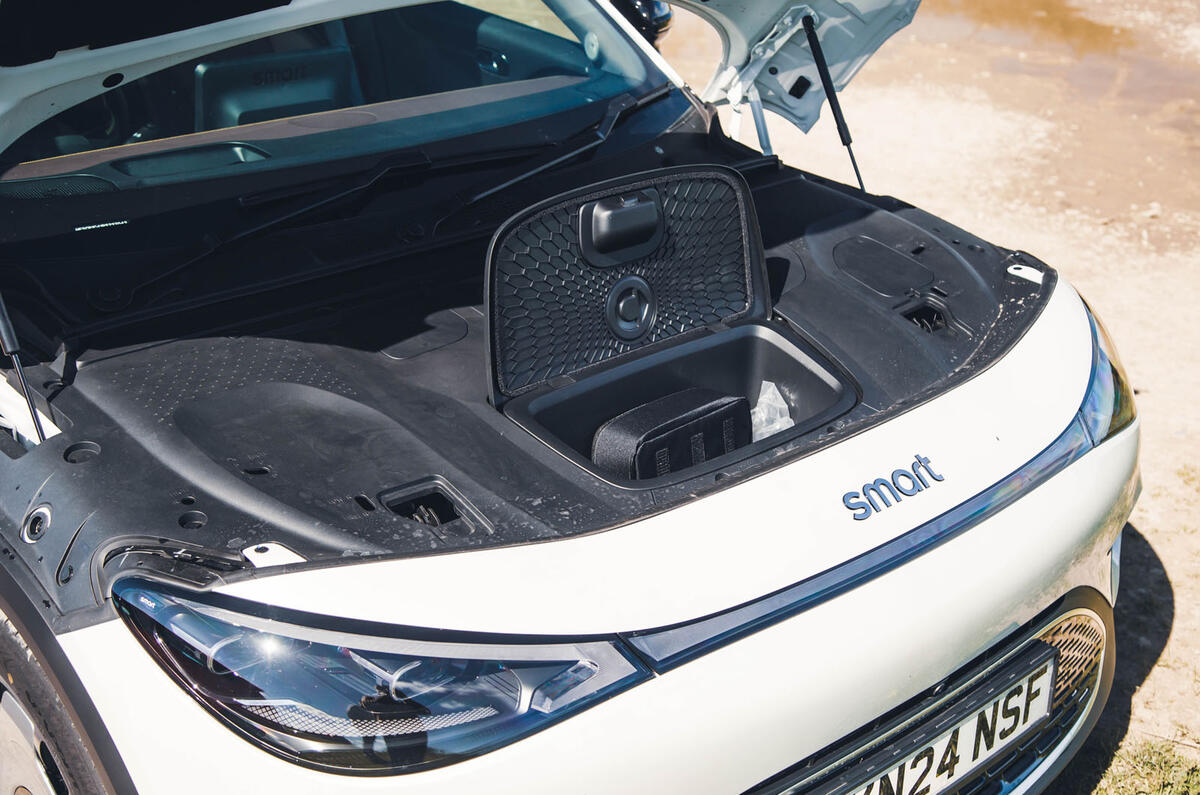
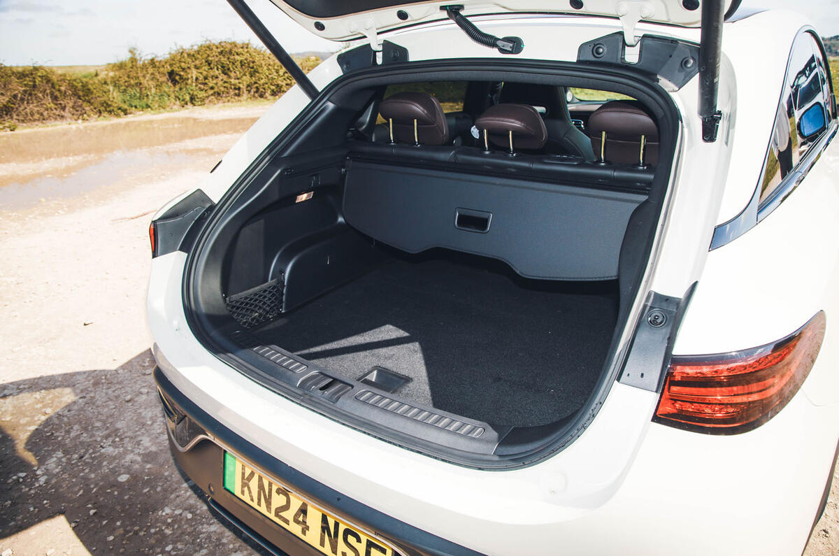
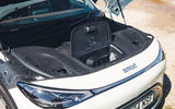
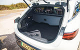
In the boot, overall carrying space is respectable, though no more. A capacity of 370 litres is enough to beat some opponents, but it comes by way of a slightly shallow cargo bay that would only admit bulky items after the removal of the ‘fake floor’ (under which is the car’s only really useful charging cable storage, because the ‘frunk’ is small enough to be almost useless).
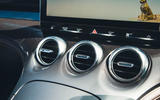
The cabin ambience has a particular kind of glitzy, plasticky material lustre to it that puts you in mind of Mercedes – and probably not by accident. Shiny grey plastic is used to cover big swathes of the fascia, centre console and doors. It was textured in the case of our test car, and robust and pleasant enough to the touch, but whether it would be considered appealing is subjective. The car’s wider standard for material quality and fit and finish is quite good, though.
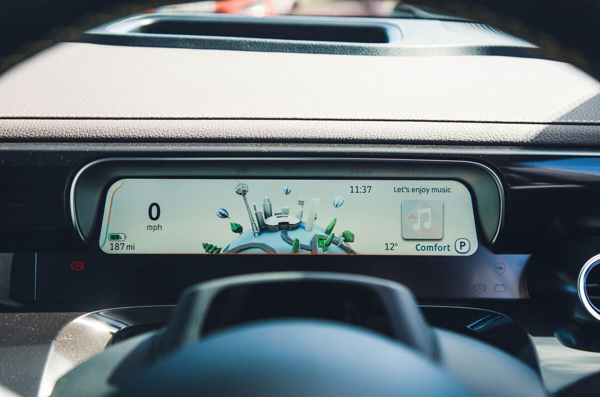
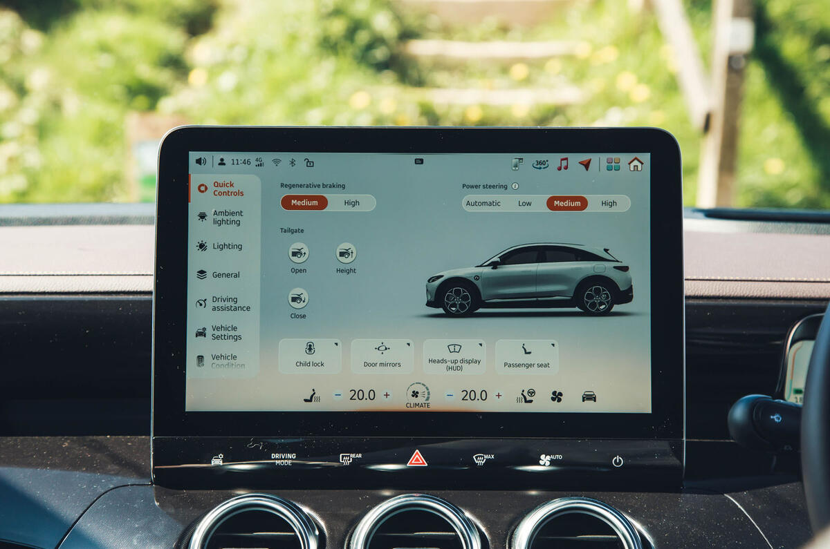
A 12.8in infotainment touchscreen inevitably dominates the upper dash (see ‘Multimedia system’, right) but is partnered with a slim but useful digital instrument display behind the steering wheel and (on Premium-grade cars, at least) a large head-up display behind that, so driving instrumentation and navigation prompts are kept close to your line of sight.
Multimedia system

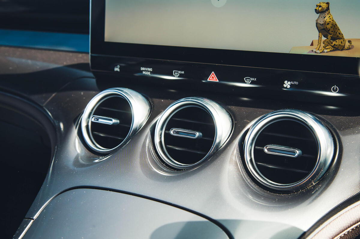
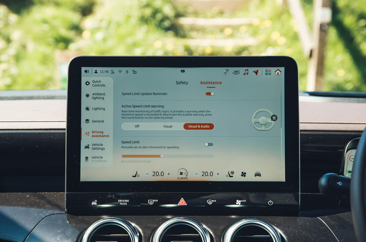
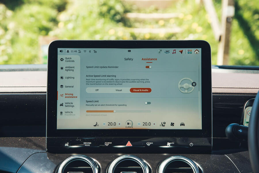
Smart has at least attempted to make the 12.8in landscape-oriented touchscreen multimedia display in the #3 navigable. A line of shortcut keys along its base gives you access to HVAC controls, driving modes and a selection of top-level vehicle systems settings, and other menu shortcuts appear at the top edge, but there’s no physical cursor controller for it.
You therefore find yourself, arm outstretched, diving two and three levels deep into settings menus to deactivate assistance systems that are reactivated every time the car starts, and seem to have to do a lot of jumping between screens even to achieve more simple things. A user-configurable tiled home screen with frequently accessed settings on it is a conspicuous omission.
It is likewise frustrating that the factory navigation system omits a north-up mapping display mode. It’s easy enough to program and follow but doesn’t always recognise voice command destinations. Mirroring for both Apple and Android smartphones is included and works well.


