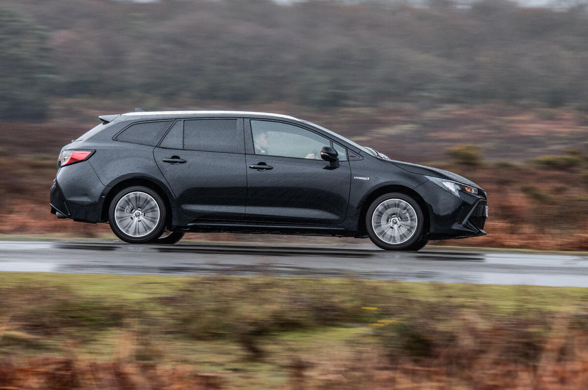
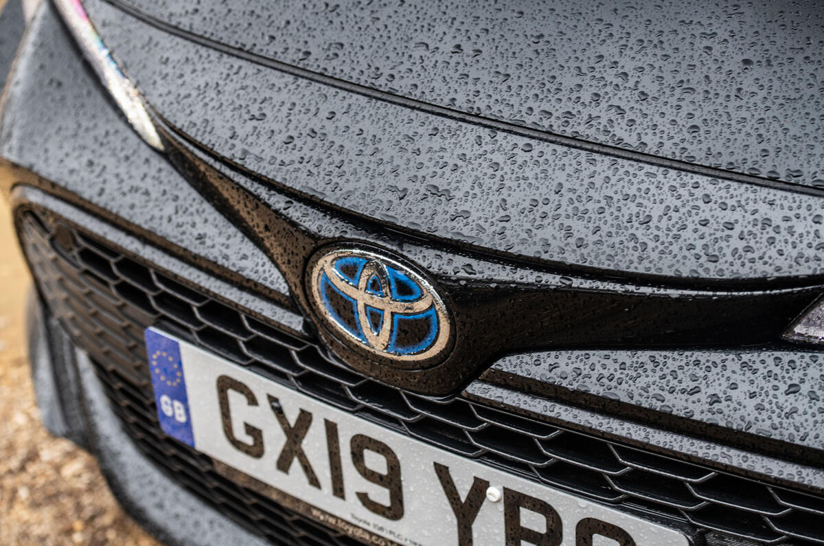
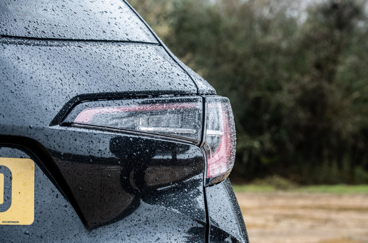
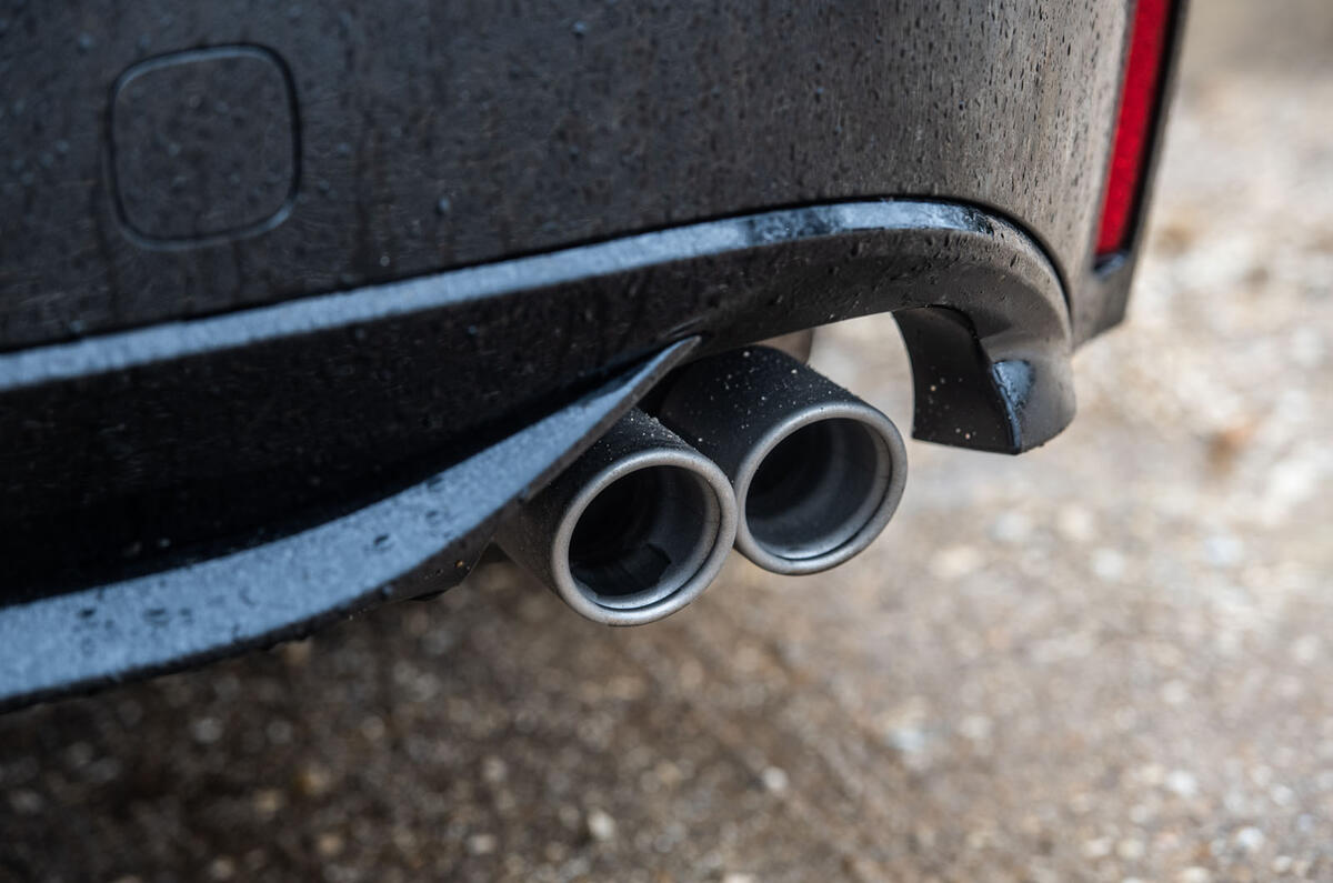
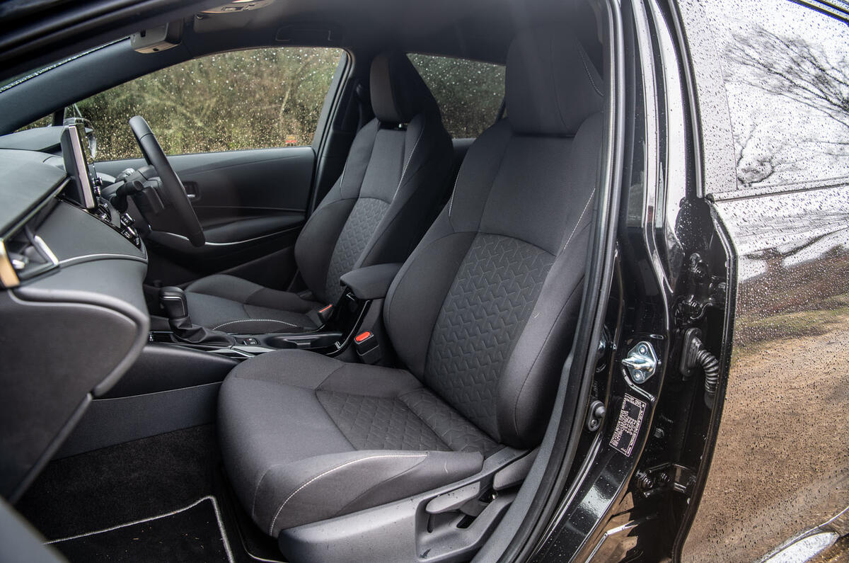
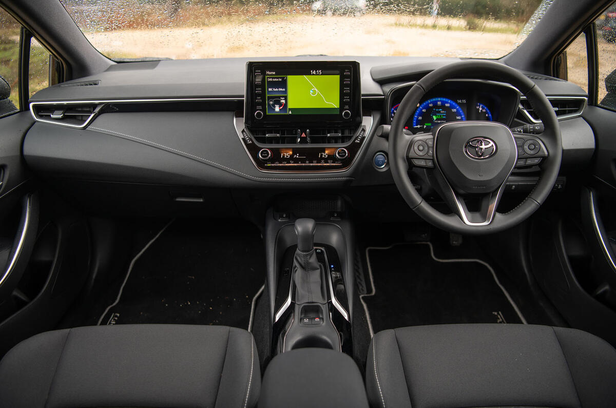
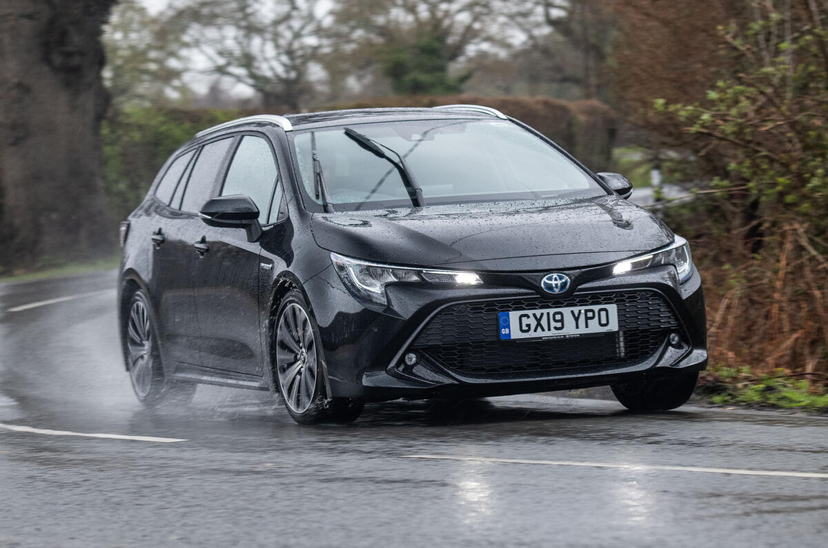
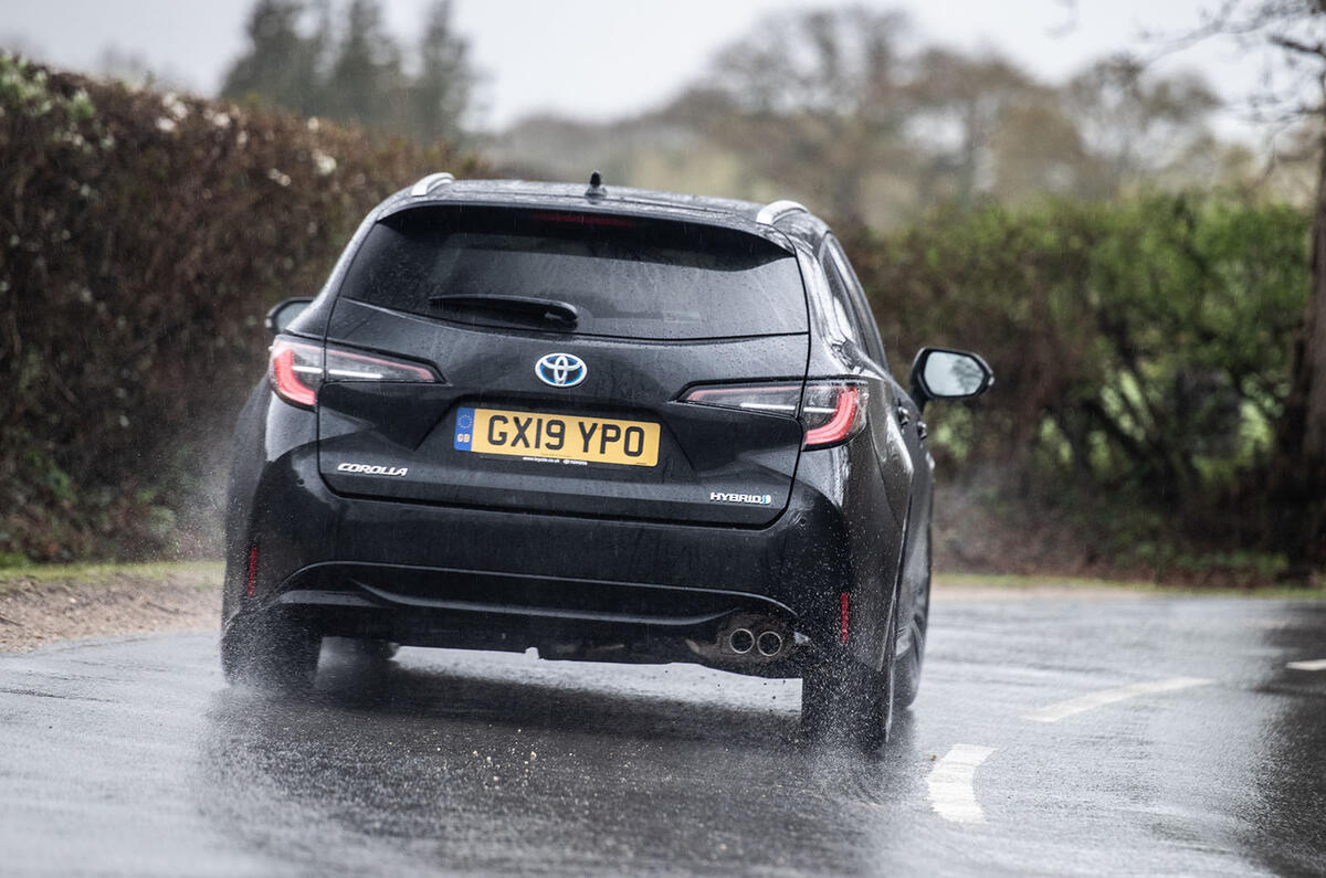
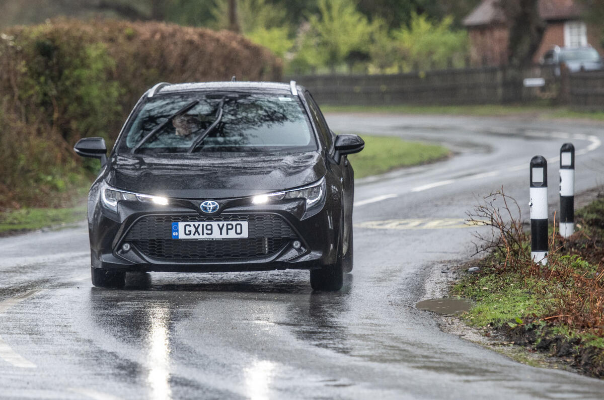
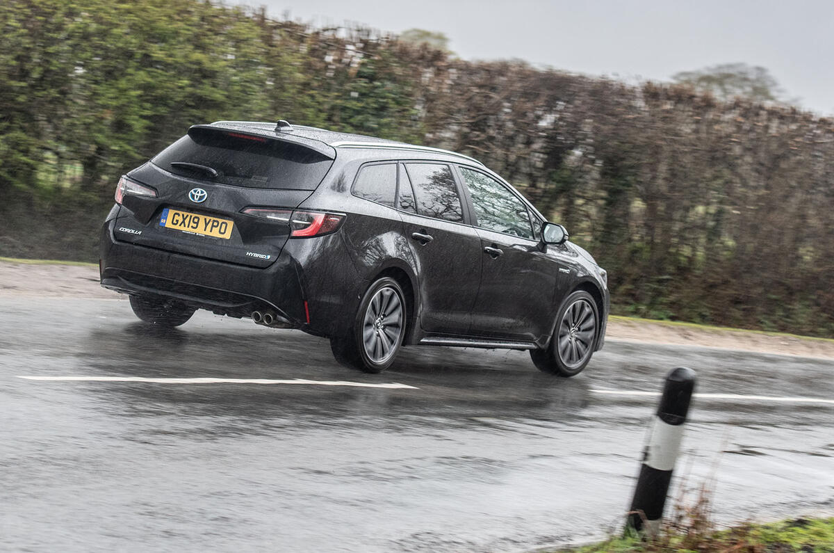
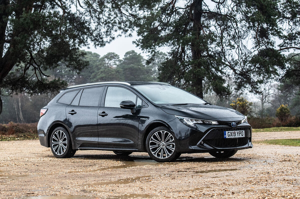
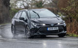
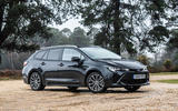
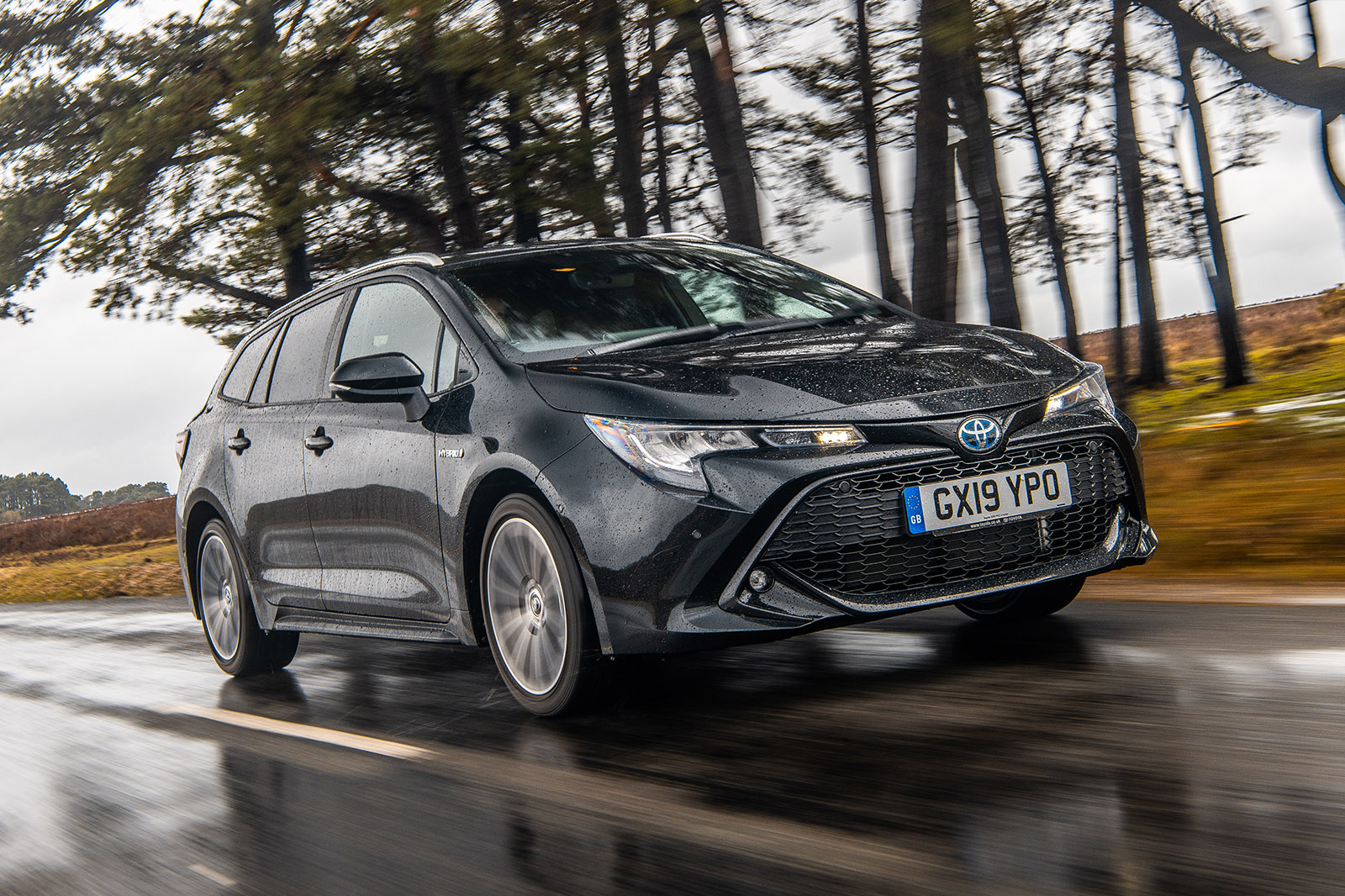
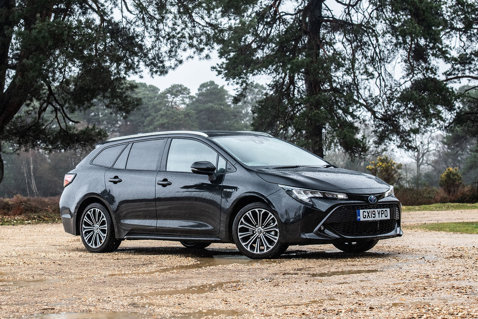
The world’s best-selling passenger car, the Toyota Corolla, is officially back in Britain. Having been away since 2006, when Toyota rebranded its mid-sized family hatchback the Toyota Auris for European buyers, the Corolla is now a global power again. And what a power it has been: around for five decades and counting, and very likely to reach its 50 millionth global registration with this 12th model generation.
If the Corolla has taught us anything, it’s that excitement and driver appeal are of secondary importance when it comes to selling mid-sized hatchbacks and saloons in world-beating volumes. The Corolla’s story so far has been about what Toyota handily initialises as ‘QDR’: quality, durability and reliability.
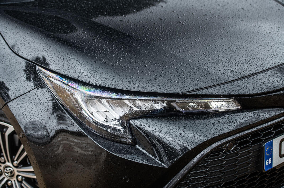
With this version, however, fourth and fifth pillars of appeal are being added to the car’s make-up: dynamic styling and driving pleasure. Now very aware of how crucial this car is to the casting of its global reputation, Toyota aims to banish the boring from the character of this car and to make it as appealing to drive as any family five-door in its class.
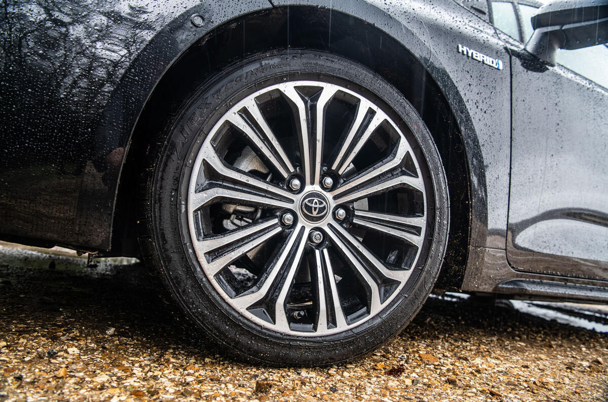
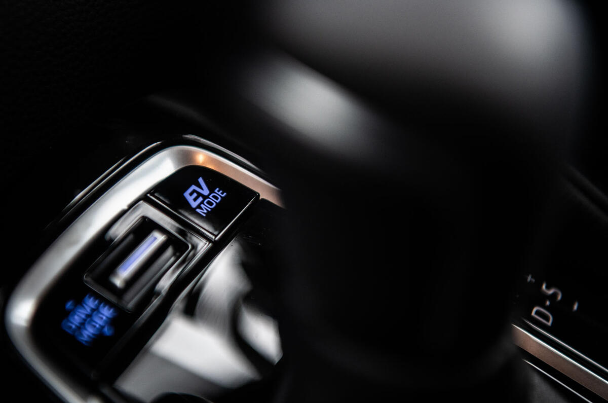
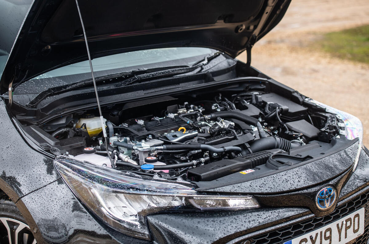
Using the same platform as the critically acclaimed Toyota Toyota C-HR crossover, the current Toyota Toyota Prius and the Lexus UX, the Corolla is in receipt of a chassis with new suspension technologies and geometries, honed on European roads. It is also the first Toyota model to spring from the firm’s new ‘dual hybrid’ model strategy – and so, as part of a broadening of the thinking that has already led to a surprisingly widespread adoption of petrol-electric powertrains, the Corolla will be available with a high-output ‘performance hybrid’ engine as well as a more familiarly economical one.


