Currently reading: All Renault models to feature retro new logo by 2024

Two-dimensional diamond emblem first appeared on the 5 electric supermini concept

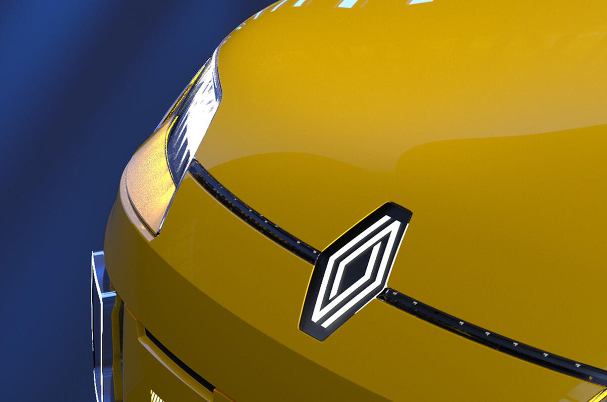
Renault has confirmed the new version of its long-running diamond logo first seen on the 5 electric concept car will be introduced across its entire range by 2024.

The French company is the latest car brand to refresh its logo to tie in with a major electrification push. The new design follows the trend for two-dimensional logos, which have become popular because they display better than 3D designs in digital form.

Renault first showed the retro-influenced new logo on the 5 concept car at its Renaulution event, with design director Gilles Vidal saying the reaction to it influenced the design to adopt it more widely.

“The Renault 5 was for us a formidable testing ground,” said Vidal. “In view of the enthusiasm and the very positive feedback we received about the logo, we decided to launch it.”

The logo has also been seen in the latest adverts for the Renault Zoe electric car and will be gradually introduced across the range as models are refreshed or replaced. It will be featured on every Renault model by 2024.

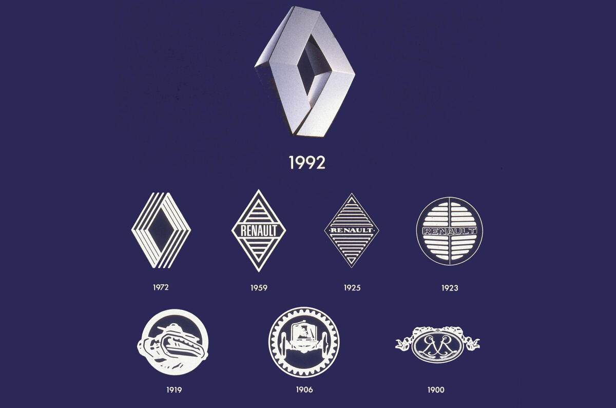
The new logo is the ninth to use the the diamond shape that Renault first adopted in 1925. Initial designs featured horizontal stripes filling the diamond, but these were phased out in 1972. The current version of the logo was created in 1992 and has been revised four times, most recently in 2015.

The new logo in comprised of two intertwined black lines, and evokes the popular 1972 design, which Renault used for 20 years.

READ MORE

Renault 5 reborn as electric supermini​

Renault's transformation strategy will see 24 new vehicles by 2025​

Peugeot revives historic logo in bold rebranding move​

Advertisement

Read our review

Car review

Early adopter of electric power has been refined rather than reinvented

Join our WhatsApp community and be the first to read about the latest news and reviews wowing the car world. Our community is the best, easiest and most direct place to tap into the minds of Autocar, and if you join you’ll also be treated to unique WhatsApp content. You can leave at any time after joining - check our full privacy policy here.

James Attwood

James Attwood, digital editor
Title: Acting magazine editor

James is Autocar’s associate editor, and has more than 20 years of experience of working in automotive and motorsport journalism. He has been in his current role since September 2024, and helps lead Autocar's features and new sections, while regularly interviewing some of the biggest names in the industry. Oh, and he once helped make Volkswagen currywurst. Really.

Before first joining Autocar in 2017, James spent more than a decade in motorsport journalist, working on Autosport, autosport.com, F1 Racing and Motorsport News, covering everything from club rallying to top-level international events. He also spent 18 months running Move Electric, Haymarket's e-mobility title, where he developed knowledge of the e-bike and e-scooter markets. 

Join the debate

Comments
5
Add a comment…
FastRenaultFan 12 March 2021
Actually maybe what Renault and Peugeot are doing with there Logos is quiet clever. There is a lot of people out there that had a Renault or a Peugeot with the current logo and it let them down and they say they would never buy another but maybe they will forget it was that car when they set it that make advertised with there new 2d Logo. Opel should do the same. I would have to say do if I was to choose I would and do prefer the new old Renault logo over the peugeot one.
ewanmac76 12 March 2021

Jeez - 1992.  I remember the current logo being launched as I had a clio at the time.  Can't believe that was almost 30 years ago!

catnip 12 March 2021

I'm going to put off my purchase of a new Renault until this new logo appears across the full range.