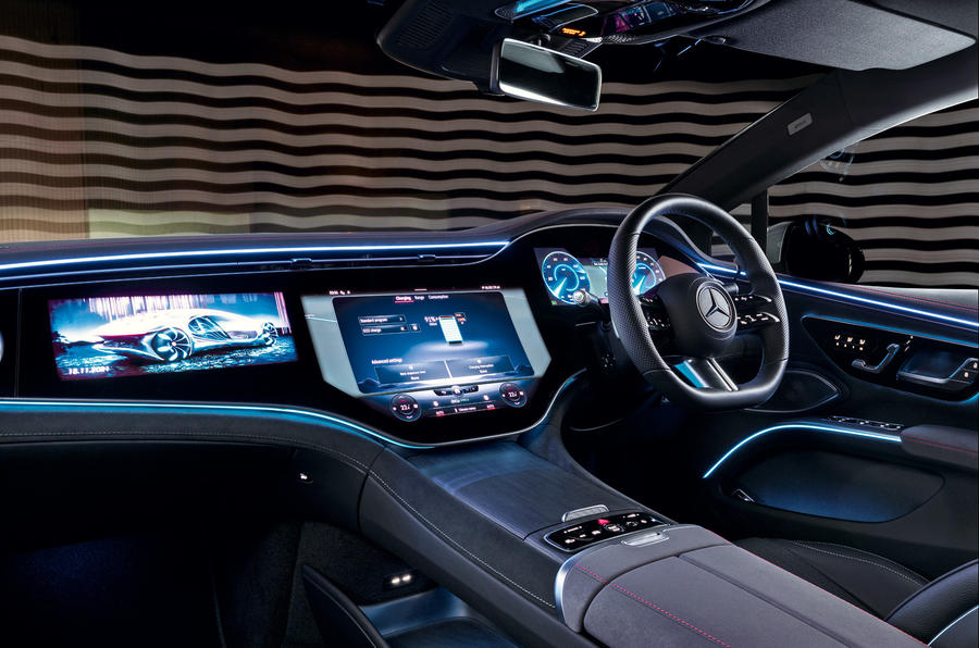
Now look here, car companies. I know that using lots of buttons is expensive and they can look cluttered on the dashboard, and that touchscreens are so much tidier and cheaper. And I know that touchscreens are much more accommodating to over-the-air updates than buttons, and that they’re oh so versatile for giving access to lots of different features, and that they’re very easy to personalise.
But maybe we haven’t told you this enough, although it feels like we all have: can you honestly please just stop it? These screens are being asked to do too much. It’s distracting. It’s – and I don’t use this word lightly – dangerous.
Recently I drove the Citroën C5 X, and I like the car. It’s comfy, spacious and good value. One of its engineers said the touchscreen layout was based on a similar principle to a smartphone. I like smartphones too. Mine is very easy to use. Certainly no harder than a bunch of static buttons or a control wheel – while I’m sitting on my sofa, but not while I’m driving.
It’s illegal to use a smartphone, for very good reasons, while I’m doing 70mph. Because at that point, I should primarily be looking at something else. Knob-twiddling or button-pushing are things that I can do without taking my eyes away from the road for too long. A normal button or control wheel or dial lets me do this. A touchscreen doesn’t.
I’m not singling out the C5 X, by the way; it’s just my most recent example. Actually, with a customisable display, big buttons and separate controls for air-con, it’s not bad by most standards.
The current worst protagonist is probably Volkswagen, particularly as it has put the heater controls just where you would choose to rest your hand to use the infernal screen – and doesn’t backlight them at night. But Mercedes-Benz is pretty poor too.
That’s two sometime paragons of ergonomic excellence, then, making infuriating interiors. There are others. Tesla, which maybe started it all, Volvo, Ford... Basically, just about everyone.


Join the debate
Add your comment
If you feel that way Matt, then perhaps you should suggest to your fellow motoring journalists to not scoff at cars with physical buttons, switches, controllers for the most frequently used functions and dismiss them as old fashioned!
Totally agree.One compelling reason we bought my wife's excellent FIAT 500 electric a year ago is that all important controls are independent of its touch screen (in fact most such controls cannot be changed from the screen when the car is in motion). I had a test drive in a KIA EV6 recently and that also appears to have buttons for most controls.