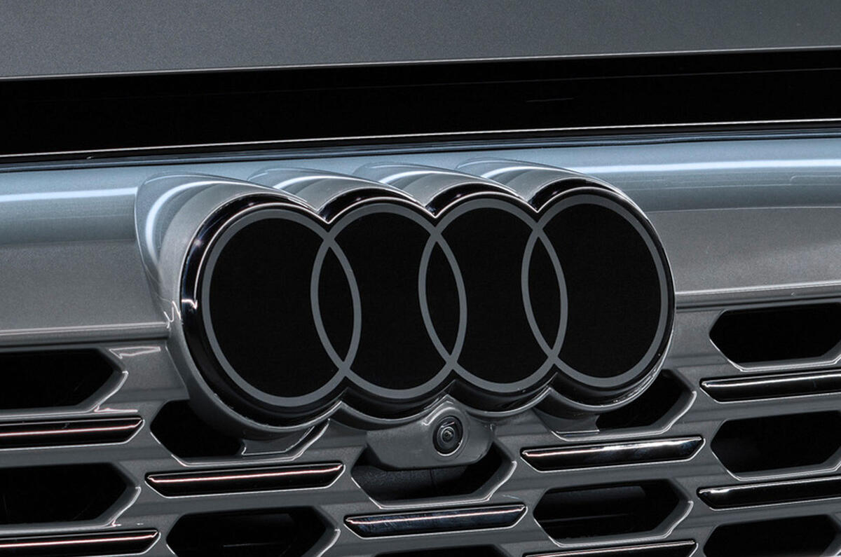
Audi has today provided a closer look at its new logo, which does away with three-dimensional chrome in favour of a more 'discreet' monochrome identity.
The new logo reflects the brand’s push into more expensive markets with what is intended to be a more understated identity, said brand strategist Frederik Kalisch.
Designer André Georgi explained: “Today’s chrome rings stand for high quality. The material alone conveys that message. But we believe that we have found the ‘new chrome’. The clarity of the new black-and-white rings makes our corporate identity unmistakable.


