Currently reading: Exclusive: Why Hyundai Santa Fe takes a design "risk"

Company's design head SangYup Lee guides us around the outside of the new seven-seat SUV

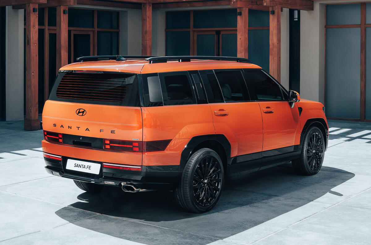
SangYup Lee, design head of Hyundai and Genesis, talks us around the outside of the new Santa Fe, whose design represents a radical departure from models that precede it and others in the Hyundai line-up.

The seven-seater – more details of which have been released today – has a less rounded, more rugged stance than Hyundai’s previous 4x4s and SUVs.

“It’s a big change compared to the previous model,” Lee says, and its design direction represents “taking a risk” – one that was later justified by the appearance of the modern Land Rover Defender and Ford Bronco SUVs.

“This is one of our biggest models,” says Lee. “It can’t fail. So this was very important.”

“Four-and-a-half years ago, we first started this project,” he explains. “We always check the big data information to forecast future trends. This was before the pandemic, and one key word that really pops is how ‘outdoors’ culture has become mainstream. We chose the direction to cover both the urban and the outdoors.”


“When you have a box-style SUV, the proportional balance is so important,” says Lee. “It has a very simple body surface with a lot of volume, supported by up to 21in wheels, which is unheard of in this segment.

“Even though it’s boxy, we want to add more precise details touches. And a lot of the challenges are aerodynamics. From an aero engineers’ perspective, they call a boxy car an ‘aero disaster’. So this is one of our challenges.

"This car has a 0.29Cd drag coefficient. We challenged a lot in aerodynamics. It has an active aero shutter on the front, which is quite unusual for this segment, and also it has a vertical air curtain which helps, and we have round wheel openings, which is a significant aero gain as well.

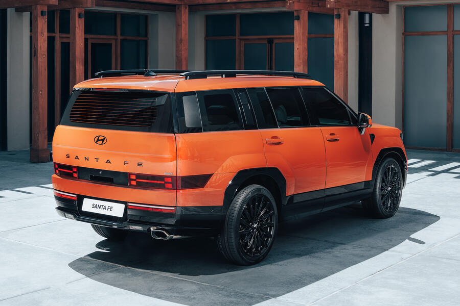
"It’s like back in the day, with the Porsche [911] 993: the rear fender flare has a lot of softness towards the back. Originally it was more angular, but we realised it’s not really helping the aero.”

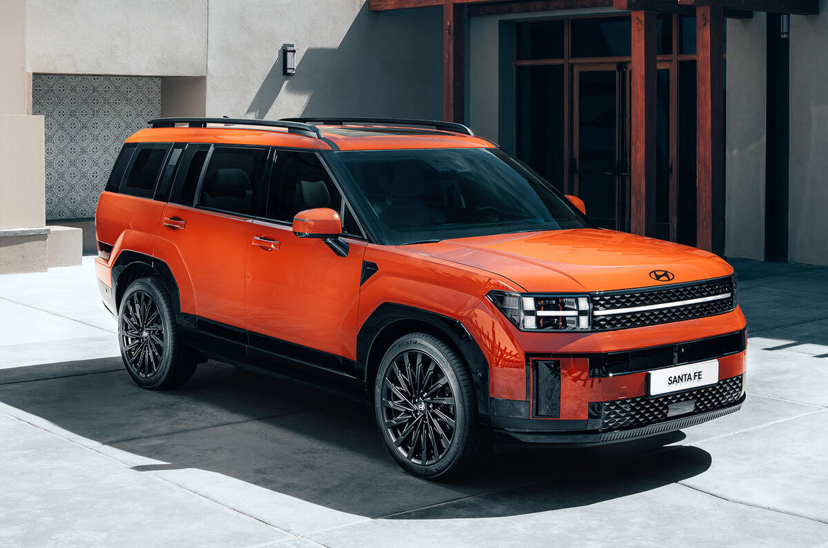
“This design is all about form following function and emphasising what an SUV can do.”

We asked Lee how the car looks so big in pictures but not in reality, whereas the Ioniq 5 is the other way around.

Back to top

“That is so true," he replied. "When you first look at [the] Ioniq 5, it’s so solid and tight [that] nobody thinks it has a three-metre wheelbase. It has lots of corner work. The corners are round as much as possible to create this compact character. The Santa Fe appears to be big because the corners are pulled out as much as possible. You saw the big tailgate: it’s a slab-sized surface and the full width is used as a design element.

“Depending on product determines what design tool we want to use. But obviously the intention for an SUV is to say ‘I’m a big boy’.”

Hyundai santa fe 2023 rear angle

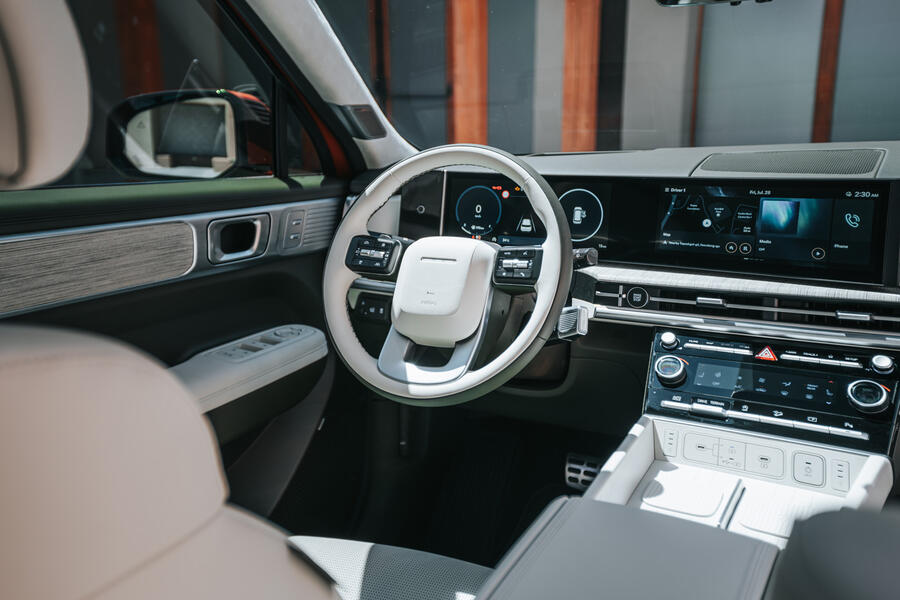
“Caring is our concept" for the interior, Lee claims. The instrument panel is curved so that it’s reachable “when you draw an arc with your arm; this is the curvature," he says. "And I’ve said this many times: until autonomous level four or five, the most important thing is that you have your eyes on the road and everything has to be easy to control, and this is why we didn’t get rid of the hard keys [and put everything on a touchscreen].

“HVAC is obviously hard keys, because this is one you use all the time, so without even looking at it, you just reach for it."

Behind the rear door, there’s a sunken grab handle sculpted into the body, with a step inside the rear door to climb on. “It’s one of the easiest access to the roof rack in the SUV segment,” says Lee.

Back to top

Also the boot opening is wide. “A [saloon] has a trunk, an SUV has a tailgate space,” Lee explains. “That’s a lifestyle space, rather than cargo-carrying. So having a strong vertical line to emphasise the cargo area as much as possible, in combination with the shut face, it’s one of the widest tailgates. If you think about it, the shutline isn't the width of the tailgate, because there are cars like the Audi Q7, which has a clamshell, but that doesn’t show you how wide the space is. That’s defined by the sill inside.”

The Santa Fe’s boot opening is almost 1300mm wide.

“It’s all about family. Every seat has two full-sized cupholders and every seat has a USB port,” Lee says.

Hyundai santa fe 2023 interior

On forecasting what cars will look like four or five years hence, when design starts, Lee says: “I don’t know what will happen tomorrow, to be honest. This is why we use big data to identify trends. We have to forecast the future of mainstream trends as closely as possible, so we have a big data group internally and we use another externally.

"Both indicated towards the outdoor lifestyle, particularly during the pandemic. Your car becomes your private safe space. RVs [recreational vehicles] are so popular.

Back to top

"We wanted to take the risk, and this is a little bit the reason that our company is a challenger: no risk, no reward. Otherwise, we always end up following the mainstream direction. Then we would become a fast follower, and we didn’t want to be a fast follower.”

The Santa Fe certainly isn’t one of those – and neither is it yet another design that looks like it could fit into any point of its manufacturer's line-up. 

Lee explains: “We already announced our chess-design strategy. Lots of makers use a family-look strategy, which have a cookie-cutter, Russian-doll consistency. There’s nothing wrong with that, but for us, Hyundai is a customer-centric brand, where lifestyle customers are very different. One Gen Z [person] in a single household is very different from mum and dad and three kids. So 'chess' is basically king, queen, bishop, knight – all very different and functionally different but working together as a team. 

"When you see our very small SUV, the Casper, that's a very compact, Gen Z-oriented SUV with a lot of animated character. For this one [the Santa Fe], it’s actually the family car, so you can't use the same design language.

"So we're diverse. There are pros and cons, but we believe that being customer-centric is what the brand is supposed to be to elevate our design vision. I wouldn’t say it's right or wrong; I'd say the customer will decide.”

Matt Prior

Matt Prior
Title: Editor-at-large

Matt is Autocar’s lead features writer and presenter, is the main face of Autocar’s YouTube channel, presents the My Week In Cars podcast and has written his weekly column, Tester’s Notes, since 2013.

Matt is an automotive engineer who has been writing and talking about cars since 1997. He joined Autocar in 2005 as deputy road test editor, prior to which he was road test editor and world rally editor for Channel 4’s automotive website, 4Car. 

Into all things engineering and automotive from any era, Matt is as comfortable regularly contributing to sibling titles Move Electric and Classic & Sports Car as he is writing for Autocar. He has a racing licence, and some malfunctioning classic cars and motorbikes. 

Join the debate

Comments
9
Add a comment…
Commenter 13 August 2023
If ford needs a reason to replace the unfortunately named flex directly, a new fairlane may be a fitting rival for this without bronco's expensive off-road gear
TStag 11 August 2023
It looks like a dodgy knock off of a Land Rover Discovery. The interior is nice but the exterior is awful.
Peter Cavellini 10 August 2023

As long as it looks slightly different it's fine, success will be measured in sales?