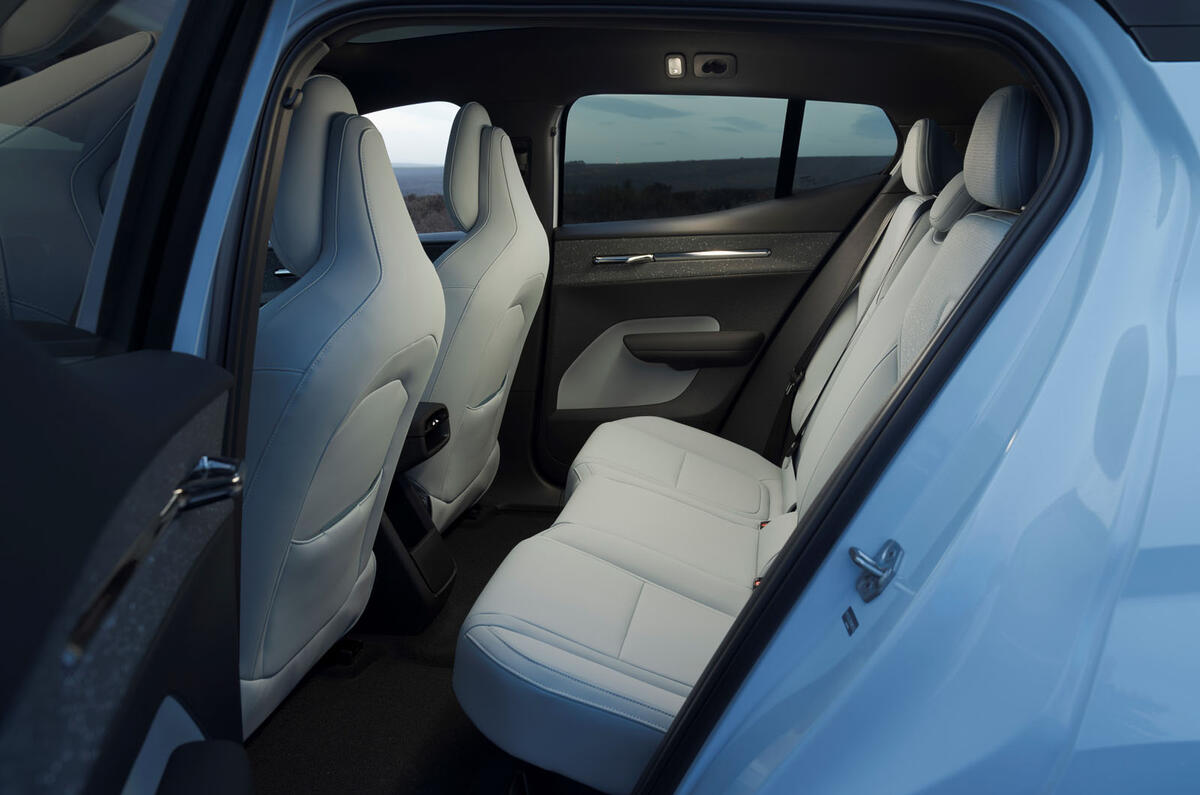
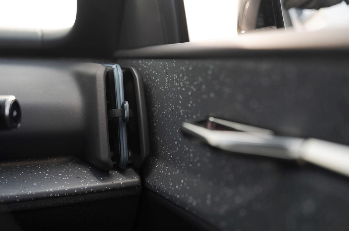
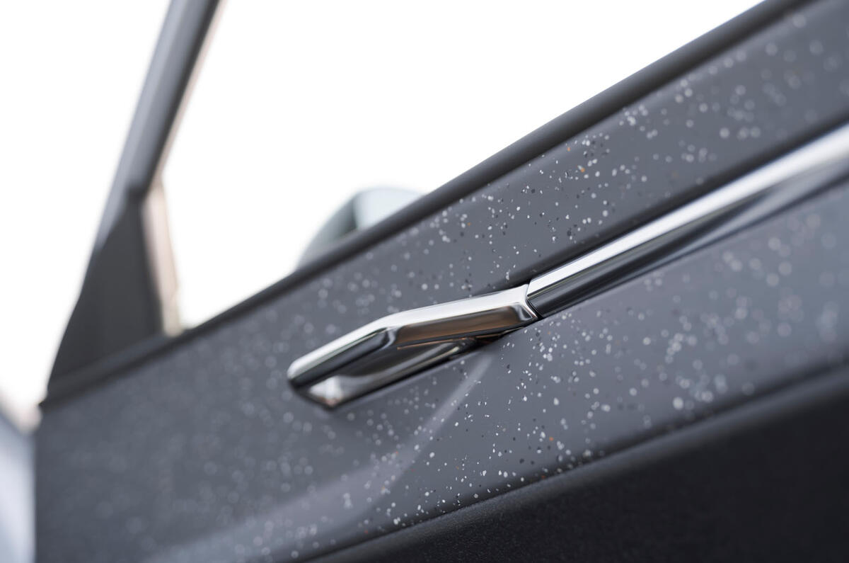
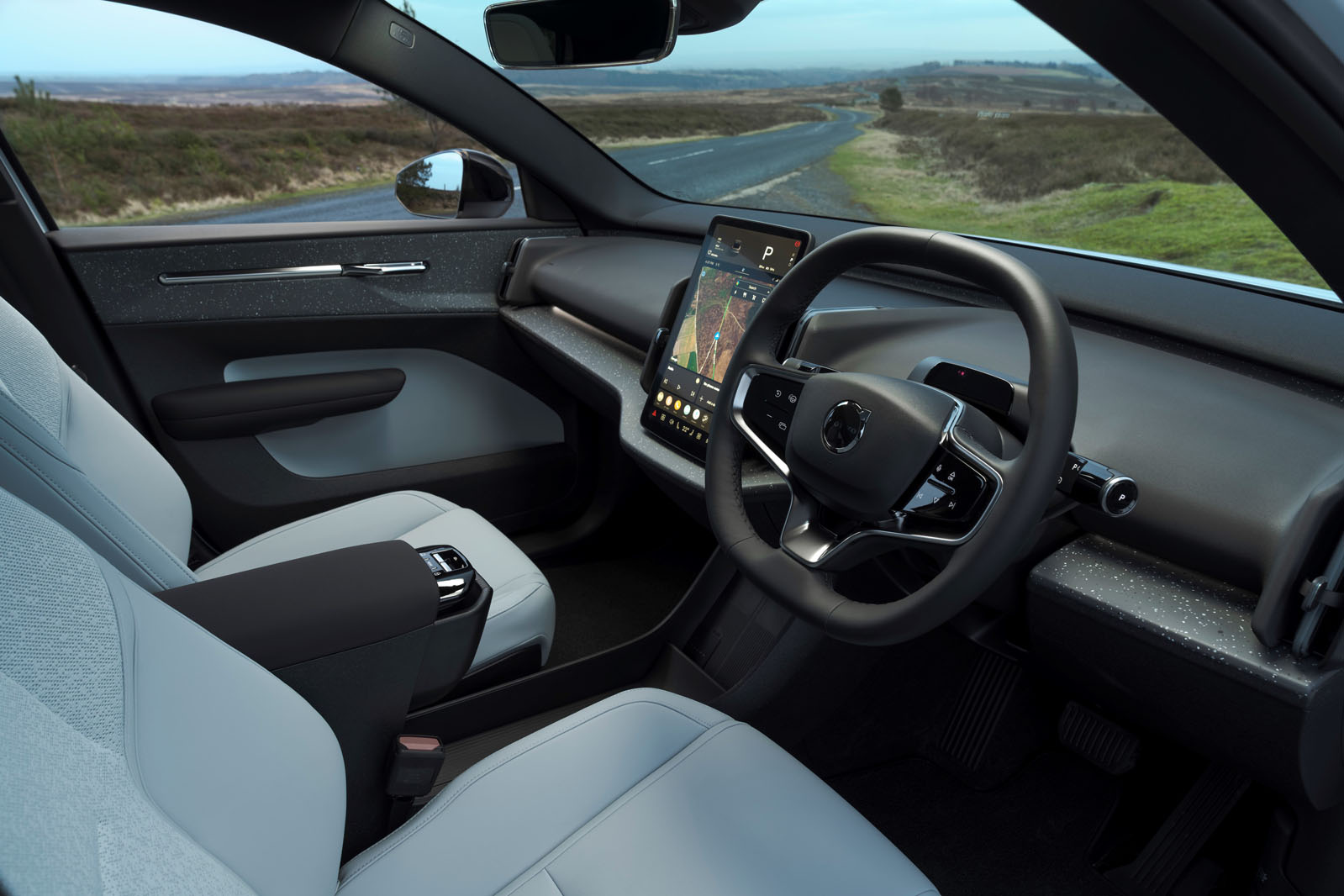
It’s a tribute to the skill of Volvo’s interior designers to have made the cabin of the EX30 such a neat, tactile and appealing place to be. It 145mm 15mm Centre uses plenty of recycled materials, yet its mouldings and trims feel inviting, solid to the touch, and both interesting and alternative.
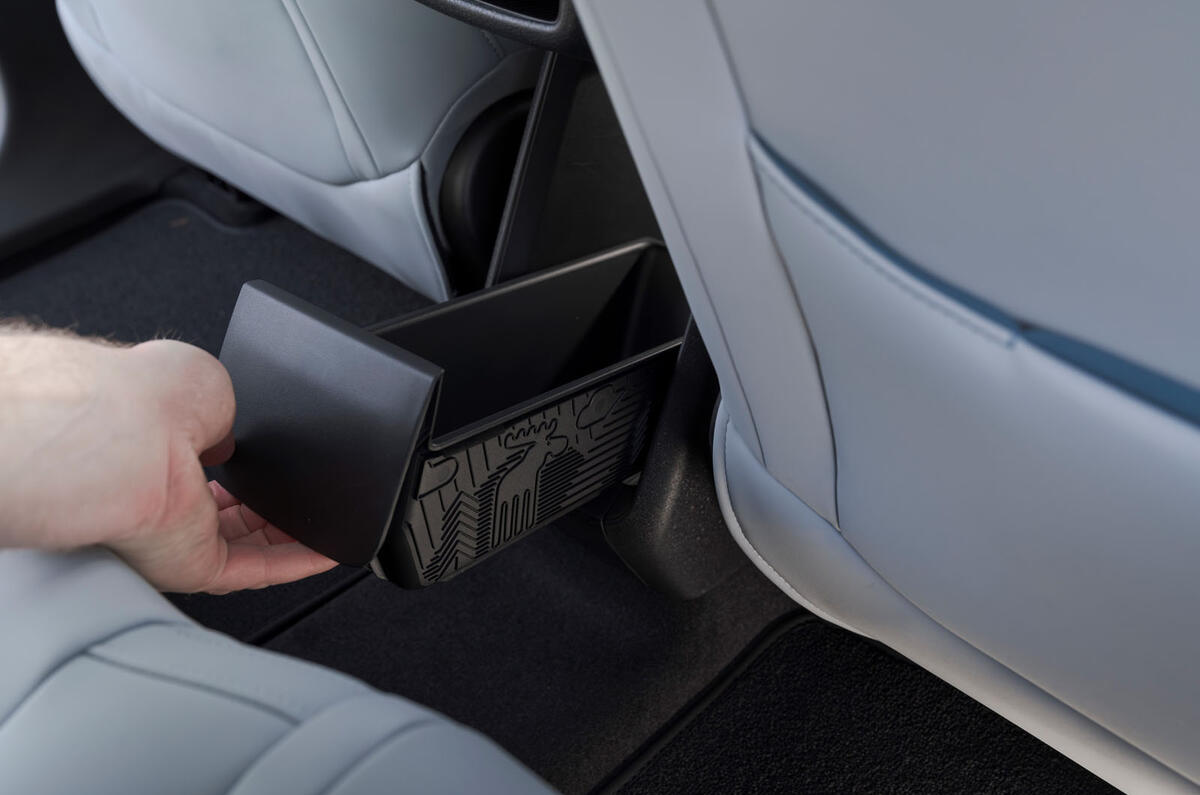
And then you start to notice what’s missing. In front of you is neither a driver’s instrument binnacle nor a head-up display. The car’s electric window switches are on the centre console to your left, and so, immediately to your right, the door console contains neither audio speakers nor any switchgear. Clever, centrally mounted, drawerstyle cupholders (which slide out from under the centre armrest) and a small, centrally mounted glovebox ahead of them make so much of the fascia and surrounding cabin layout symmetrical, so as not to add manufacturing complexity for right- or left-hand drive.
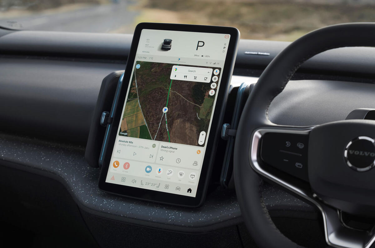
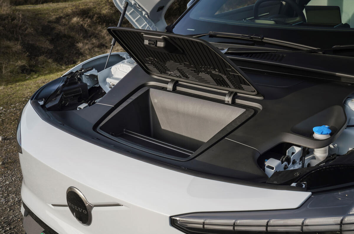
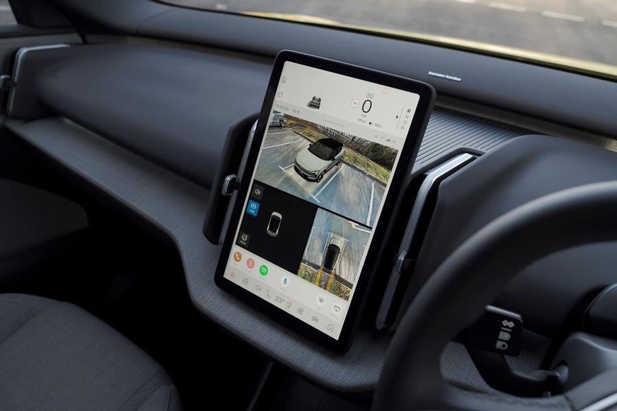
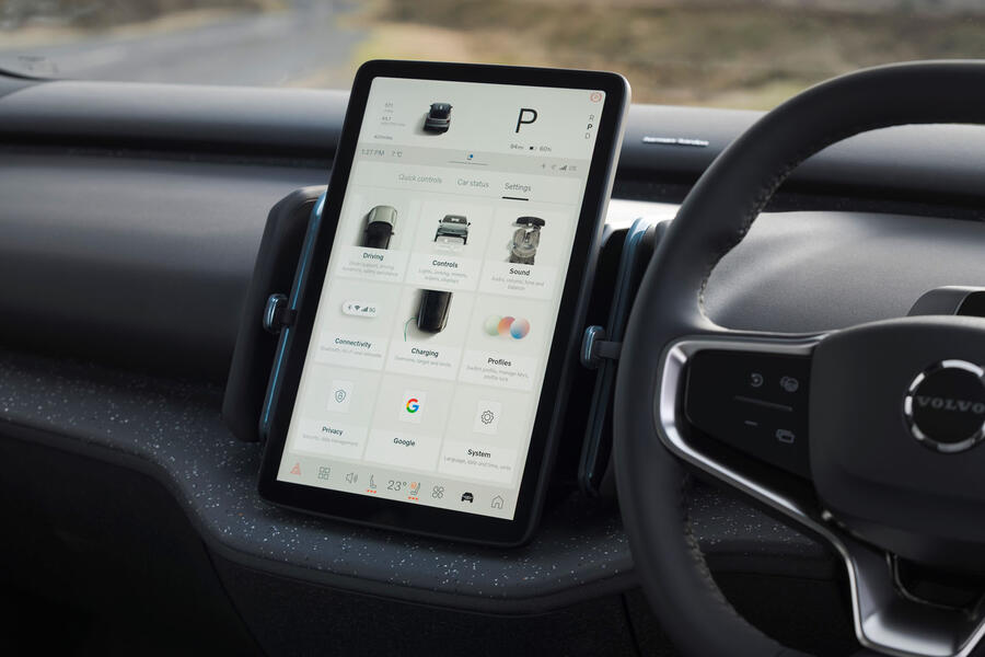
There is little in the way of a lower dashboard, with extra storage available instead in a shallow covered floor bin ahead of the centre console. Above that, the car’s 12.3in, portrait-oriented touchscreen infotainment system sits, carrying a simplified digital instrumentation panel at its uppermost edge, and everything else – from trip computer data to navigation mapping, audio, telephony and climate controls, and so many secondary controls for things like foglights, wiper control and ADAS systems – accessible below.
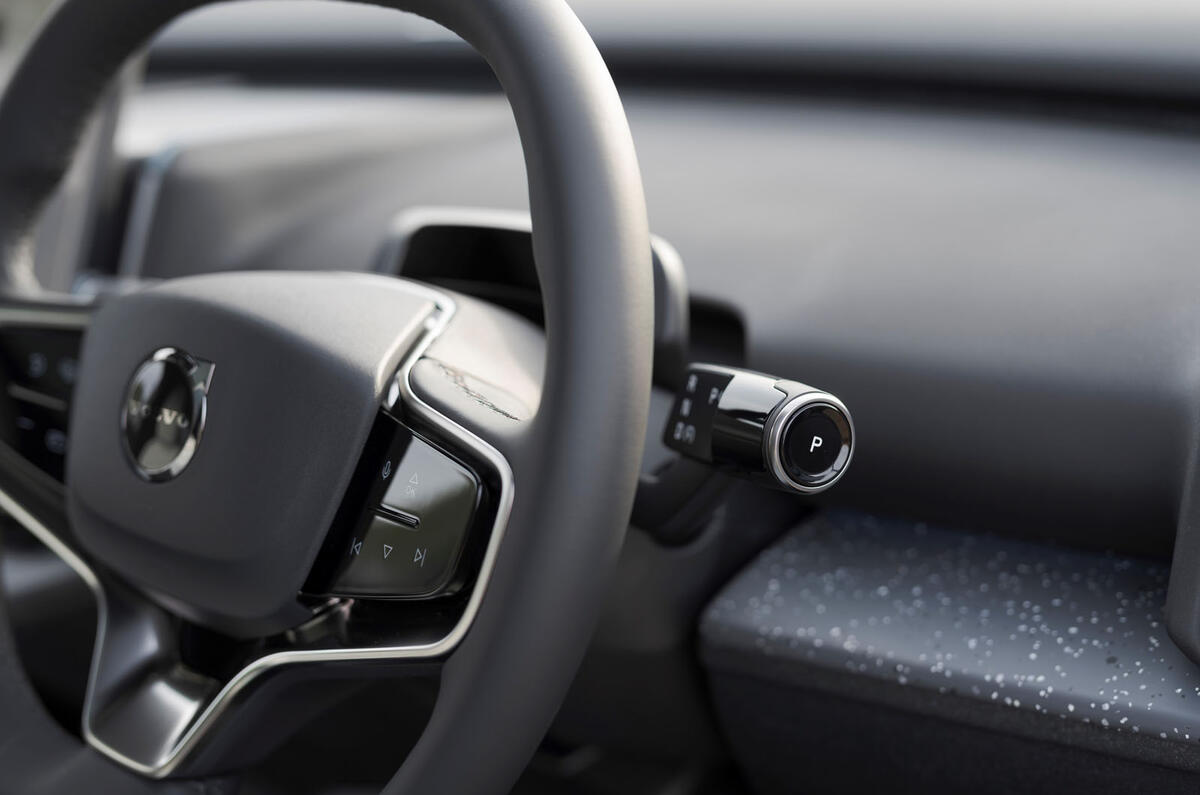
Suffice to say, this is a pretty bold ergonomic rethink – and, in our book, a problematic one. Although the steering column does have physical stalks for transmission control (right) and main beam/turn indicators/windscreen washers (left), and there are also a few physical switches on the steering wheel spokes, that’s still a lot for one ‘centralised’ touchscreen console to manage. It falls down for top-level accessibility of key functions – and seriously enough to constitute a significant drivability problem. It takes too many individual interactions to deactivate the driver monitoring or speed limit alarm systems, for example – and, without a tactile physical cursor controller, diverts too much of your attention from the road in the process.
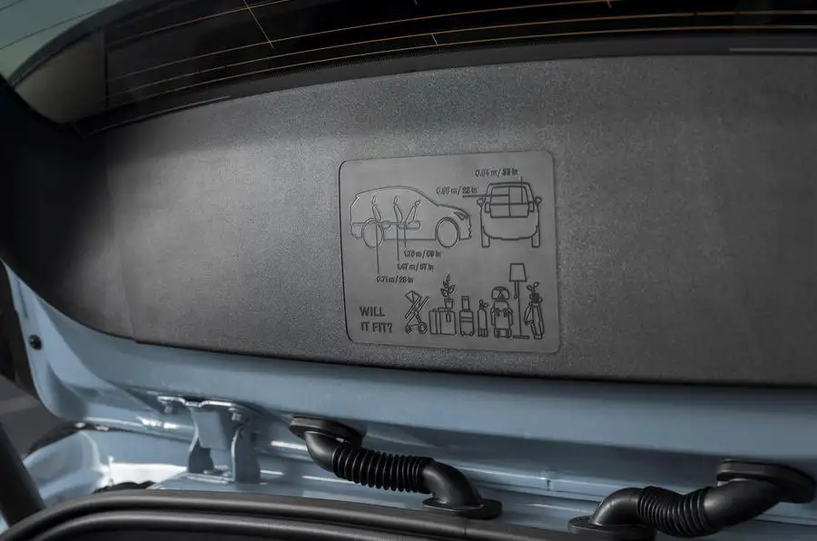
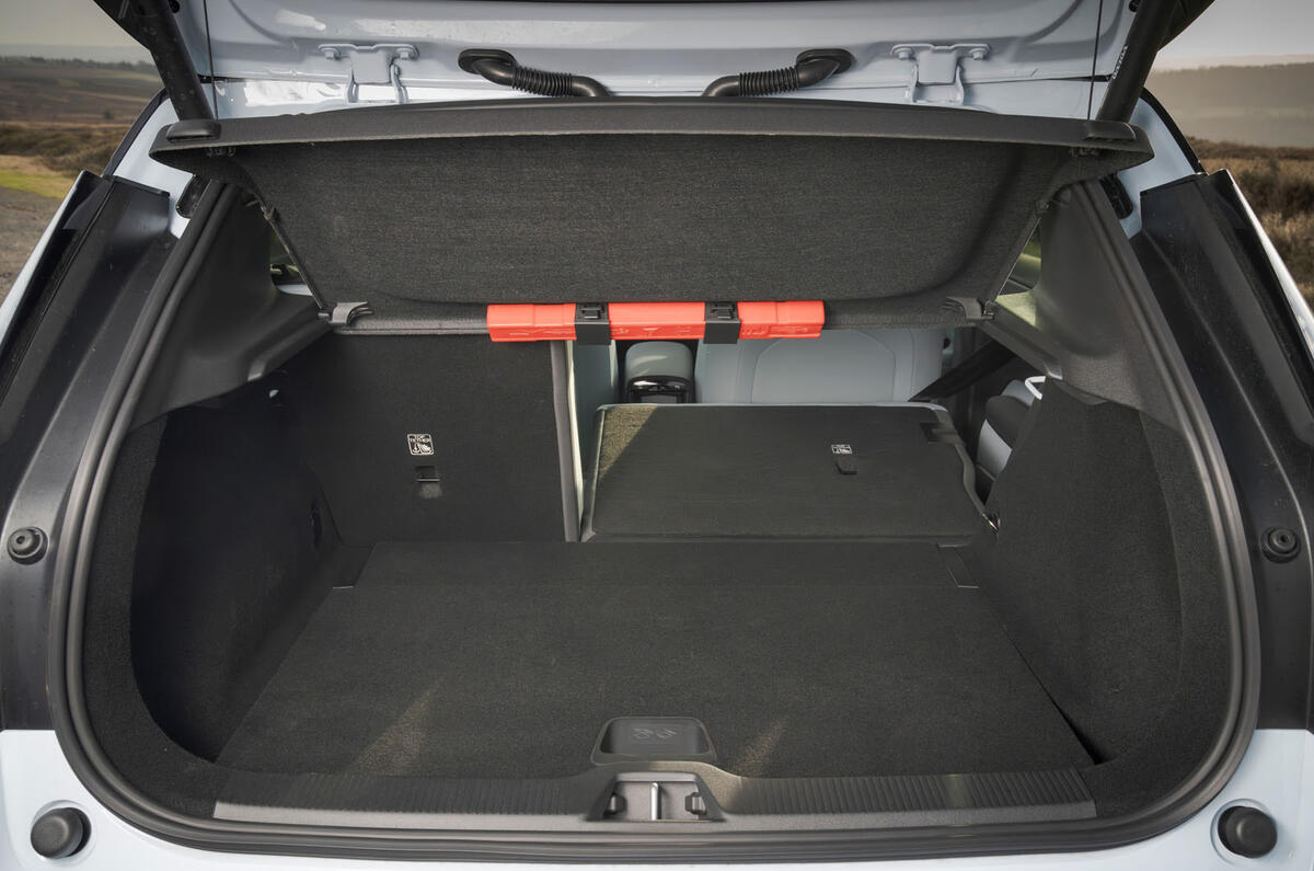
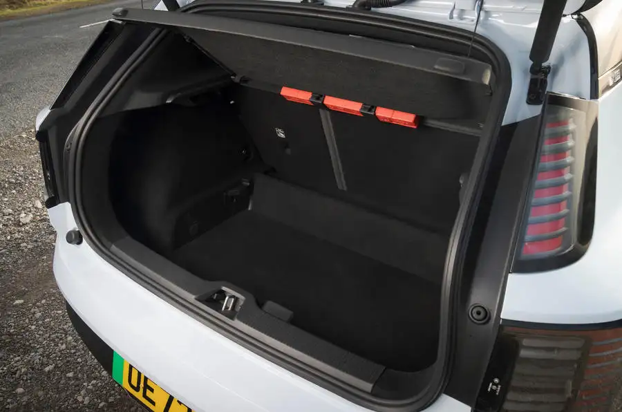
Volvo claims that an over-the-air software update for the infotainment home screen, due later this year, can address the problem, and well it may. Still, in the main, you might expect a safety-centred Volvo to be quite a lot simpler and easier to operate, and much more reassuring than distracting to drive, than this – not to say more practical (neither second row nor boot space deserves credit in a class of significantly more practical options).
Multimedia

Volvo’s 12.3in infotainment system for the EX30 is powered by Google Automotive software, but the company has promised wireless mirroring with Apple and Android handsets since the car’s debut. It was disappointing to find on our test car that Apple compatibility has so far been omitted (the same thing happened with the Polestar 2 when new), although Volvo claims it will be added via an over-the-air software update.
Top-level navigability for the system lacks the user configurability of rival systems, and so your most accessed functions can remain hidden behind layers of menus. Volvo allows some adaptation of the home screen but not of shortcut toolbars, which would make a big difference. As it is, controls for functions that directly affect the car’s drivability (and that reset to ‘on’ automatically) simply aren’t accessible enough.
A benefit of the nav system being Google-based is anyone with a Google account will have their saved addresses and recent destinations waiting for them. Our car’s Harman Kardon premium audio sounded a little thin for its lack of door speakers.


