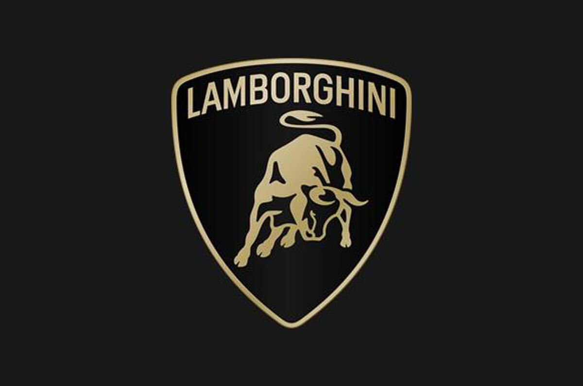
Lamborghini has refreshed its logo for the first time in more than 20 years, giving its trademark raging bull badge a new look that aims to promote the firm's attributes.
The new logo, which will be applied to all new cars going forwards, is said to "better reflect the "brave", "unexpected" and "authentic" values" of Lamborghini's 'mission'.
The Italian supercar manufacturer has also created a new bespoke font that "echoes the unmistakable lines and angularity of the cars".
The emblem itself is very similar to the previous iteration, but the bright gold detailing has been toned into a subtler bronze and the Lamborghini name is written in a "broader" typeface, "symbolising the clear identity of the brand".
The first car to wear the new badge is expected to be the plug-in hybrid version of the Urus SUV, due to be revealed in the coming months, followed by the Hurácan's successor later this year.
Notably, the bull itself will appear individually – without its shield-shaped surrounding and the Lamborghini name – for the first time on the company's website and social media channels.
The rebranding programme is the latest step in Lamborghini's 'Direzione Cor Tauri' business strategy, under which it will electrify its line-up by the end of 2024 and introduce its first EV – based on the striking Lanzador crossover concept – in around 2028.


Join the debate
Add your comment
Marketting bods have an impressive capacity for talling rubbish...
...better reflect ... Lamborghini's 'mission'.
Lamborghini may retain the bull on their logo, but stop naming the car after fighting bulls. Lamborghini's mission is not promoting the cruel bullfighting.
Subtle but braver?, I don't care what the badge looks like, I'm buying the Car for what it does, how it makes me feel, so it's for future products,don't think there are many people who don't know their car brands at a glance.