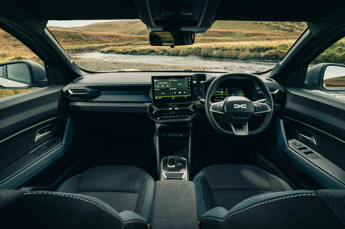
Inside is where the outgoing car is feeling its age, being just a bit plain. The new one addresses that.
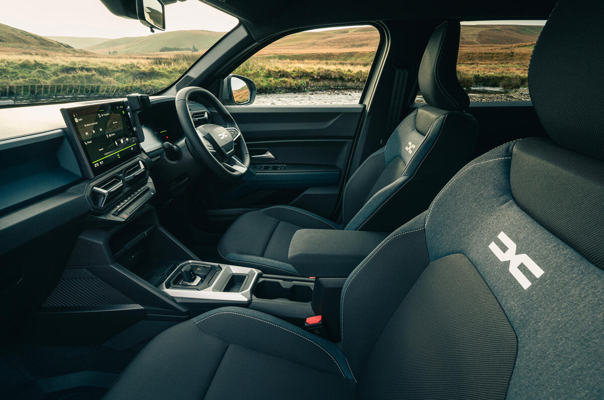
It still doesn’t feel like an expensive, upmarket car: it’s all hard plastic in here, but it’s a bit more designed.
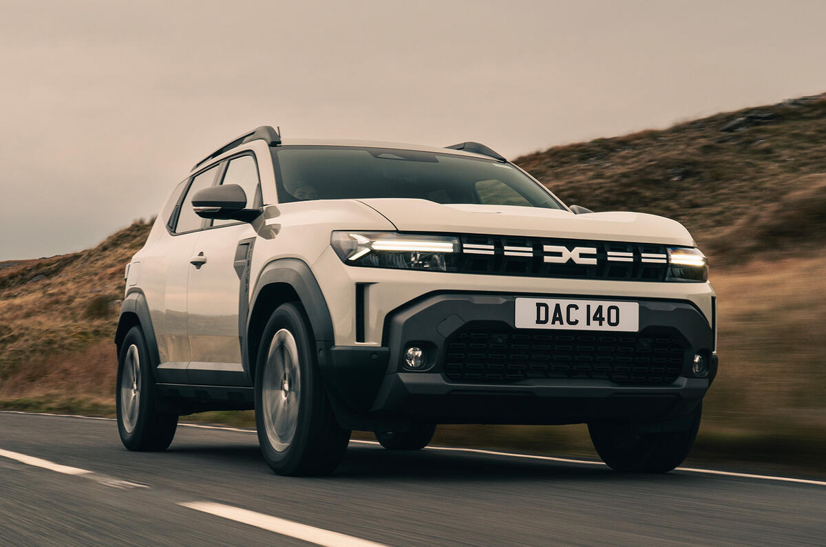
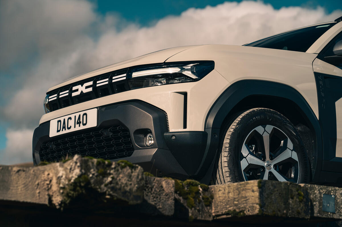
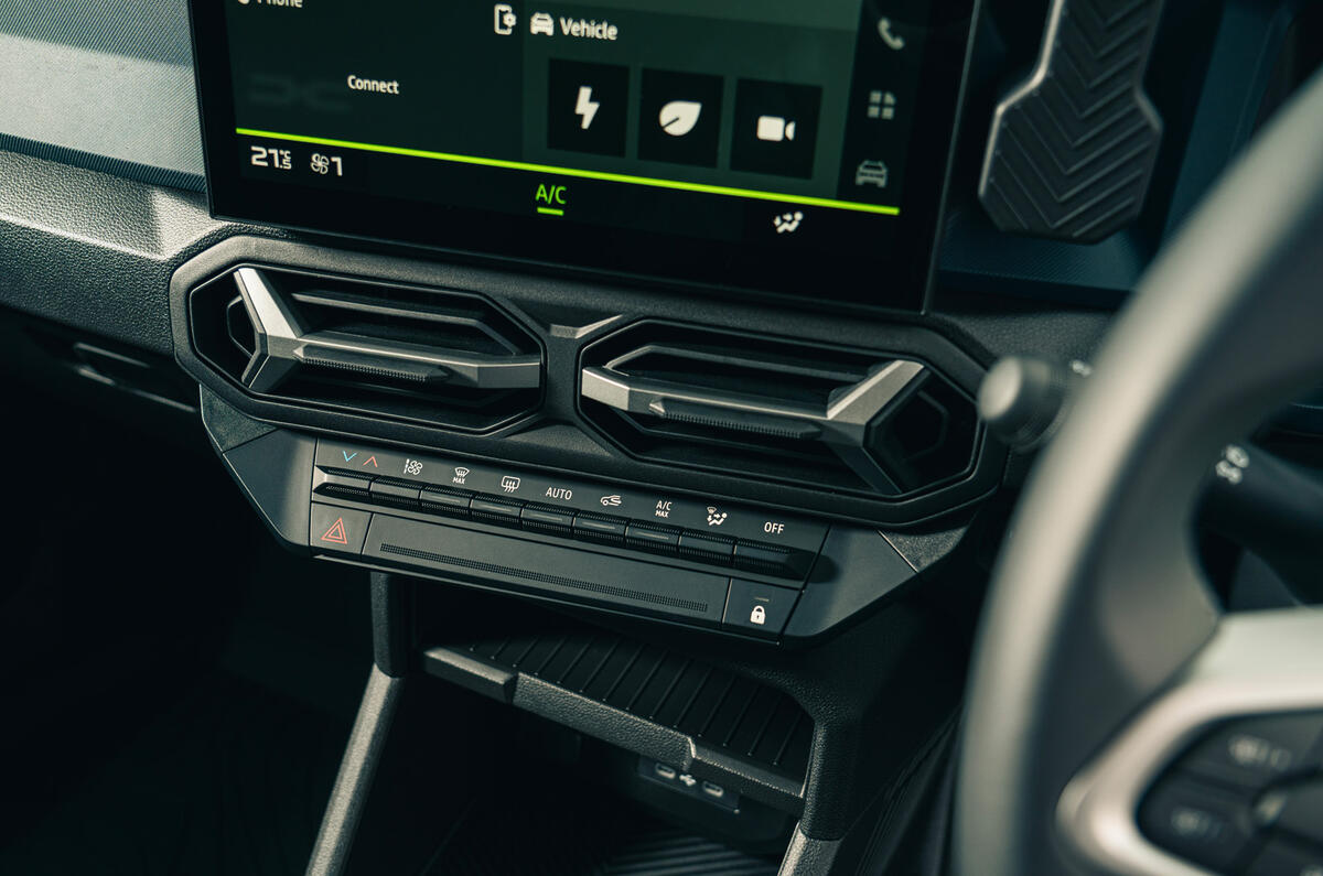
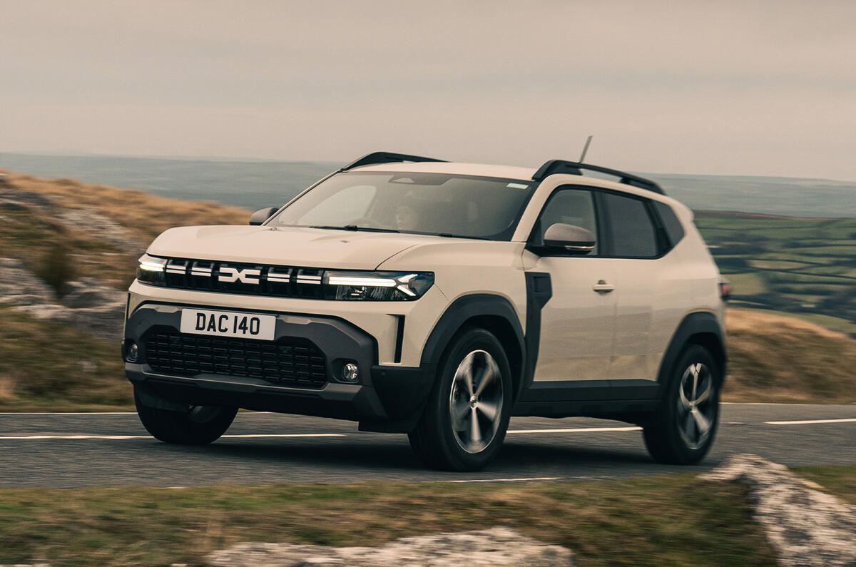
The exterior has Y shapes as a motif in the lights and that continues with the interior air vents.
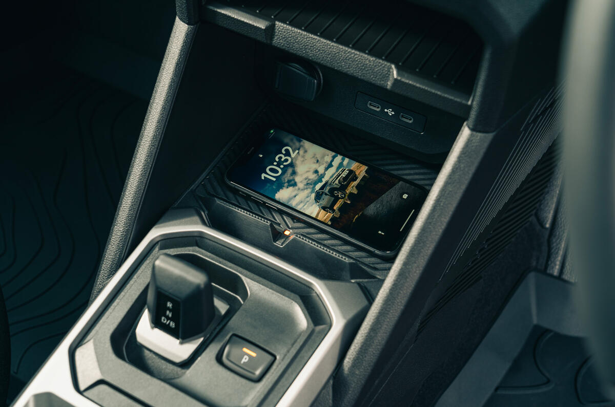
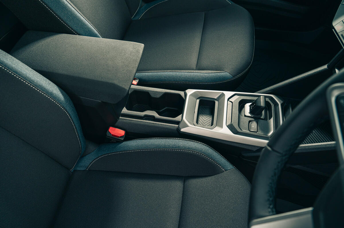
Cheaper trims might be greyer, but our test car had a splash of colour on the dashboard and I was really charmed by the ‘jeans’ upholstery. There’s a good selection of trays and cubbies too.

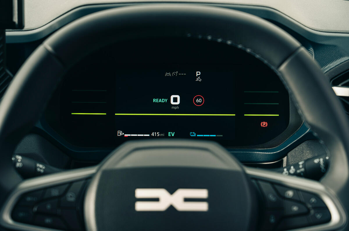
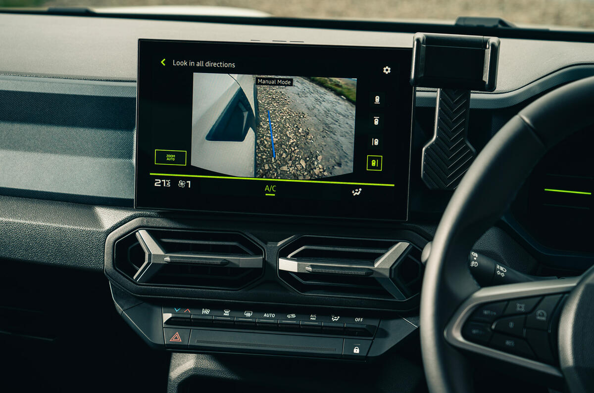
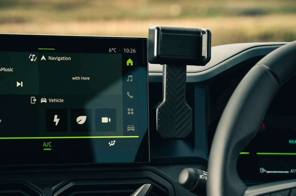
More digital tech has sprung up, something we'd argue the Duster didn’t need. Entry-level trims have analogue gauges with a small screen between the dials, and a phone holder instead of a centre screen.
We suspect that might be the best set-up. The test cars on our launch event all had a digital gauge cluster and a 10.1in central touchscreen.
Both of them look good and work fine, but the driver display doesn’t really provide much added value apart from looking more modern for the sake of it.


