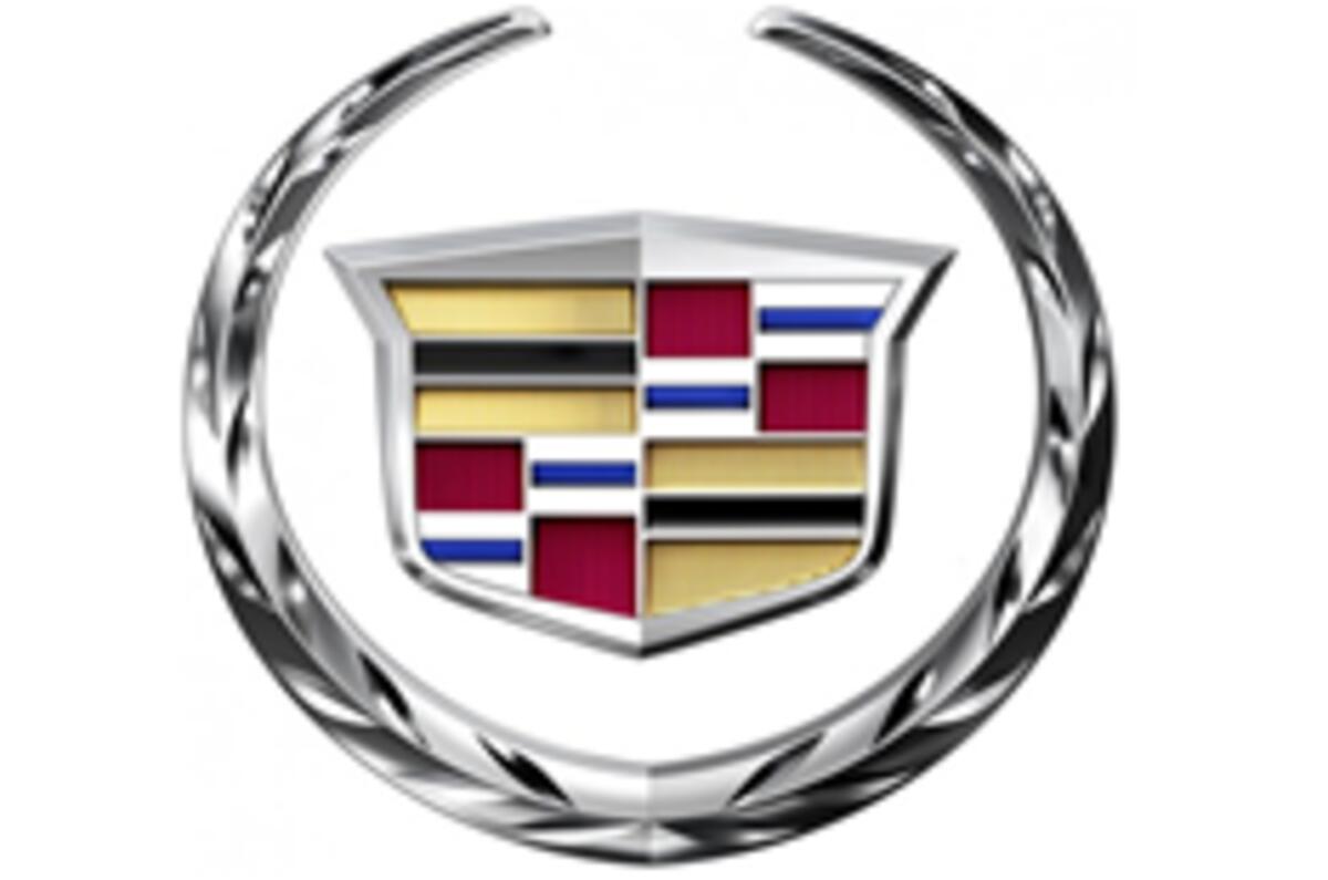
This is the facelifted Cadillac logo.
The mildly tweaked logo has been put into use without any announcement from the company, replacing the previous version after ten years.
Changes include a more textured effect on the wreath and inside the crest, and enhances the embossing and light effects of the crest edge.
No announcement has been made as to when the logo will begin to be used on Cadillacs


Join the debate
Add your comment
Re: Cadillac facelifts its logo
Well your entitled to your opinion, I don’t agree, in my opinion the current lineup is great.
The Caddy CTS/CTS-V and the new Sport Wagon are great cars and match their rivals in every conceivable way. This is not the 70s, 80s, or even 90s; the new cars are a long way from past indiscretions. I understand they have a checkered history to overcome, but to be fair they are worlds apart from decades past.
Re: Cadillac facelifts its logo
Jack,
there are very few cars i would want less than a Cadillac. Sorry mate, but IMHO there entire range might as well be junked and started again. I also cant think of a single one that can "match or beat thier competition" and even if they did have one, i wouldnt touch it will a barge pole as it would be worth 1/4 of naff all in 3 years time.
So really they need to be addressing their image and range, rather than worrying about a few extra shadows, and colours on the logo!
Re: Cadillac facelifts its logo
Your namesake…