A few weeks ago I spent quite a few hours driving the new Mercedes CLA saloon. It was the Great British Weekend – Goodwood Festival of Speed on Saturday and Flying Legends at Duxford airfield on the Sunday. Goodwood is great, but for me it will never beat watching a fleet of Spitfires taking off…
Even though the CLA had the base 1.6-litre petrol turbo engine – and the sort of eco-restrained throttle response that makes the car feel underpowered – the CLA went surprising well when pushed and returned pretty decent economy over a blisteringly hot weekend. On poor roads the ride was unimpressive, but the CLA is an appealing package.
During the seven or so hours I spent at the wheel, something fundamental dawned on me. I was staring at the CLA’s instrument binnacle – with its flashy silver-edge binnacles, tablet-style screen and bank of controls on the centre console – for long periods. But for 95 per cent of the time I was looking at the speedo needle and the radio display.
Which made me question two things: why the important sections of the speedo (around 30mph and 70mph) cover such tiny arcs. And why the nice, big, radio display was off-centre.
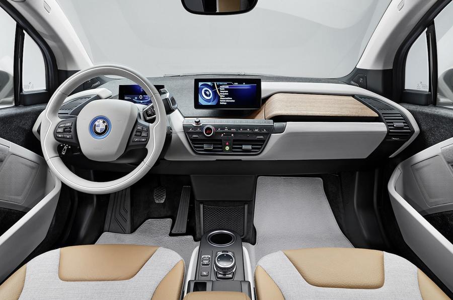
The time I spent facing the CLA’s impressive cockpit, I couldn't help but think that it is time for the car industry to rip out the dashboard and start again from first principles.
The idea of having a cluster of instruments crammed into a binnacle small enough to be seen through steering wheel and then taking up much of the dash face with air vents seems remarkably outdated. That flat elevation in front of the driver, peppered with instruments, has hardly changed in principle since the beginning of the auto industry. Even the term ‘dashboard’ goes back to the days of horse-drawn carriages.
Going back to first ergonomic principles, any instrument pack or display should be mounted much further forward, towards the base of the windscreen. The time it takes for the eyes of a no-longer-young driver to go from focusing a couple of hundred feet down the road, to the speedo and back, is long enough to miss, say, a bicycle appearing out of a side street. Staring at the 3-4mm difference between 30 and 35mph is even, I would suggest, more unsafe. And do we really need the centre stack to be stuffed with complex climate and audio controls?


Join the debate
Add your comment
Minnesota BMW
Regards,
it's really wonderful BMW is
Old Toad...
I agree with all you have said! The i3 is a pointless, stupid looking car with stupid doors and not hi tech, the electric tech is not too clever either. Yet as it's a BMW it will be idolised by journos who need a scoop, they must dare say they agree it's nothing special...it could cost them a night in a 5* with a bar tab!