Currently reading: McLaren P1 designer Frank Stephenson on modern car styling

The American designer has spent more than three decades at the top of the vehicle design game. We get his take on current affairs and future possibilities

Ford, BMW, Mini. The top styling jobs at Maserati, Ferrari, Fiat, Lancia and Alfa Romeo, then leading McLaren’s design journey from a standing start to the dawn of an entirely new product cycle. Frank Stephenson has some CV.

Unfettered by the birth of Frank Stephenson Design in 2018, the 62-year-old American’s current projects are intriguingly diverse, extending well beyond the automotive world.
98 Fiat 500

So we wanted to know what views this unique perspective would lend to the armchair designer topics du jour. Should electric cars look different from fossil-burners? What four-wheeled artistry can I buy on a budget? And, not unimportantly, are SUVs inherently ugly?

As the constraints of internal combustion engine packaging fade, how might car design evolve?

“The EV world will change everything we know about interior packaging. When you start reducing the powerplants, you’re going to open up a lot of room inside the vehicle, which should be used to maximum effect. You have to start radically changing the architecture. Family vehicles will have a lot more comfort. Perceived space is comforting: that’s why people fly first class.
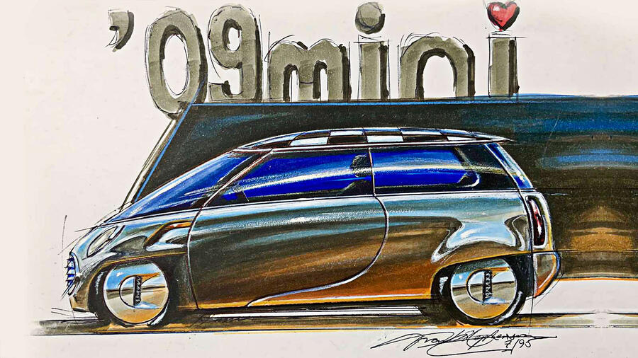
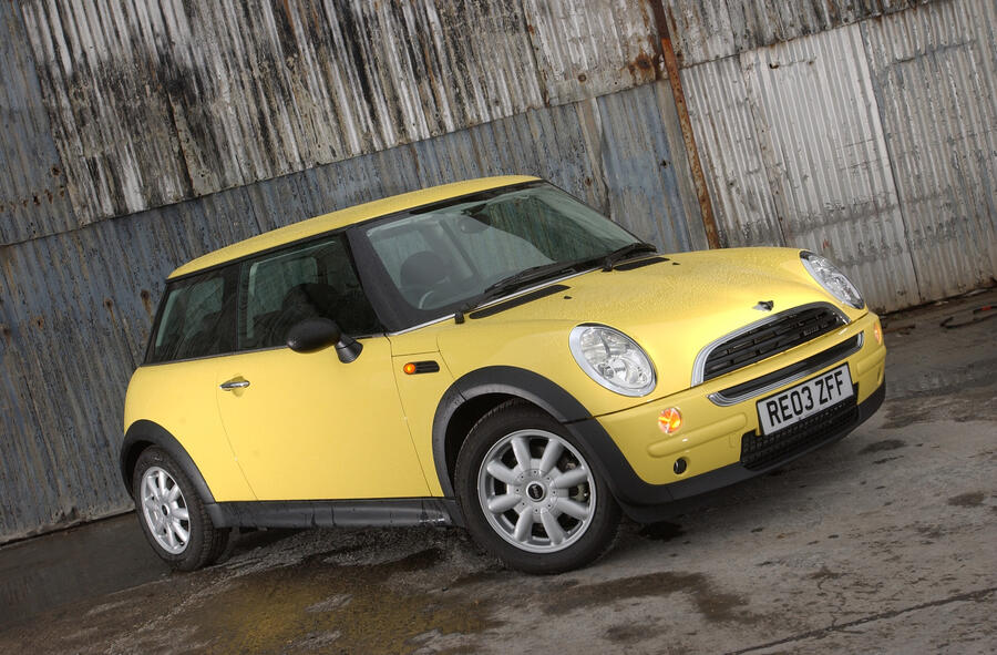
97 Mini 09

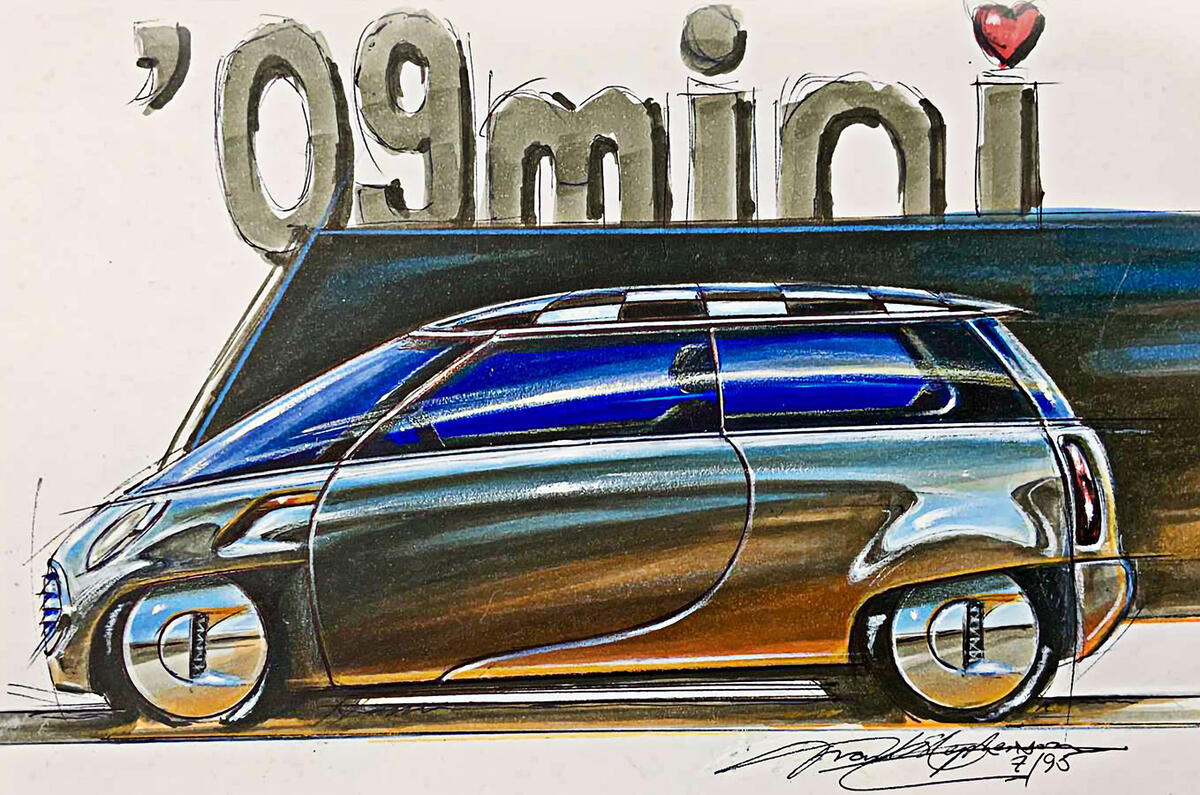
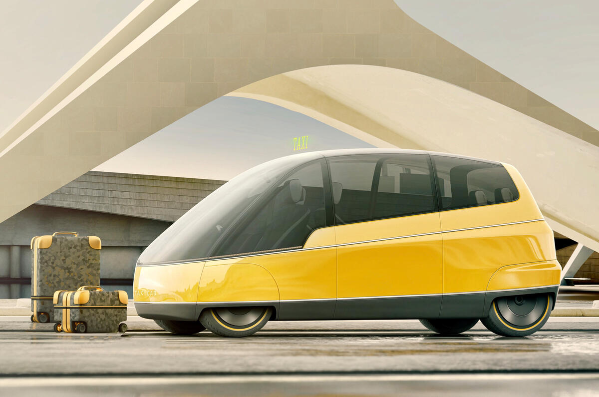
“And that will reflect in the exterior design. When designing the new Mini in 1995, I did a sketch that was 10 years ahead of the [2000] car. I completely changed the architecture with an electric motor in the front but tried to keep the Mini look. The length stayed the same but it had super-short overhangs that really helped with the interior. That’s how I think cars will become: one-or one-and-a-half-box designs, rather than two- or three-box, like a sedan. Wheels will be pushed out to the corners and you will get a blunter front end. Then it’s the designer’s job to make it look exciting.

Back to top

“Aero isn’t a problem: you can make an aerodynamic brick if you want to. It’s a dark art. Flushness is important: minimal gaps, clean surfaces. It’s not so much of a challenge as when we were doing clays in the 1980s and 1990s and you started getting this ‘bar of soap’ look. It’s about a scientific understanding of what’s happening under the car. And electric motors provide enough power to counterbalance aerodynamic problems. There are a lot of solutions coming that will shock us. I don’t think we’ve bottomed out on aerodynamics by a long shot.”

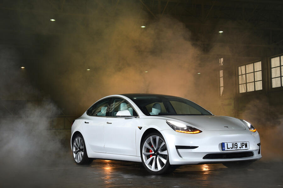
Why are production Teslas so conservatively styled, despite their focus on technology?

96 Tesla model 3

Tesla has taken a smart approach. As a customer, the last thing I would want for a new car company in that price bracket is to change designs like we change our shirts. You wouldn’t see a consistency or a confidence if it changed often. They’re refining their design language, not making big changes. There’s nothing wrong with the way a Tesla looks: they’ve pretty much hit the nail on the head from the get-go.

“There’s an element of timelessness when you don’t radically design a car that’s meant for the masses. If you’re doing a hypercar, you’re doing haute couture; you’re making a statement. But the cleanliness of Tesla design is going to look good for many years. You know it’s a Tesla; it doesn’t look like anything else. It’s like nice, clean, clear handwriting: it doesn’t go out of style.

Back to top

“That’s not to say I like the Cybertruck, though: it’s the one vehicle I hate the design of most in the industry today.”

Which production EV design most impresses you and why?

95 Volkswagen id3

“I don’t think anyone has arrived at that look that really takes advantage of electric motorisation. But I like the Volkswagen ID 3 as a smaller car: Volkswagen Golf-like but quieter, smoother – faster, maybe. Designwise it doesn’t rev me up, but it is what Volkswagen is. There are quirky elements, but it’s serious, sterile and Germanic, which is a good thing.

“I really like the profile: one-and-a-half-box. Its proportions are dynamic, it’s got a little bit of push to it, it looks fresh. I like the impression that the glass extends quite far forward. You don’t need such large air intakes on the front. I prefer the front end as a solid wall with side intakes for the brakes and minimally sized other cooling intakes.

“I don’t like blacking-out sill panels, because that lifts the bottom of the car and makes it look a little more off-road. From my viewpoint, it should look planted. The back is nice and clean, but I don’t like that the black goes down to the bumper: that takes a lot of the solidity of the car away.

Back to top

“I like it because it’s different yet still Volkswagen-ish. But it’s not a masterpiece of design in my book.”

Why is it hard to design a beautiful SUV, and who does the best job of it?

94 Aston martin dbx

“We don’t tend to like big objects. It’s not that an SUV is huge, but it’s not cuddly. But there’s no reason why you can’t make a lithe-looking, agile-looking SUV. Aston Martin has done a very good job with the Aston Martin DBX. It kind of looks like a sports car.

"I feel repulsed by the Lamborghini Urus: it’s over the top, like a Versace dress, like: ‘Why are you wearing that!? It’s 9am!’

93 Lamborghini urus

Back to top

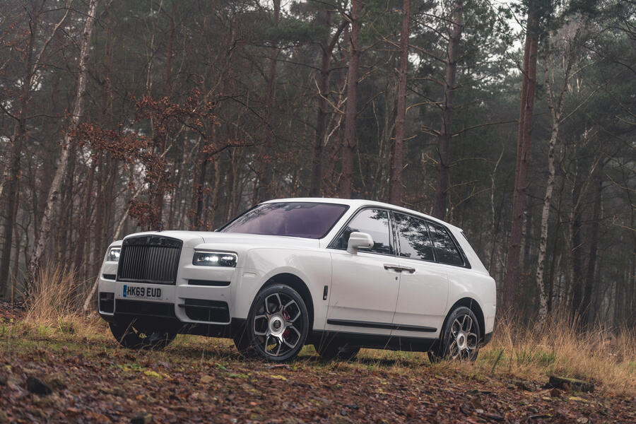
I’m curious to see the Ferrari Purosangue. The Bentley Bentayga and the Rolls-Royce Cullinan have finesse all over them, but they’re bulky, almost brutal palaces on wheels. I do like the Range Rover Velar, because it’s like a suit that has been massaged to fit what’s underneath. It’s not a box on wheels: it has a lot of form, complex shapes and surfaces. 

“You can work with the greenhouse to lighten up the vehicle, not make it look like you’ve got the curtains drawn in your house. SUVs are typically family vehicles, so opening up the side glass area is a better approach. It’s not an SUV, but Citroën did that with the [Xsara] Picasso: it was very airy inside and they managed to make it look very cool and unique.

92 Rolls royce cullinan

“In terms of electric SUVs, if you’re running four in-wheel motors, you don’t have a transmission tunnel to worry about, just a battery, which allows you to increase space and rethink the interior.”

Frank of all trades

91 Frank stephenson taxi

Back to top

“In the car business, you’re used to designing not only exterior surfaces but also steering wheels, instrumentation, buttons, lights, wheels – everything that needs a look. It prepares you to go into many other industries,” says Stephenson.

And that breadth is illustrated by his current workload, which includes two remote-controlled cars to race on the moon under the Moon Mark project, various short-haul electric VTOL aircraft, blast-absorbing seats, watches, graphics, logos, a supercomputer, race car liveries and “a chocolate bar that doesn’t look like a chocolate bar”.

Educated opinion

90 Ferrari f430

We at Autocar tend to leave aesthetic judgements to the reader. Eye of the beholder and all that. But Stephenson says it’s not that simple: “From an education point of view, designers learn what good design is and what bad design is, and if somebody outside of our circle says ‘that looks great, that’s good design’, then from a trained point of view we can tell them ‘no, you’re wrong’. But on the other hand, if someone likes something or dislikes something, that’s up to them. Taste is subjective; good design is not.”

Frank’s greatest hits

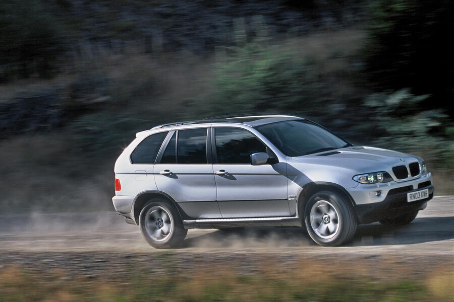
BMW X5, 1999

Back to top

89 Bmw x5

Such was the time pressure from Wolfgang Reitzle to see how a Land Rover-type BMW might look that Stephenson sketched his design for the original X5 while on a flight.

88 Bmw x5

A full-sized clay model was ready six weeks later.

Mini 3-door, 2000

84 Bmw mini

Back to top

Four theoretical iterations, each spanning a decade of evolution, led Stephenson from the original 1959 Mini to the R50 design that eventually made production.

83 Bmw mini

It referenced the English bulldog through its stance and underbite.

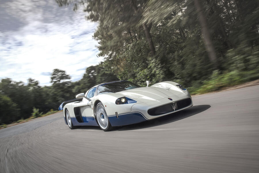
Maserati MC12 Stradale, 2003

82 Maserati mc12

Clothing innards sourced from the Ferrari Enzo, Stephenson set about designing a GT1 racer that could feasibly yield a limited homologation run for the road.

Back to top

81 Maserati mc12

Its intricate aerodynamic strakes had to be hand-fabricated. 

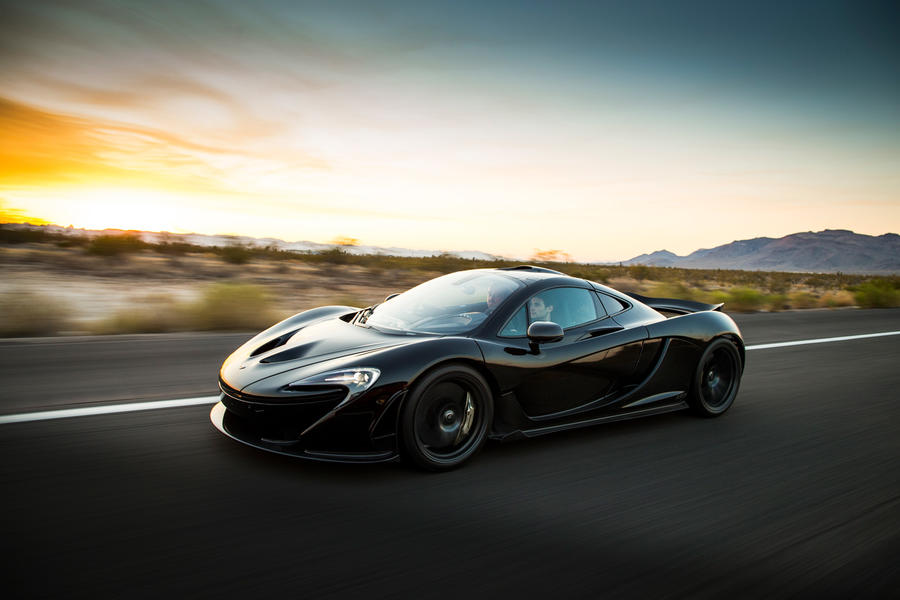
McLaren P1, 2013

79 Mclaren p1

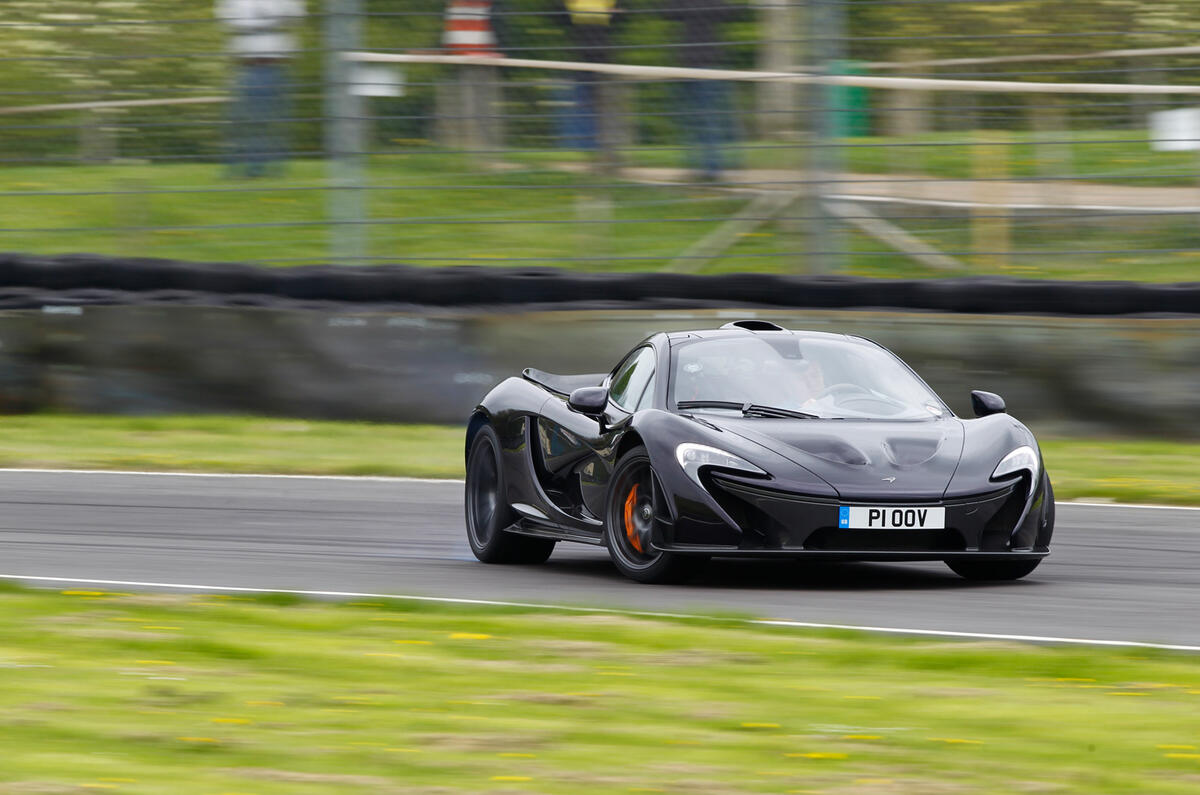
As with the Mini, biomimicry was a strong influence while Stephenson designed McLaren’s hybrid hypercar, which imitated the sailfish – reputedly the fastest animal in the ocean, at 70mph flat out.

77 Mclaren p1

Back to top

Stephenson had one stuffed for aerodynamic inspiration.

Frank’s favourite bargain beauties

76 Saab 93

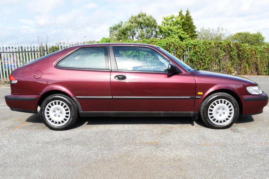
1998 Saab 9-3: “I have a deep love for Saabs, because I grew up with them in the 1970s. My father was a Saab dealer and I got used to the styling when I was very young, so it feels familiar. They did the two-box hatchback design in a much more characterful way than other car companies, because of the negative slope on top of the C-pillar that had a sort of concave shape.

“They blacked-out the B-pillar so you have a large expanse of glass on the side, and I like the front and rear screens; Saab typically used interesting glass profiles. It has that distinctive grille, which isn’t the prettiest but looks like it was designed for performance. And still the ignition between the driver and passenger, which is cool. There’s no fuss on it, like the Swedish mentality of not going over the top. It’s quirky but serious.” 

One we found: 2000 9-3 2.0t 3dr, 24,000 miles, £6495

75 Renault avantime

Back to top

2001 Renault Avantime: “This is a love-it-or-hate-it design,” Stephenson says. “The designer, Patrick Le Quément, is an architecture and boating enthusiast, and it shows in the Avantime. It has flying buttresses, shapes we hadn’t seen on a car before and a geometric look that was helped by the two-tone colour.

“Nobody puts an A-pillar ahead of the front axle, but they did it. Frameless windows were unusual on a big car but look fantastic when done right. The rear glass is amazingly curved – I don’t know how they did it – and the tail-lights were another madman-or-genius touch. They look pinched near the top then expand again, like a venturi effect.

“If I saw one today, I would think it were from the future. It had me thinking Renault was going in a new, architectural direction, but they dropped it like a hot stone.”

One we found: 2003 Avantime 3.0 V6 Privilege, 95k miles, auction estimate £3500-£4500

74 Bmw z4 roadster

2002 BMW Z4 Roadster: “From the Chris Bangle era of ‘flame surfacing’, this isn’t a beautiful design but a funky design. It represented a pretty major shift. A lot of it isn’t traditional to how car designers work: we don’t like the middle of the car to sag or hard edges running into soft edges, but you get all that here. You could say the design is a little over the top, because it doesn’t need all the curves it has, but that’s what makes it interesting.

Back to top

“For simple proportions, this car is really good. It’s very cab-rearward: you felt important with that really long bonnet, and the rear is sort of like a Marcos. They pushed the hips out; it sits well on its wheels. It’s a tough little guy: more toned up, without the excess flab the Z3 had.”

One we found: 2004  Z4 3.0i, 68k miles, £6750

Join the debate

Comments
20
Add a comment…
michael knight 13 February 2022

Some good stuff, but Saab 9-3? Of all the Saabs you could choose that is the blandest peice of design of the lot. 

And the BMW x5 is one anti-social design, i hate it with a vengance. the sheer rea-end bulk of it was a big f-you to most other things on the road. It's a cartoon. 

TS7 13 February 2022
I don't agree with what he says:

"designers learn what good design is and what bad design is, and if somebody outside of our circle says ‘that looks great, that’s good design’, then from a trained point of view we can tell them ‘no, you’re wrong’."

A good design is what works for the individual, not what we're told.

abkq 13 February 2022

'I like X' doesn't always coincide with 'X is beautiful'

'I like X' is what works for you, even in the case when the general consensus is 'X is not beautiful'

However, if you are an influential critic or designer in the position to rewrite the rule book, then 'I like X' becomes 'X is beautiful'

History is written by winners.

Will86 13 February 2022

A really interesting read, thanks Autocar. Refreshing to hear the designer of the P1 seems to love all car design, not just the pricey stuff. Looking at some of the comments below, I think both the first and second generation X5s are really nice designs. Though I'm not an SUV fan, there is something just right about the proportions. And the DBX is infintely nicer to look at than the Urus. I was never that keen on the original new Mini though. They improved it with the mid-life refresh but I prefer the second generation. As for the ID3, I think it's a case of nearly but not quite. There are interesting elements but also clumsy ones like the big black panel at the top of the bonnet and I find the back end is a bit heavy.