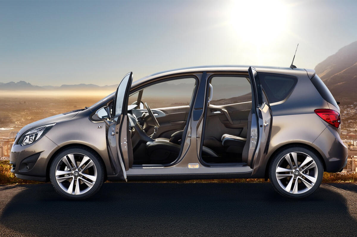
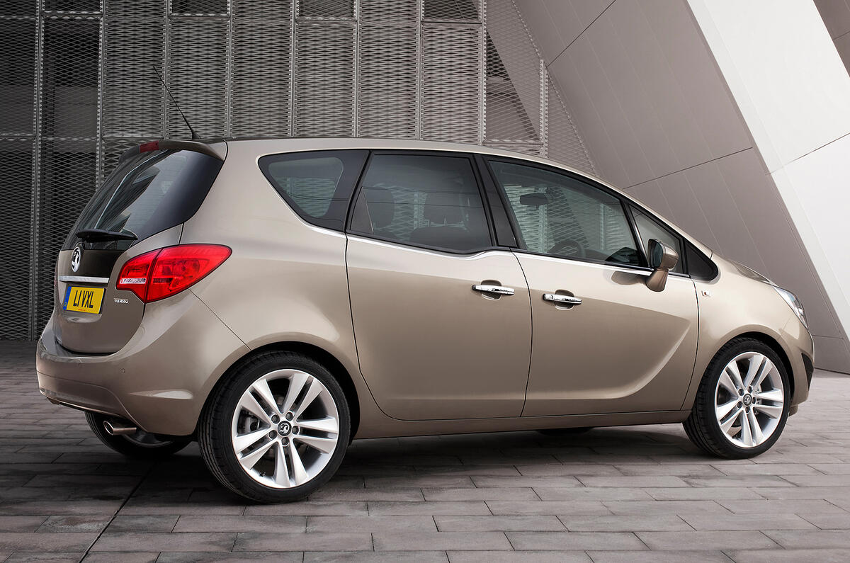
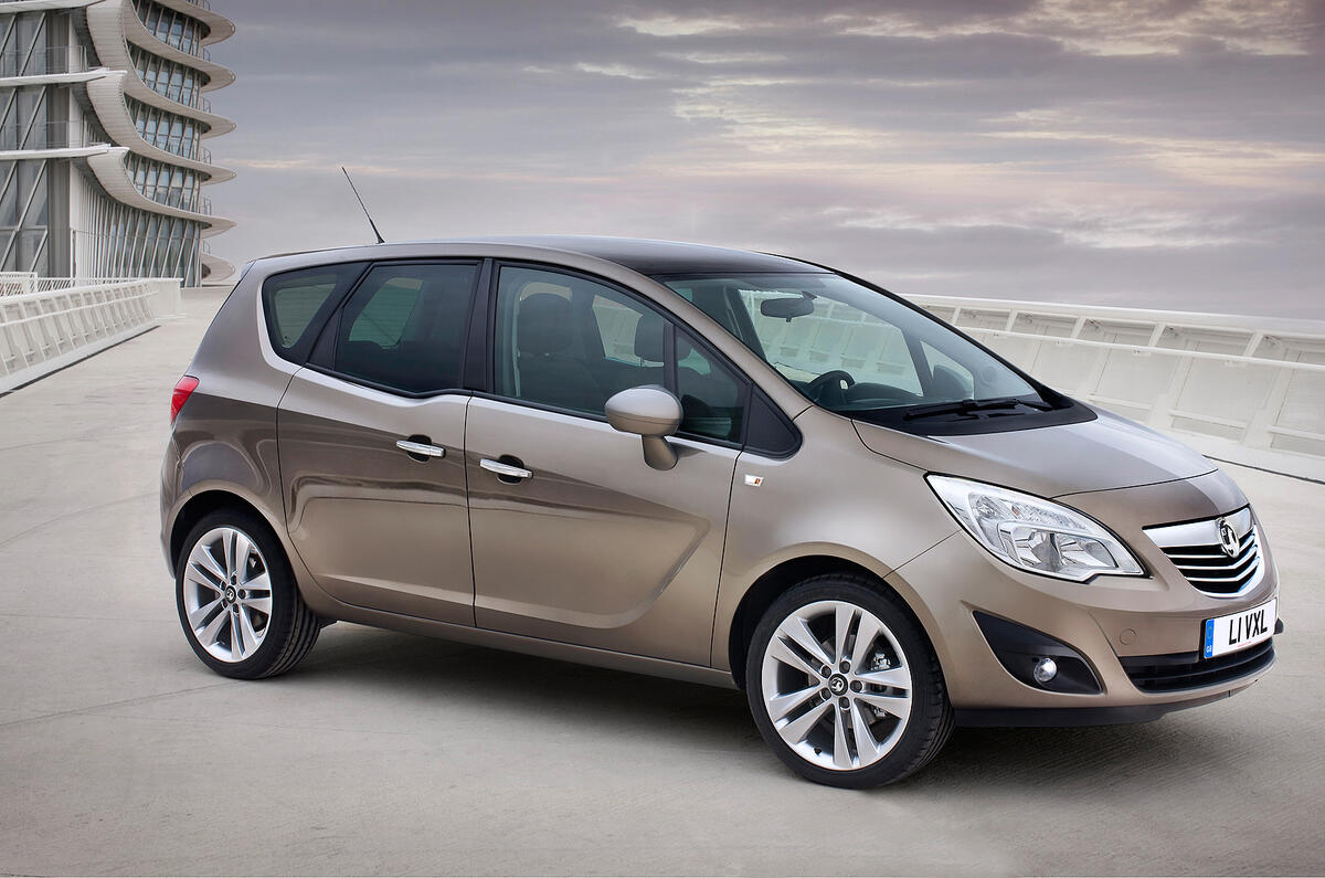
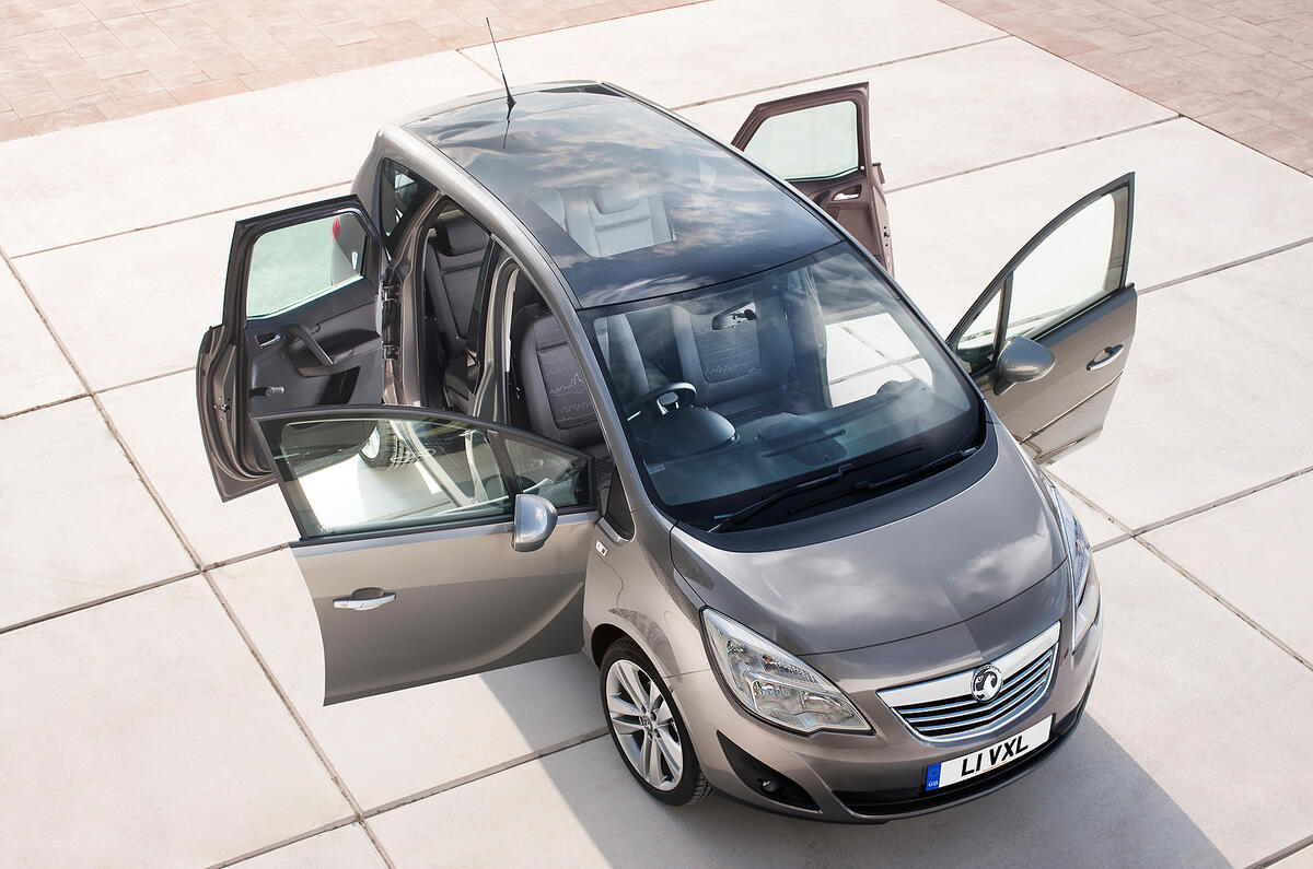
These are the first pictures of the interior of the new Vauxhall Meriva.
Vauxhall says it has been designed to maximise space, visibility and functionality.
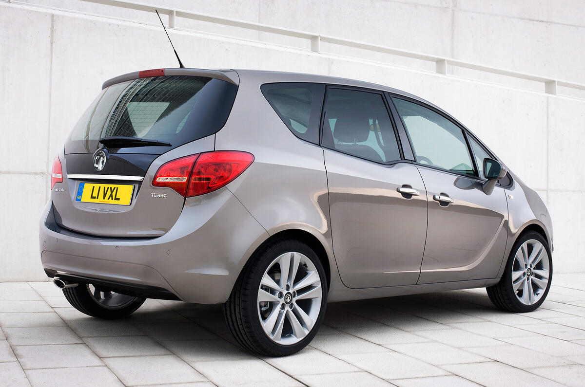
See the Vauxhall Meriva interior and exterior pictures
To achieve this, the Meriva’s designers have lowered and moved the instrument panel forward, creating more space for front occupants. The A-pillars have also been narrowed, aiding driver visibility. In the rear, the lower window line increases visibility for passengers, especially children.
The FlexSpace seating system on the new Meriva has been improved over the current model's; the rear seat cushions and rear seatbacks slide and lower in one action.
In addition, both its outer rear seats can be moved fore and aft individually. They also slide inwards to provide more shoulder width and leg room in a four-seat layout. The rear seats lower fully without the headrests having to be removed.
With its rear seatbacks up, the Meriva’s boot has a 400-litre capacity. This increases to 920 litres with the seatbacks folded, and 1500 litres if loaded to the roof.
Twitter - follow autocar.co.ukSee all the latest Vauxhall Meriva reviews, news and video





Join the debate
Add your comment
Re: Vauxhall Meriva interior: first pics
I was growing to like this car. Not any more though . The forward 3/4 vision on the old one was dire. Ok I concede it may be difficult to judge from the photos but is that a herd of wildebeests hiding behind that thick shallow angled A pillar !
Come on designers we would actually like to see where we are going especially around bends. Or maybe I am going around the bend. It is possible to get forward 3/4 Vision in an MPV just look at or rather out of Citroens Picassos.
Re: Vauxhall Meriva interior: first pics
I like the exterior looks, particularly in this light brown/bronze colour, and the interior looks light and airy, but, like the others here, there seem to be an awful confusion of buttons on the centre console and the door trims look rather plain, which seems to equate in many minds with cheapness. It will be interesting to actually see what it's like in the metal, so to speak.
Re: Vauxhall Meriva interior: first pics
Vauxhall/Opel seem to think that a huge number of buttons on the dash equals quality. It doesn't. They should take lessons from VW.
The exterior is a morphing of Corsa with some C4 picasso on the sides and Merc A class at the rear. Nothing new there then.
The sliding seats do nothing new that the current Meriva doesn't do already.
I hope quality improves, my wifes Meriva is still (after 2 weeks) at the dealers having a new steering rack fitted. Well, it will be fitted as soon as they can get the part, it seems that they're failing quicker than they can make them (dealers words not mine).