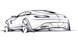
Currently reading: A preview of the Mercedes-AMG GT with the company’s designers

We talk to the design chiefs behind Mercedes' SLS replacement as they reveal how the AMG GT's shape will influence future models

Mercedes-Benz design boss Gorden Wagener has said the new Mercedes-AMG GT represents a “paradigm shift” in car design for the manufacturer.

The car, which is due to be officially revealed next month, ushers in Wagener’s vision for the future look of the Mercedes family, a design philosophy called ‘sensual purity’.

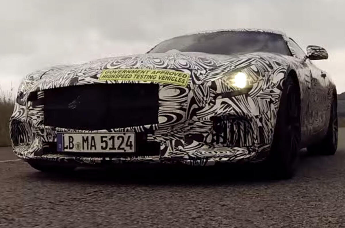
Autocar had a sneak preview of the AMG GT’s exterior and interior at Mercedes-Benz’s Design Centre in Sindelfingen, Germany. 

Wagener explained how Mercedes-Benz is moving away from ‘traditional luxury’ towards ‘modern luxury’. This can be construed as part of the company’s efforts to appeal to a younger customer base. 

The design chief also pointed out that he is keen for the AMG GT to be regarded as a new chapter for Mercedes, and not simply as a follow-up to the SLS AMG.

“The SLS is a fantastic car, but it is nonetheless a generic design – it has a bit of a mathematical structure,” he told us.

“This new car goes beyond this; we avoided having any sharp edges and created a look that is sophisticated on one hand and modern and high-tech on the other. It really embodies the idea of sensual purity you will see in every new Mercedes car.”

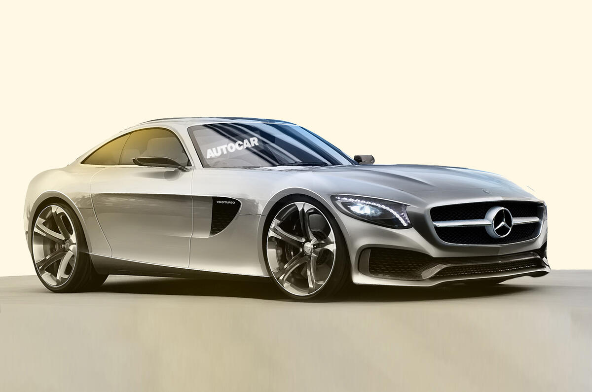
Wagener went into detail about the thinking behind the exterior design of the Mercedes-AMG GT: “It has fantastic proportions, the kind we’ve known from Mercedes sports cars ever since the 300SL. It has class and style. The round ‘greenhouse’ is almost aeroplane-like, and has a retro touch of the 300SL about it.”

The Mercedes-AMG GT features conventionally hinged doors as opposed to the iconic gullwing apertures of its predecessor. There are several reasons for this. It’s partly down to cost but also, Wagener says, “to really emphasise that this is a new chapter. We ended the SLS and we don’t want to see a direct comparison between the cars because they are so different.”

The new model is also more compact than the outgoing car: “It is 2cm shorter than the SLS and has a shorter wheelbase too. If anything the SLS was a touch too big in terms of length and width, and so I think the proportions of this car are more perfect. It also makes it a bit more agile.”

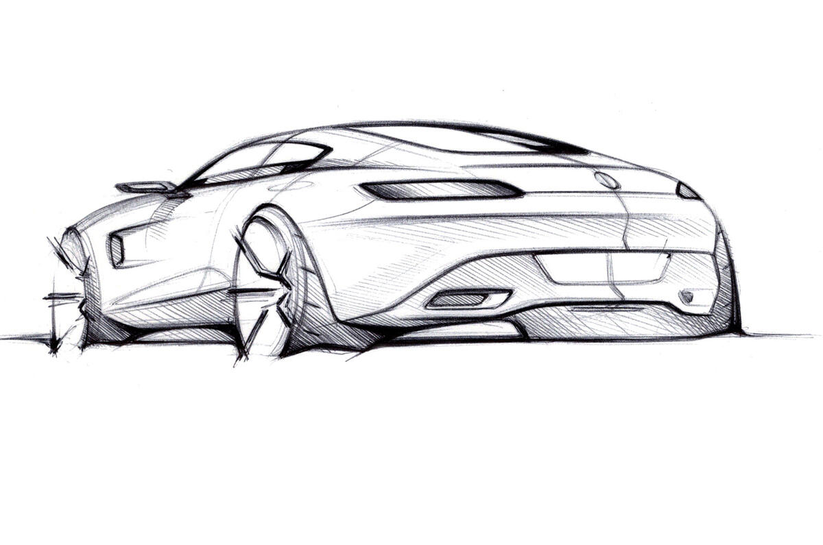
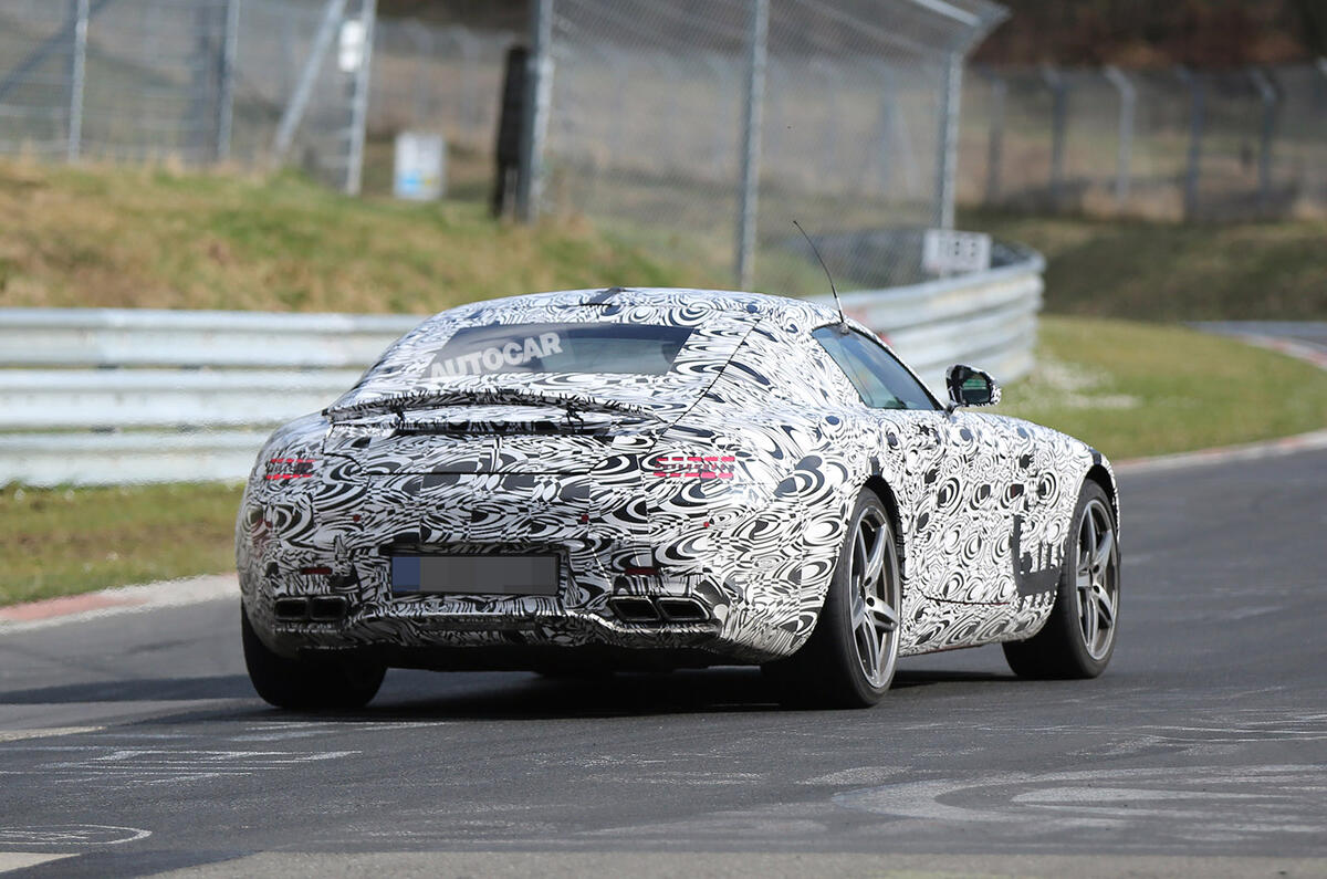
The car’s broad rear haunches are one of its most distinctive exterior design features. Wagener says: “The rear for me is the nicest part, with its huge shoulders. This is an example of how we can play with the execution of our design philosophy – the more sporty the car, the bigger the shoulder. 

“You have to decide where to put the ‘real estate’ and we put three feet of it into the shoulder and a lot into the wheel arch. I think it is a perfect balance, the stance we have achieved with the shoulder makes the rear perspective really stunning. 

Back to top

“This shoulder theme is a very significant one for all Mercedes. If you look at all of our coupés – from the S-class coupé to the Mercedes-Benz CLA and even the Mercedes-Benz B-Class – they have a shoulder, albeit in some cases a tiny one.”

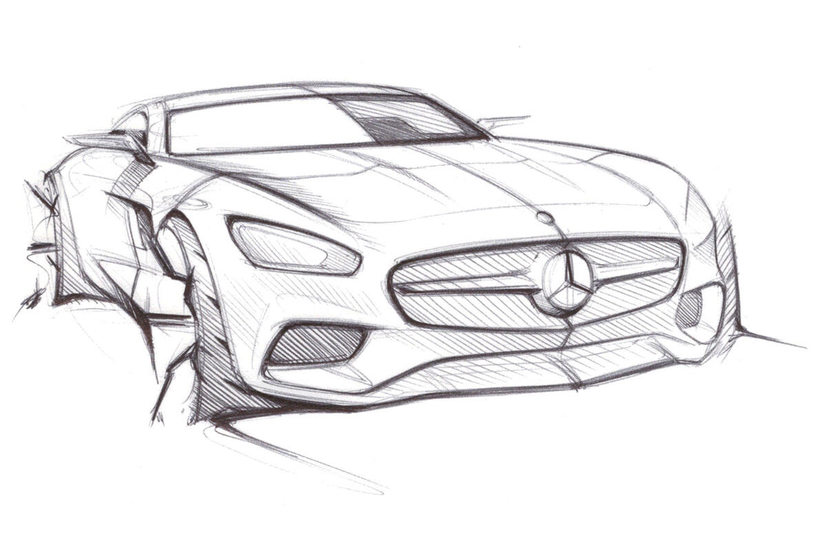
He describes the front styling as “typical AMG, with the radiators left and right, huge openings for cooling and then the ‘A-wing’ signature, which has already been seen on the latest E-class AMG. We are giving AMG a specific face as a sub-brand in the future, so you will see different executions of this.

“The headlight design is aggressive and the front is designed so that when you sit in the drivers’ seat, you can see the bonnet and the left and right wings.”

Read Autocar's review of the SLS AMG GT Final Edition

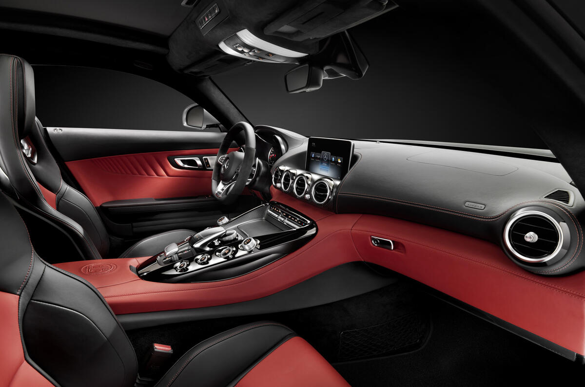
Autocar also had the chance to sit in a near-complete design of the Mercedes-AMG GT’s cabin, as interior designer Jan Kaul explained the highlights. 

“The cockpit feeling is inspired by aviation and jet themes,” he said. “There’s a really high tunnel console which rises sharply to meet the dashboard. 

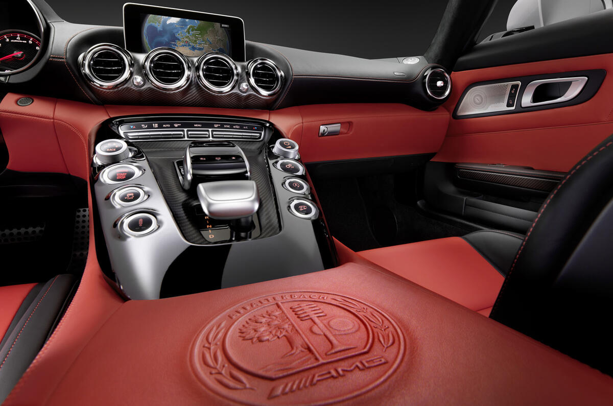
“One of the highlights of the interior is the metal plate which integrates all the driving performance functions. They are in a high position, ergonomically in the perfect position, close to the driver’s body.

"The inspiration for these four cylindrical elements on each side of the centre tunnel comes from the V8 engine. It is such a wide and high tunnel console. It expresses the power that the car has and the driving performance. 

“Another interesting feature is that we tried to reduce the number of functions on the centre console, just focusing on the driver performance. So it was necessary to take some of the buttons that are necessary for the user interface and put them in the roof. This really accentuates the cockpit feeling, because aeroplane pilots have buttons above them.

“In a lot of areas in the cabin, we played around with contrast. One example is the colour trim contrast between black and white, but there is also the contrast between gloss and matt finishes. For example, on the centre console we have a PVD (physical vapour deposition) coated black diamond insert and it’s a very nice contrast to the matt carbonfibre. 

Back to top

“Other aviation themes are the centre console control panel, which is shaped like an NACA air duct from an aeroplane, and the four air vents in the centre of the dashboard, which interpret jet engines and are a signature on our top-of-the-line models."

The cabin feels comfortably snug without occupant head, leg or shoulder room being an issue.

“It doesn’t feel small inside,” affirms Kaul. “The dimensions were not really a negative aspect in the design process. We had almost complete design freedom over this car. It’s a pure two-seater and is designed to feel like a tight suit that is tailored to you.”

AMG boss Tobias Moers had an active role in shaping the interior, requesting the repositioning of the infotainment screen, which on early test mules was placed higher on the dashboard.

Moers felt that the positioning wasn’t suitable for a driver’s car, and ordered it to be lowered, a complex task that required the design team to rework the air duct venting within the dashboard.

Design chief Wagener is a believer in ‘reduction’ – removing unnecessary complexity from car designs – but adds that Mercedes is unlikely to follow the lead of Tesla by installing minimalist touch screens in its cars.

“Even though I’m a lover of touch pads on some devices, I don’t think a touchpad is appropriate in a car,” he says. “We go a different way than Tesla because we want to move screens and functions higher up, where you actually look on the street. 

“In the Tesla the screen is very low, and you are unable to put touch pads in positions where they are in your first field of visibility. This is why we are true believers in separating screen and the touch pad element – it is easier to operate.”

Wagener can barely contain his enthusiasm for the car: “To me it is one of the most beautiful cars we have ever created. It embodies all of the modern luxury on one hand, but on the other hand it is very pure and high-tech looking.

Back to top

"It takes all of the DNA of the legendary Mercedes Silver Arrows into the next decade, but it still keeps the classy sexiness of the classic sports cars.”

But the Mercedes-AMG GT represents more than just a new rival for the Porsche 911 and Jaguar F-Type coupé. It also ushers in an era where Mercedes puts design at the forefront of its car development. The workers at the striking Design Centre building, created by noted architect Renzo Piano, are taking the lead in shaping how we will regard Mercedes vehicles in decades to come.

Wagener says: “A few years ago it would not have been possible for Mercedes-Benz to design a virtual reality concept car as we did with the Vision Gran Turismo concept [which informed the AMG GT].

“As designers we have to define the future so it is important for us to look into the future. We are already looking to 2018 concepts [and with] platforms we are looking to cars that are going to be on the road in 2030.”

Get the latest car news, reviews and galleries from Autocar direct to your inbox every week. Enter your email address below:

Join the debate

Comments
6
Add a comment…
TheOmegaMan 14 August 2014

If you're gonna make an

If you're gonna make an impractical 2 seater sports car the engine might as well be behind the driver. A 911 still has 2+2 and will outhandle this Merc. For that reason, I'm out
Moparman 13 August 2014

Hyperbole drive engage!

It's a Mercedes that looks like a Mercedes. The idea that this is going to appeal to younger buyers is slightly ridiculous as those who are younger and can afford it tend to live in cities and eschew cars preferring to spend their hard-earned on getting onto the property ladder. What it is supposed to due is lull middle-aged blokes such as myself into thinking they are younger and perhaps threw money at MB for a midlife-crisis car rather than the ubiquitous Porsche. Time alone will tell if they succeed.
n. leone 13 August 2014

Design trend

To me, this car looks clean and elegant only from the back of the front wheels backwards. The front is a swollen triumph of arrogant grill, hypertrophied cooling ducts and badly resolved headlamps, that contribute to unbalance the whole design, making the car look as if it had a half-mile long bonnet. Sexy? Did this Wagener chap take a good look at the original 300 SL? Because if he did, he didn't understand anything at all.